PostX lets you optimize your site for different devices. Changing how the website looks on different devices like desktop, mobile and tab is now in your control. Here’s a quick video to help you out:
There are 3 settings for 3 types of devices each to optimize your website. And PostX makes it very easy and intuitive to do.
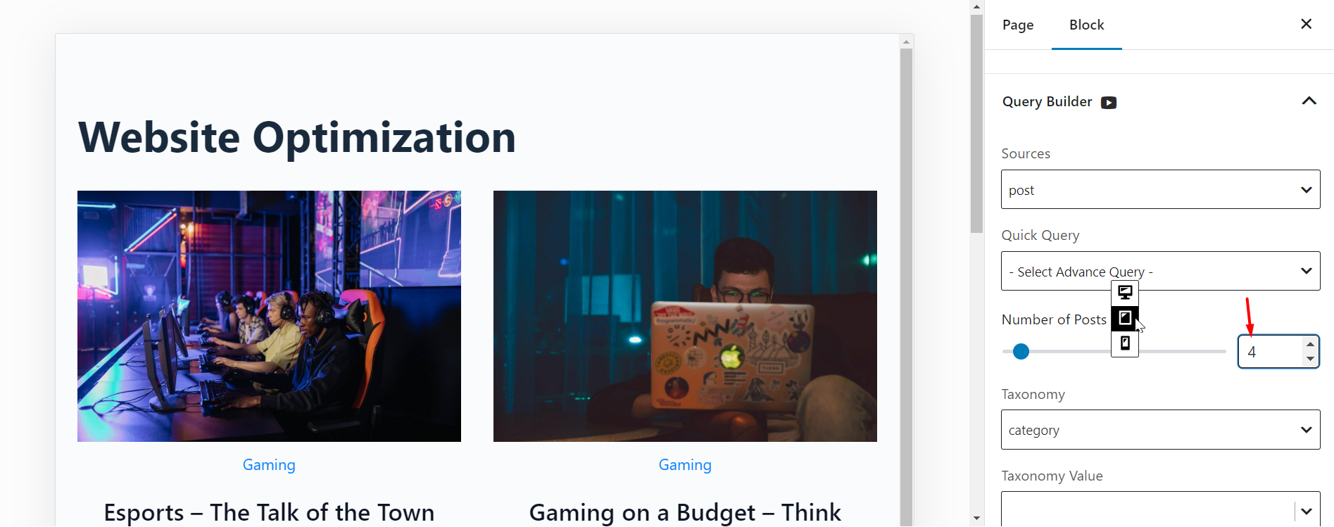
Device Types for View Optimization
You can optimize your websites for 3-types of devices : Desktop, Tablet, and Mobile.

Let’s see how you can optimize the number of columns, number of posts, and images for different types of devices:
Column Optimization
You can show different number of columns for different devices. Just click on the device type (as shown in the image above) and change the number of columns you want to show on that particular device.
Change the Number of Posts
You can change the number of posts for different devices:
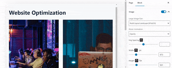
Change the Image Width and Height
You can change the width and height of images for various device types. Here’s an example:
Optimizing is a must for any website. And this multi-device optimization settings will help you achieve the perfect layout without any hassle.