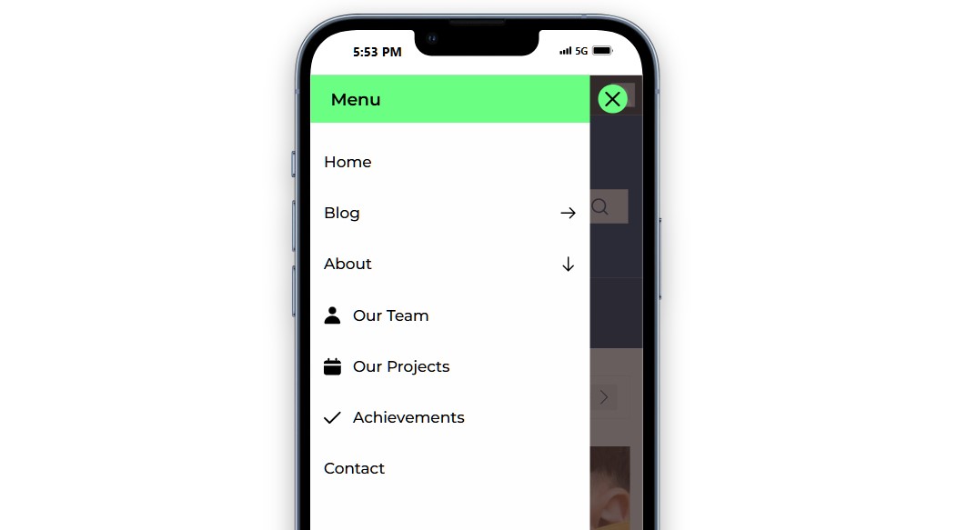
PostX’s Menu Block offers a Hamburger View option. It is designed to optimize the menu for mobile and tablet devices. The mega menu and list menu will automatically adjust to the mobile layout.
To enable it, simply navigate to the Hamburger View section in the Menu block settings.
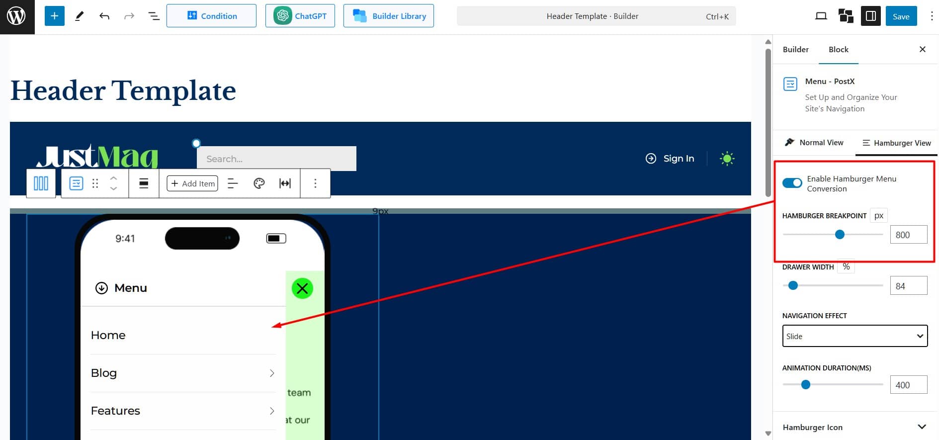
Enable Hamburger Menu Conversion: Toggle this option to activate the hamburger menu for smaller screens at the specified breakpoint.
Hamburger Breakpoint: Set the screen width (in pixels) where the menu switches to a hamburger style, with a default value of 800px.
Drawer Width: Define the width of the navigation drawer as a percentage or pixels of the screen width. It is adjustable up to 100%.
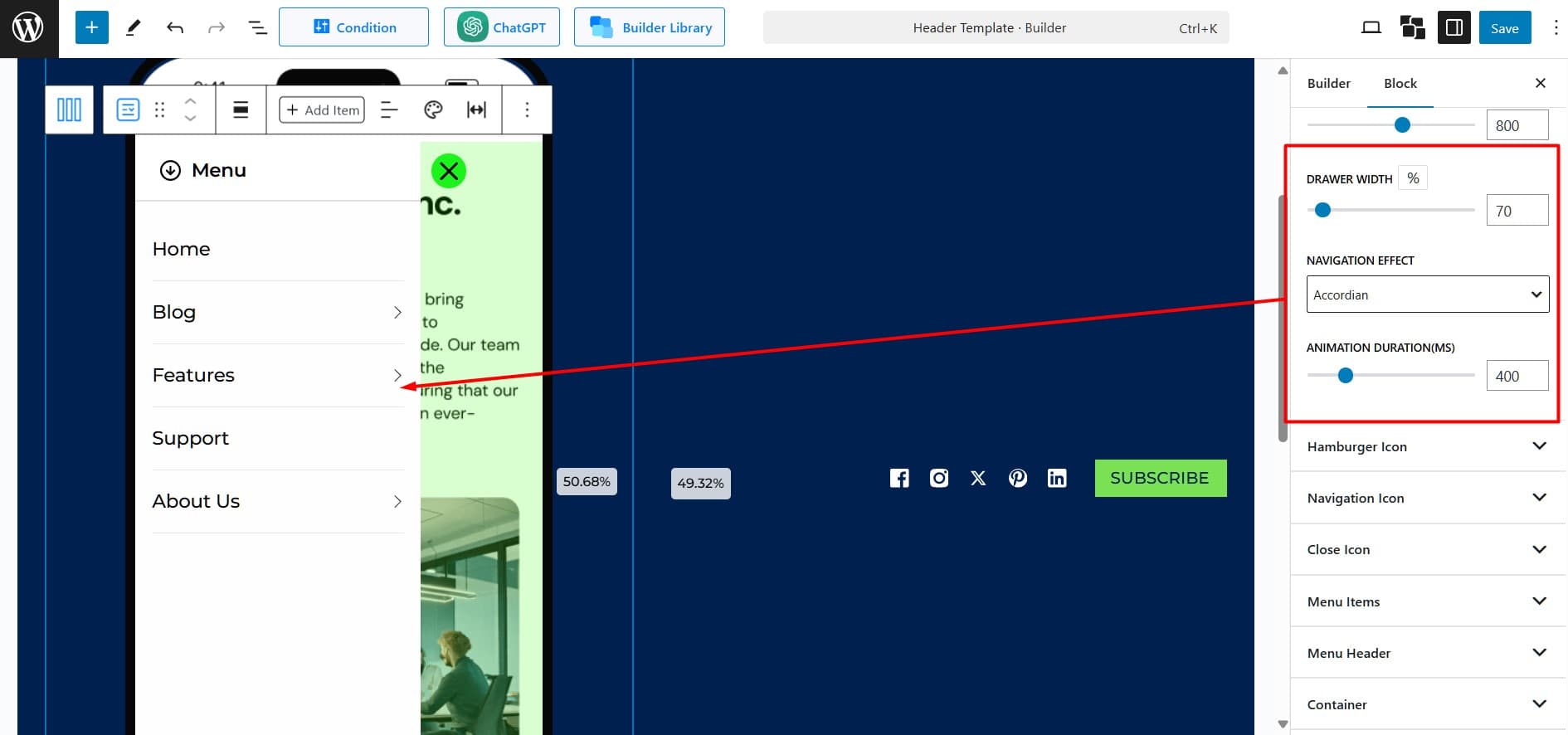
Navigation Effect: Select an animation style for smooth transitions within the menu. There are three options:
- Dissolve: Menu items fade in and out for a smooth transition.
- Slide: Menu items slide in from the left or right for a dynamic effect.
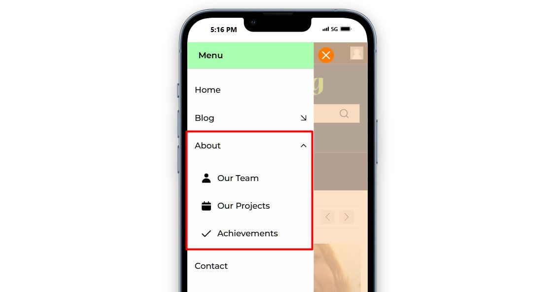
- Accordion: Menu items expand and collapse vertically. This is perfect for multi-level menus. See the example below.
Animation Duration (ms): Set the animation speed in milliseconds, with 400ms as the default value.
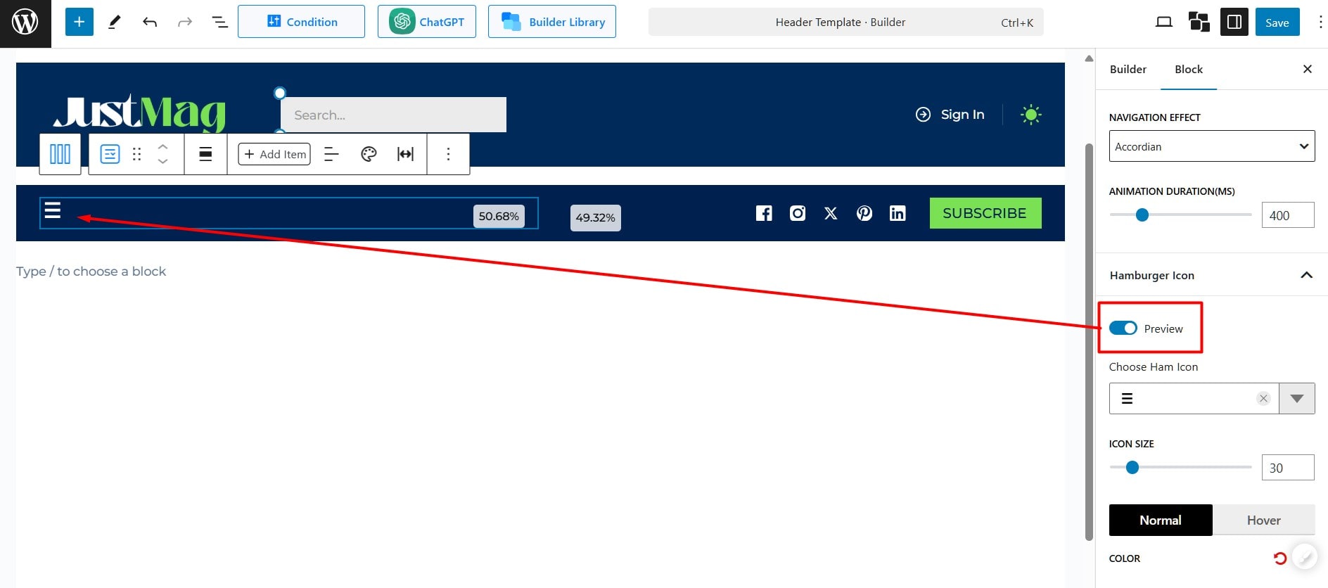
Hamburger Icon: Select a hamburger icon and customize the size, color, background, border, and border radius for the icon. Enable the Preview to see a live preview of the changes made to the hamburger icon.
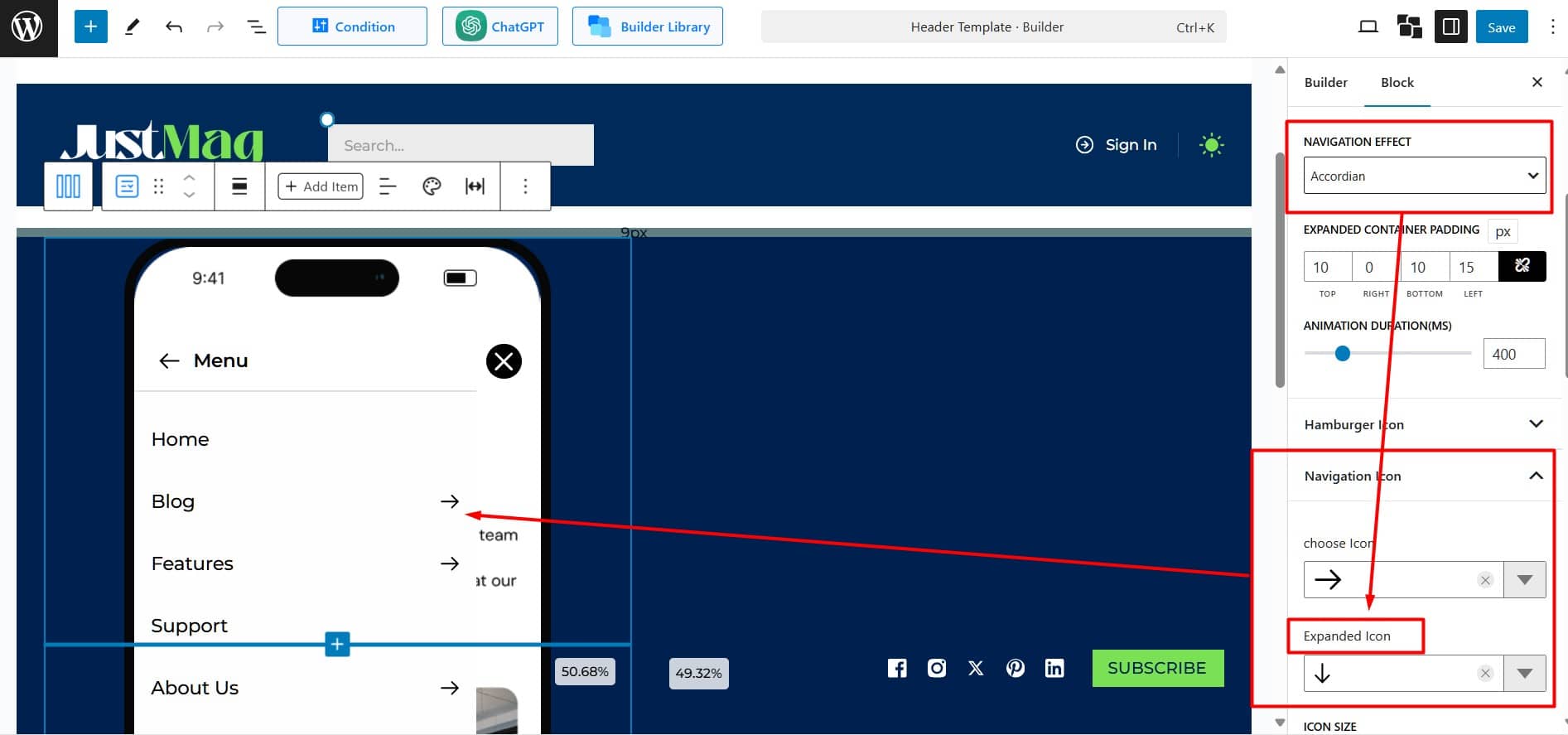
Navigation Icon: Customize the appearance of navigation icons. Modify its colors and shapes.
When “Accordion” is selected as the navigation effect, an “Expanded Icon” option will appear in the settings. This feature visually shows the current state of the menu by indicating which section has been expanded,.This makes it easier for users to navigate through the content.
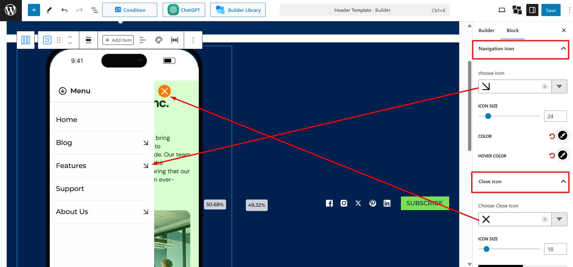
Close Icon: Select a close icon and adjust its size and position for better usability.
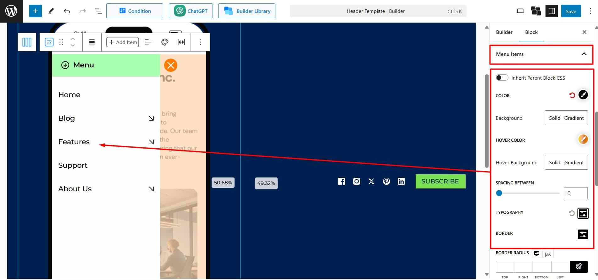
Menu Item: Modify the color, background, spacing, and borders of the menu items.
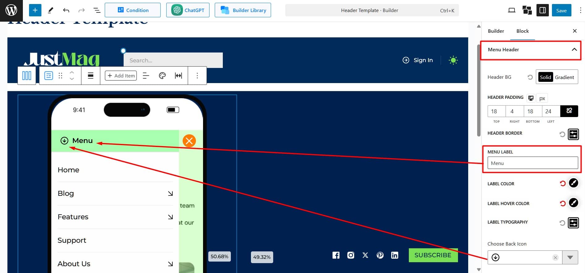
Menu Header: Choose between a solid color or a gradient background. Adjust the padding and border style for the menu header.
- Lebel Settings: Enter custom text for the menu label. Choose colors and adjust the font for readability and style.
- Back Icon Settings: Choose a back icon design from the available options. Adjust its size and set the text-to-icon spacing for a balanced and clean layout.
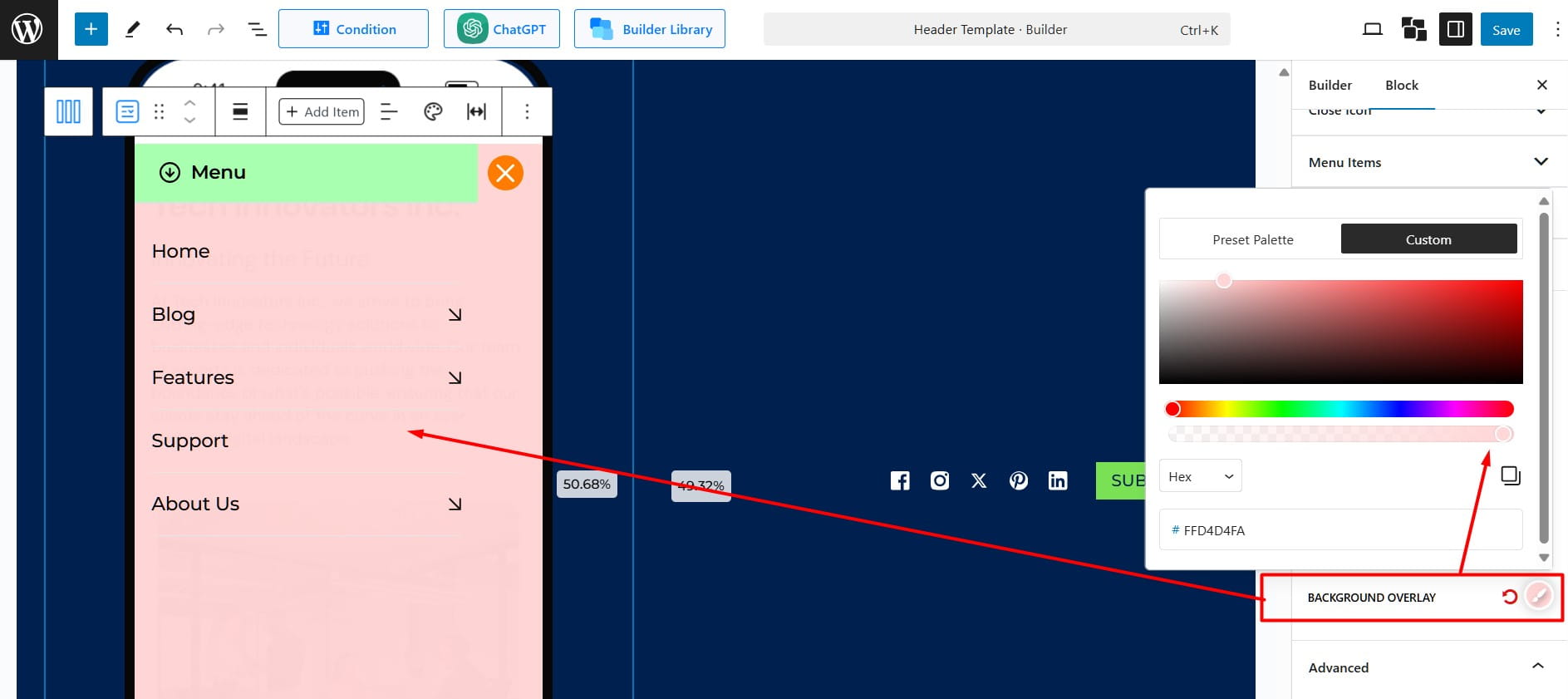
Container: Customize the container with a solid or gradient background. Adjust padding and border, and add a shadow or overlay for emphasis.
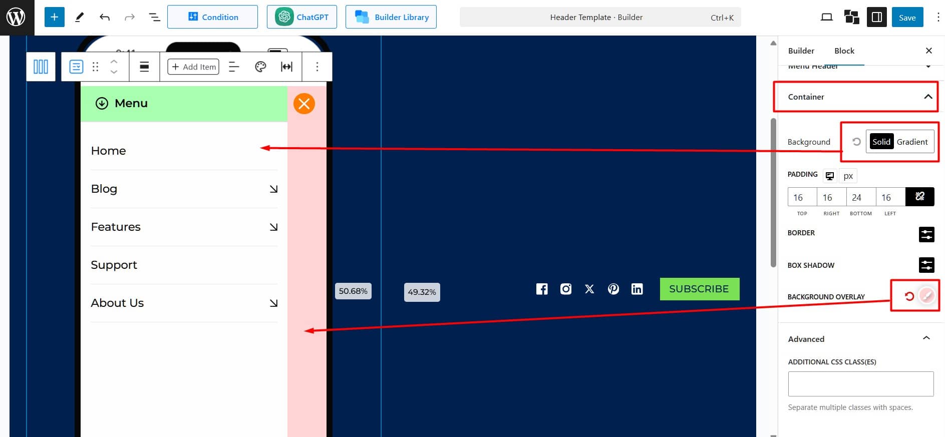
Use Overlay Only (Optional): Reset the background and apply the overlay to fill the container. Adjust the overlay transparency to create a distinct contrast between the background and the menu items.
