Rows and columns are essential for creating more complex layouts in WordPress. The PostX row/column block is a handy tool for creating and customizing them. This guide will provide simple instructions so that even WordPress beginners can understand and utilize the features of PostX’s row/column block.
Let’s check out how to use the PostX Row/Column Block.
Video Tutorial: Row/Column Block
We have created a video tutorial for row/column blocks to help you understand the process better.
Step 1: Adding the Row/Column Block
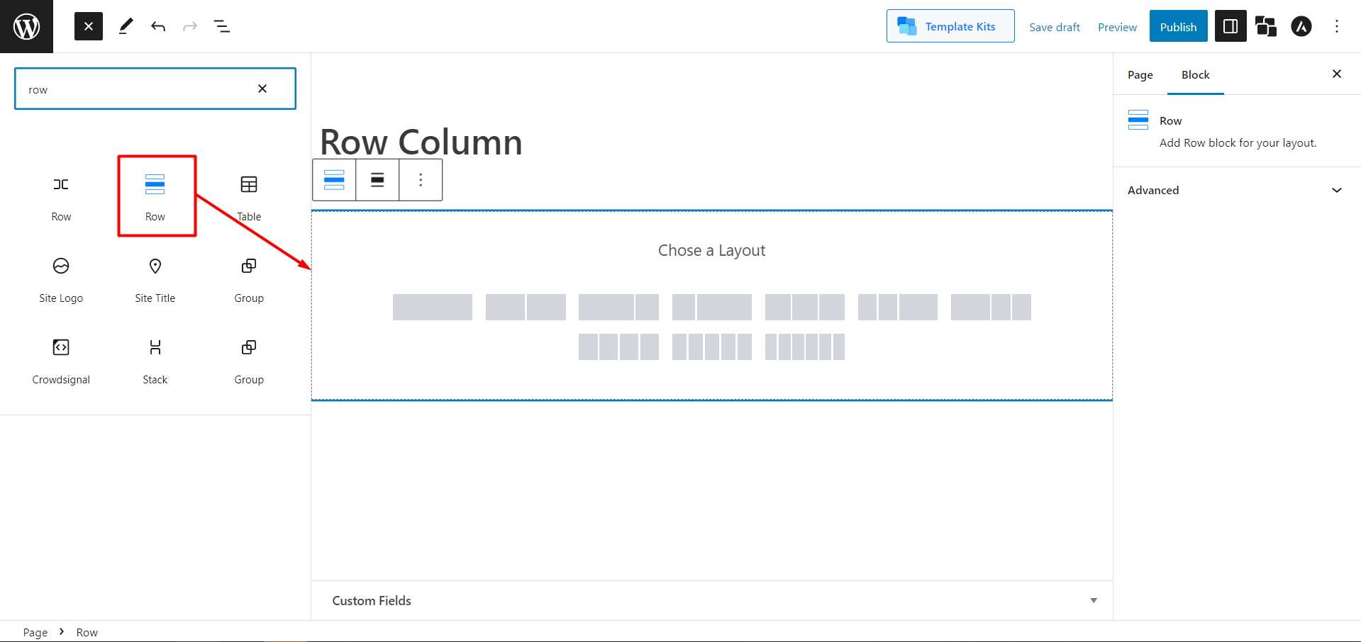
To start, open the WordPress Dashboard, navigate to Pages, and click Add New. Then, click the plus sign (+) in the upper left of the toolbar to open a list of available building blocks in a sidebar. Search for “Row” and select the Row block. This will add the block to your editor.
Step 2: Choosing Layouts
Choose any of the predefined layouts. Then, you can change the column width with the container adjuster and manage the Row and Column Gaps with a slide bar. If your theme has a default width, you can enable the toggle bar to Inherit the Theme Width to simplify the process.
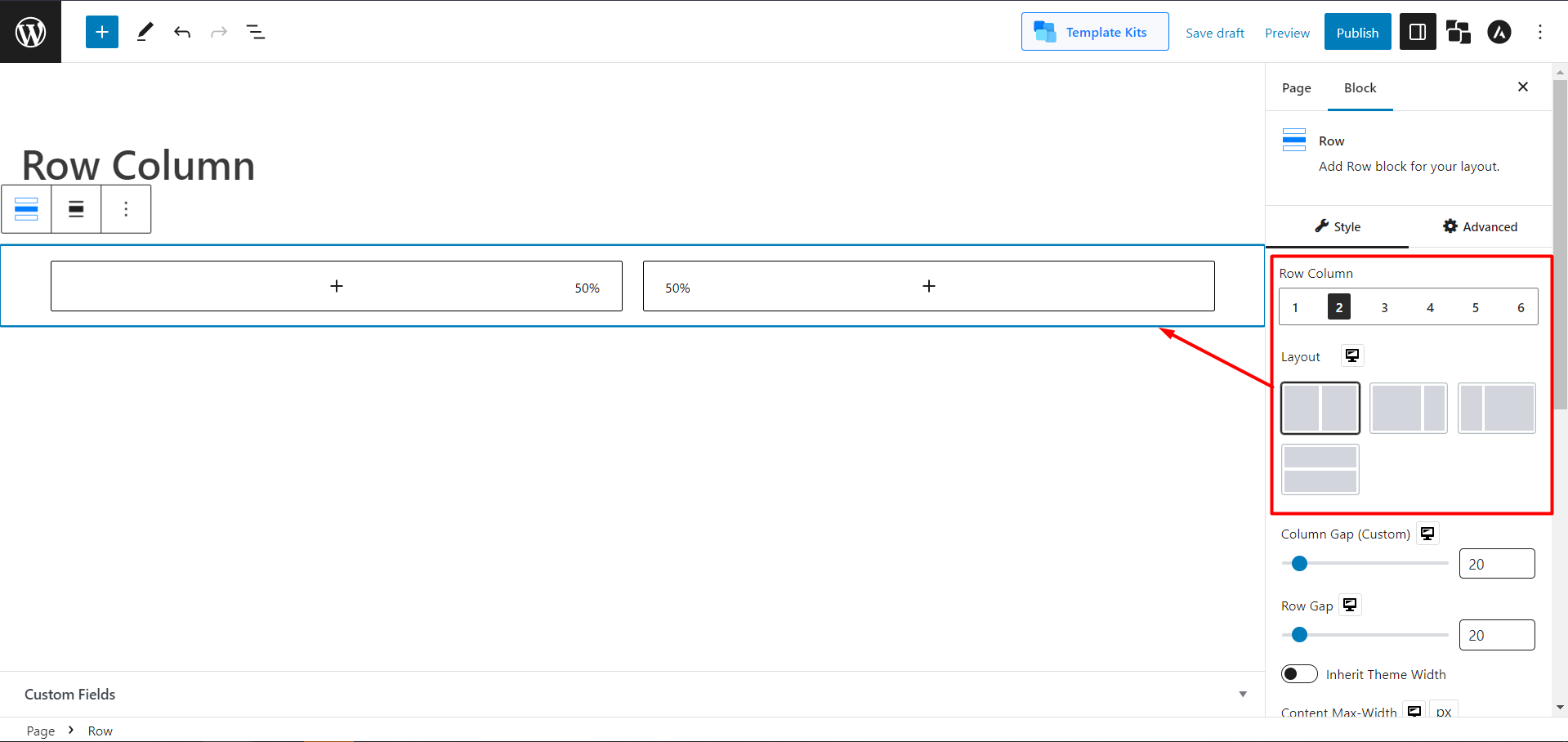
Then you can add other blocks in your row/columns as needed.
How to Use Other Features of Row/Column
PostX’s Row/Column block has more than just some basic features. Let’s see how you can use those features easily.
Adding Flex Properties
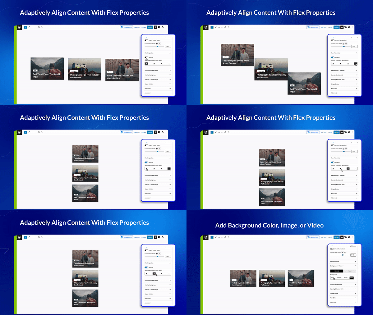
Flex is a powerful layout component that provides a way to align child elements of a container horizontally or vertically in either direction. In the Column setting, you can use the Flex option both horizontally and vertically. In the Row setting, you can align your contents vertically. You can also reverse your contents with a toggle bar.
Adding Background (Color, Image, Video)
You can customize the background and wrapper of your row/column using colors, images, and videos. You can set different backgrounds in Row and Column settings.
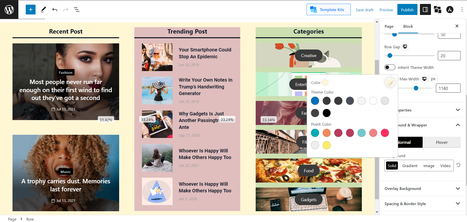
Solid Color:
You will have the option to add solid colors in the background of the row/column.
Gradient Color:
You will have the option to add gradient colors in the background of the row/column.
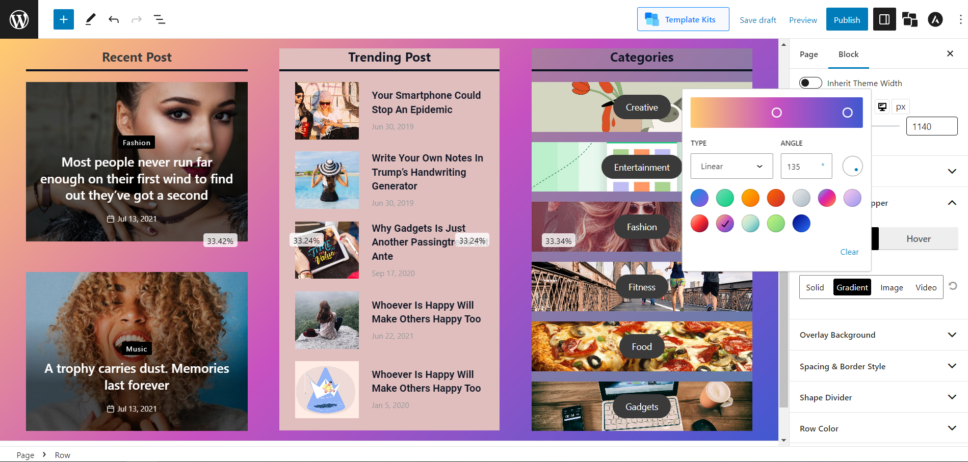
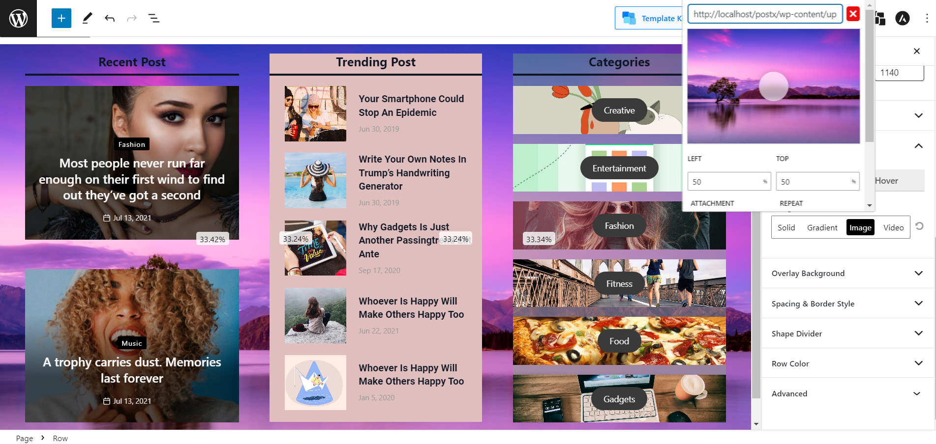
Image:
You will have the option to add images in the background of the row/column.
Also, you can even add a Video as a background.
Changing Row Color and Column Color
Change the color, link color, link hover color, and typography of rows and columns.
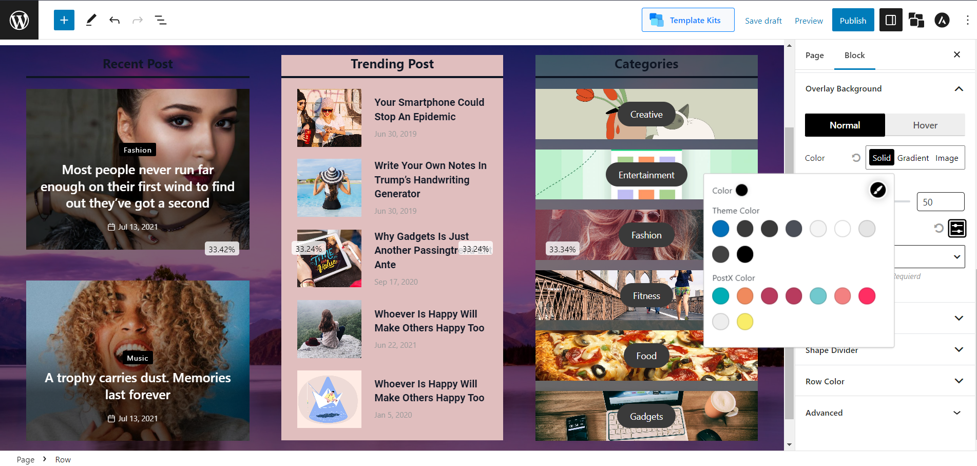
Adding Background Overlay
You can add overlay backgrounds like a solid color, gradients, or even images in the background and on hover.
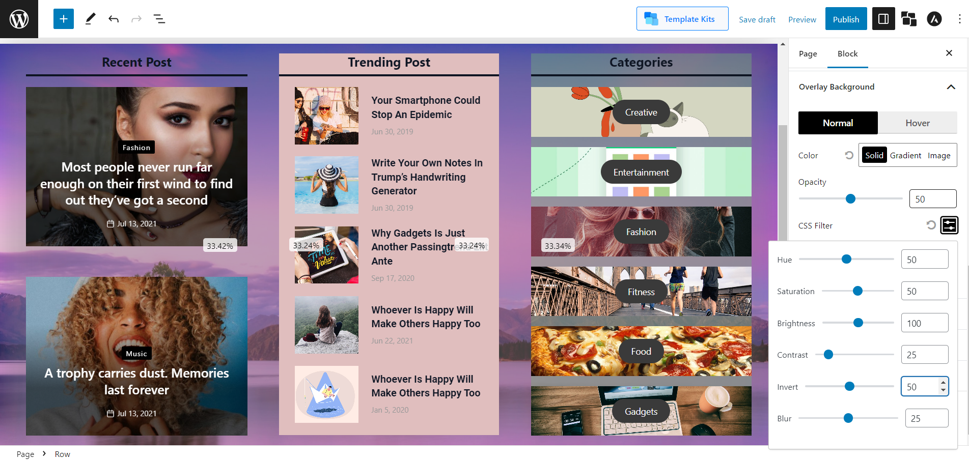
Css Filter:
Adjust the opacity, hue, saturation, brightness, contrast, invert, and blur to make them more customized.
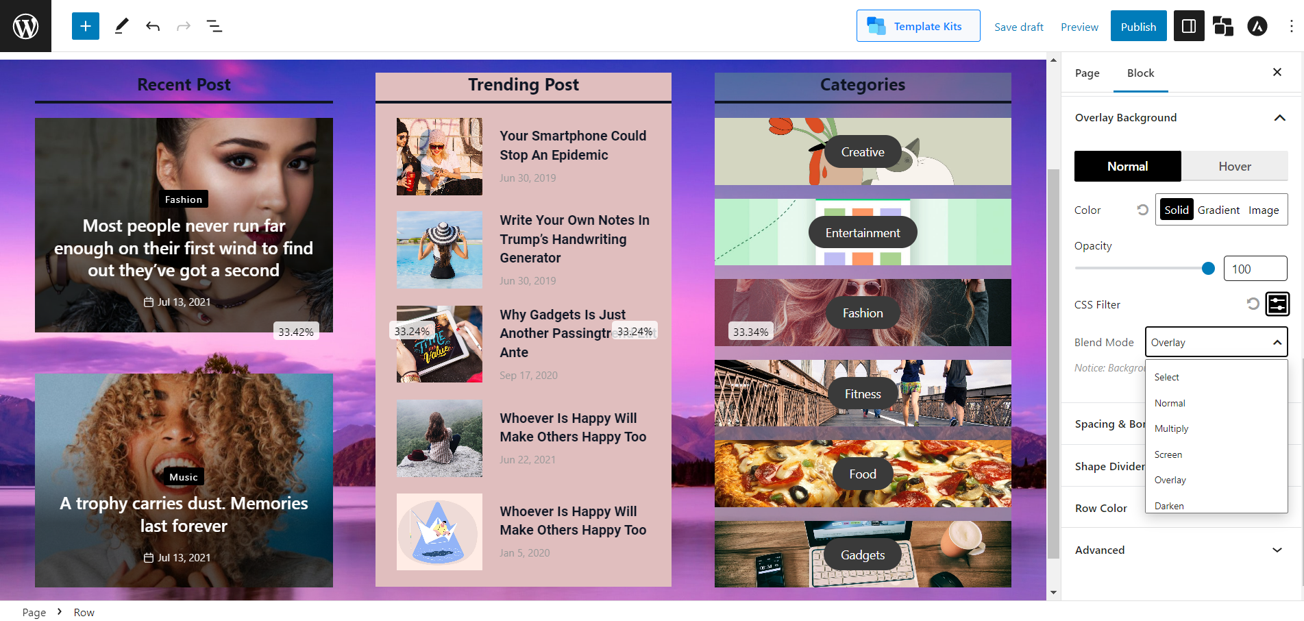
Blend Mode:
Different premade blend modes to select for your background overlay.
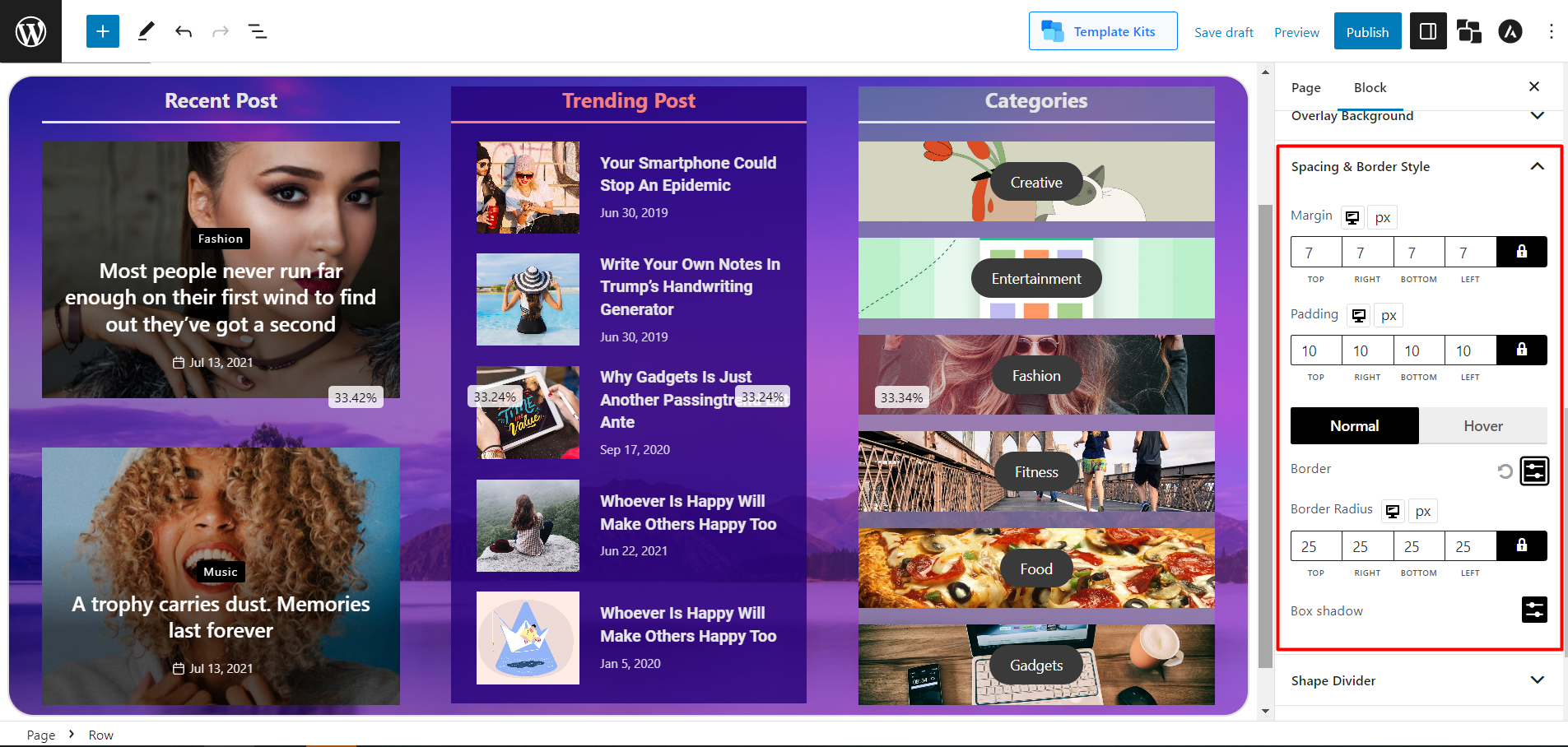
Modifying Spacing and Border Style
Adjust the default margin, padding, border color, radius, and box shadow from this setting.
Adding Shape Divider
Shape dividers are an excellent element in designing your website content. With PostX Row/column block, you can add 8 premade shapes. However, there is an option to reverse the shapes, and that will let you add a total number of 16 shapes. If you want to create a layout that has colored shapes at the top and bottom to make your particular content amazing, then this feature is just catered for you.
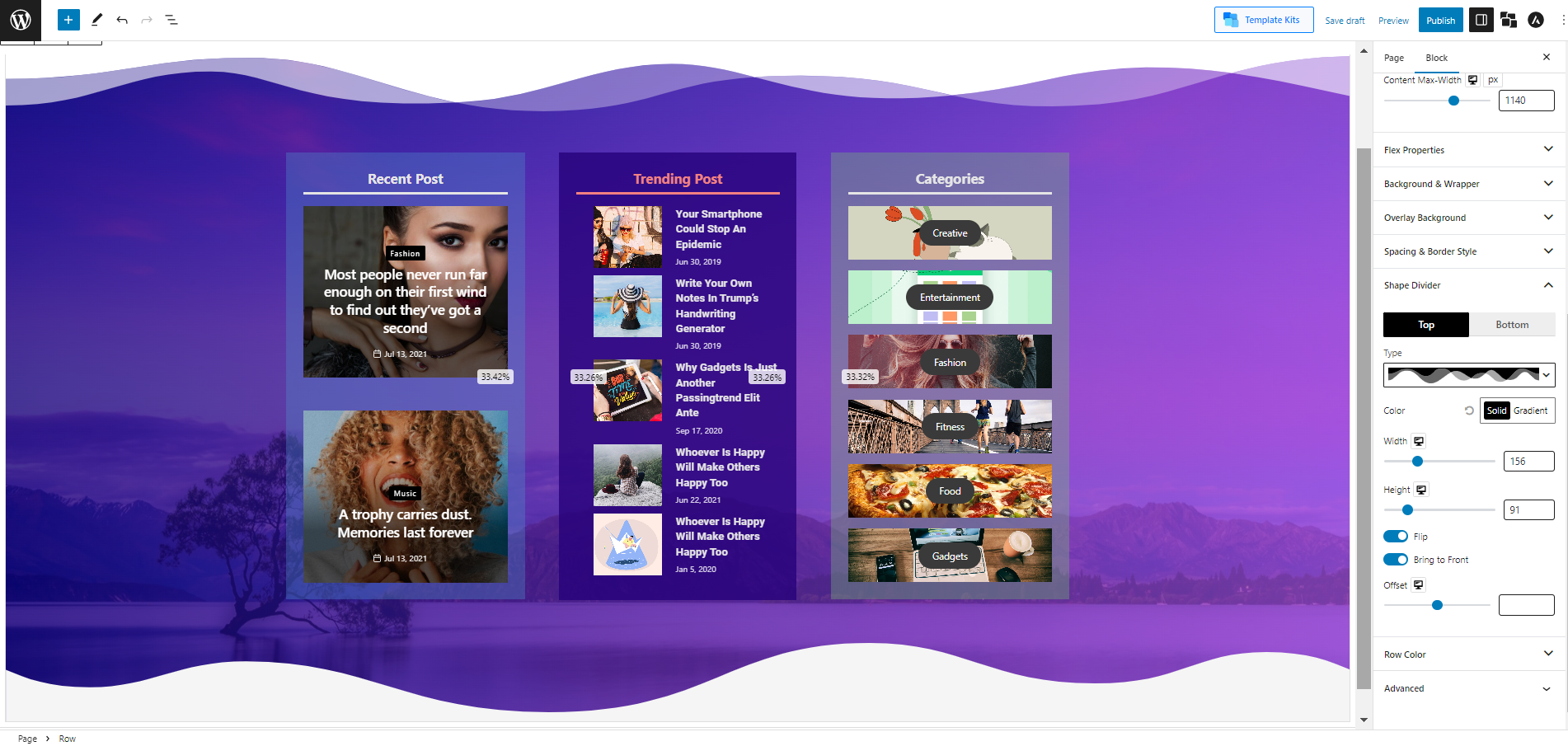
You can add graphic shapes at the top and bottom of your content section and adjust the color, width, and height.
Making the Column Sticky
A sticky column is important for most blog sites. A sticky Column lets you “stick” your particular column to the front page of your WordPress blog so that it remains at the top. Sticky columns can be used for announcements, promotions, or other special content that you want to ensure remains prominent on your site.
PostX Row/column block lets you enable the sticky column to keep your column at the front of your page. And adjust the gap with a sliding bar.
PostX row/column is an invaluable tool for creating stunning websites. Now that you understand the basics, you can use the diverse options available to customize your website to meet your needs.
Making the Row Sticky
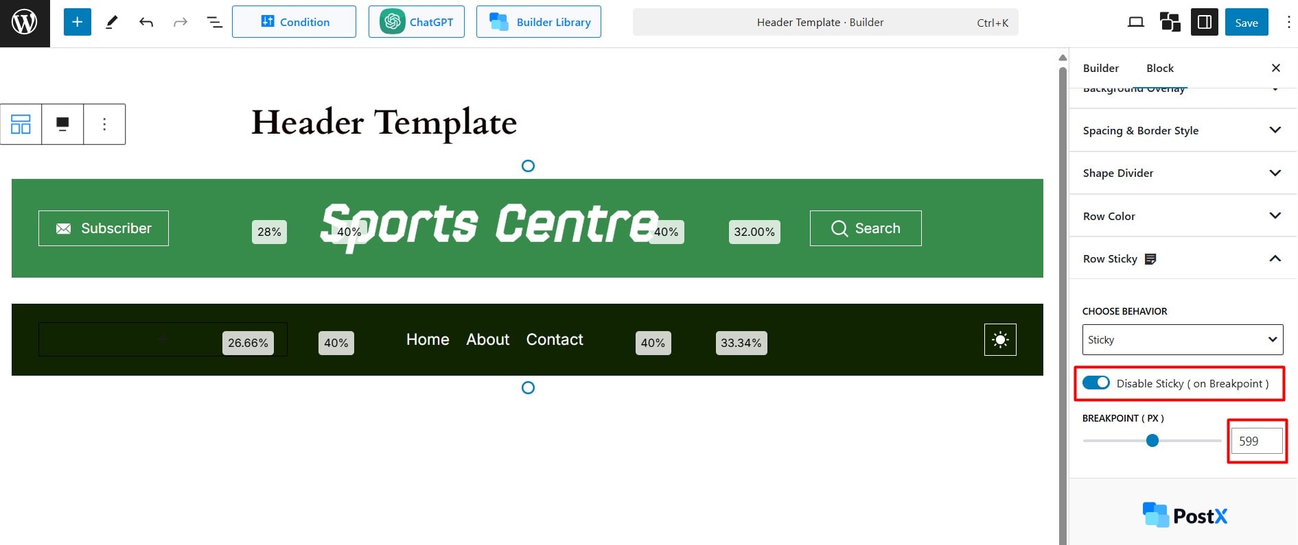
The new Row Sticky setting allows you to make specific elements, such as header menus, or any content within a row block, sticky on the page as the user scrolls.
Choose Behavior
There are three behavior options to understand clearly:
Normal
This option works like the default row block, without any sticky behavior. By default, all row blocks are set to normal.
It is ideal for a website where elements such as sidebars, headers, or footers do not need to be sticky at all.
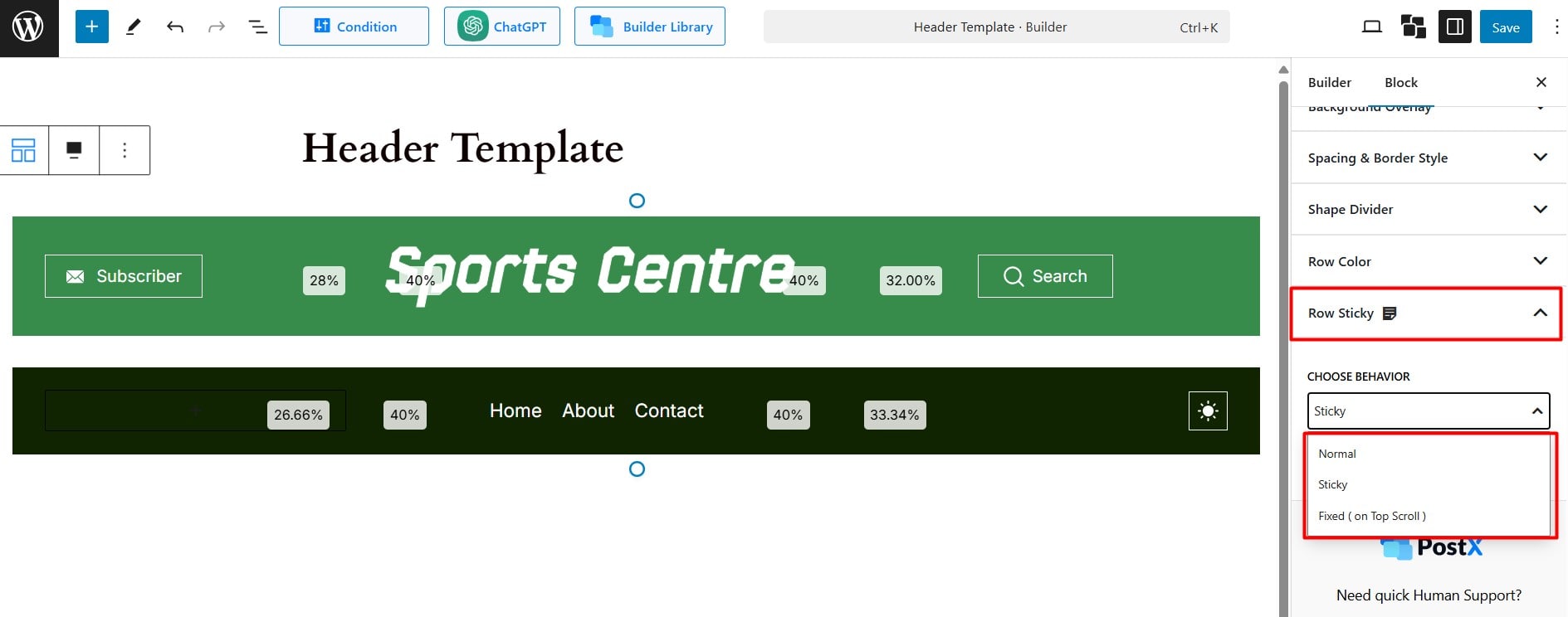
Sticky
This option keeps the element fixed at the top of the page, no matter how far you scroll down. The navbar will always remain visible, even before the user starts scrolling.
Example: On a news website, as users scroll through articles, the navigation bar (with links to sections like Home, Politics, Sports, etc.) remains fixed at the top. It makes navigation easier without scrolling back up.
Fixed (on Top Scroll)
This feature hides the navigation bar when the user scrolls down, but it appears when they scroll up. It’s great for long pages where you want the navigation menu to be accessible without taking up space when needed.
Ideal for landing pages, portfolios, or long-form content. The navigation bar disappears when scrolling down and comes back when the user scrolls up. This way, it provides easy access to navigation without clutter.
To make your navigation menu sticky click here.
Disable Sticky (on Breakpoint)
To disable sticky positioning on certain screen sizes, you can set specific pixel values for the breakpoints. Keep in mind that the “Disable Sticky” doesn’t function for the “Normal” option.
For example, to make an element not sticky on mobile devices, set the value to less than 600px, and for tablets, use a value under 990px.
