PostX offers a powerful mega menu feature that helps to create detailed drop-down menus with multiple categories and subcategories. This menu includes images, descriptions, links, icons, sign-up forms, promotions, and more.
PostX’s mega menu helps to enhance your site’s navigation while making it more functional and attractive to visitors.
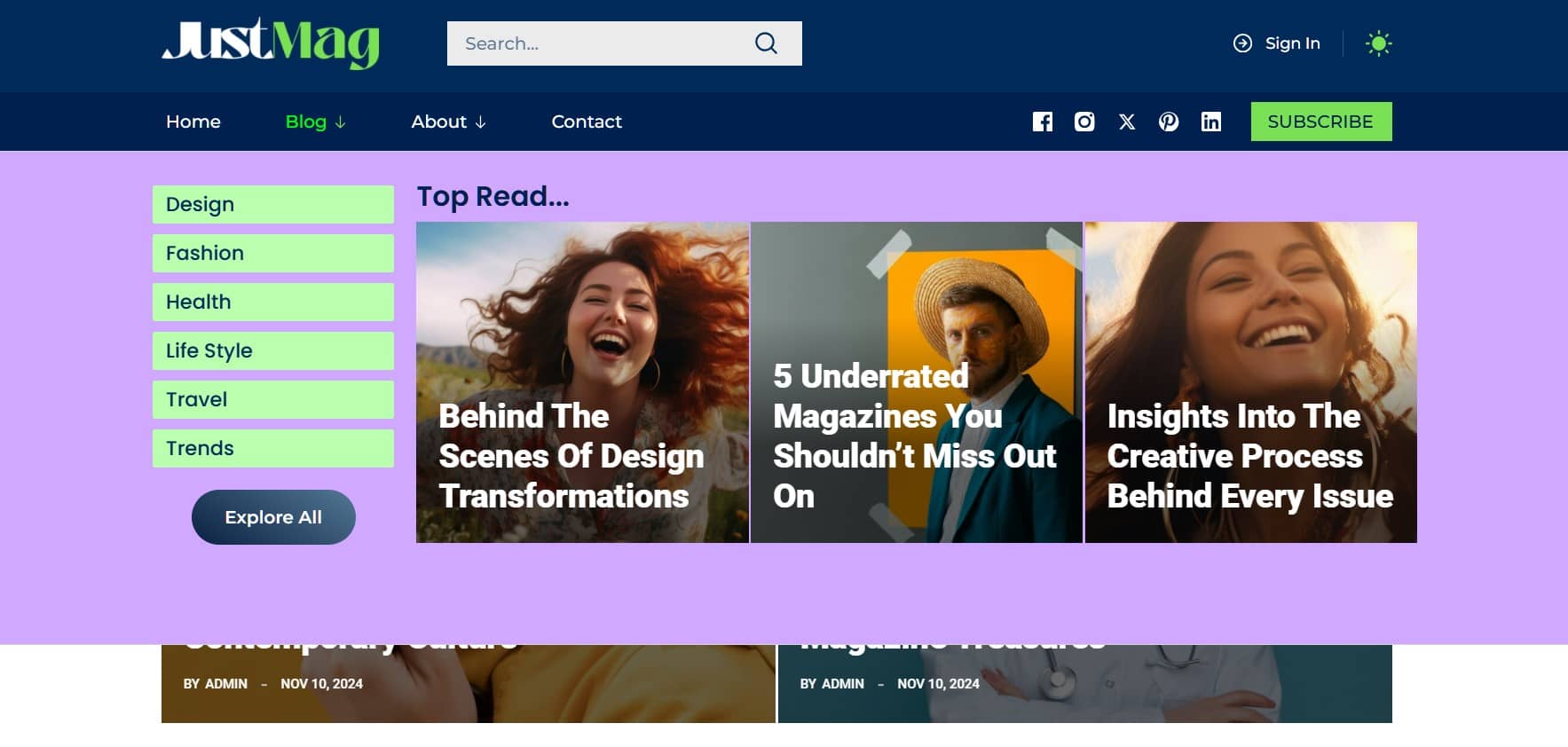
Adding the Menu Block
The first step to adding a Mega Menu is to set up a Menu Block. This block is where you’ll manage all your navigation items. Here’s how to do it:
- Log in to your WordPress dashboard and go to PostX > Site Builder > Header.
- Look for the Menu Block and add it to the desired position in your header.
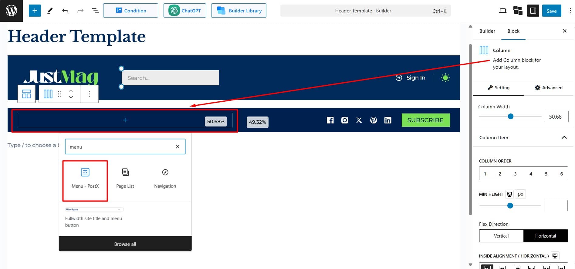
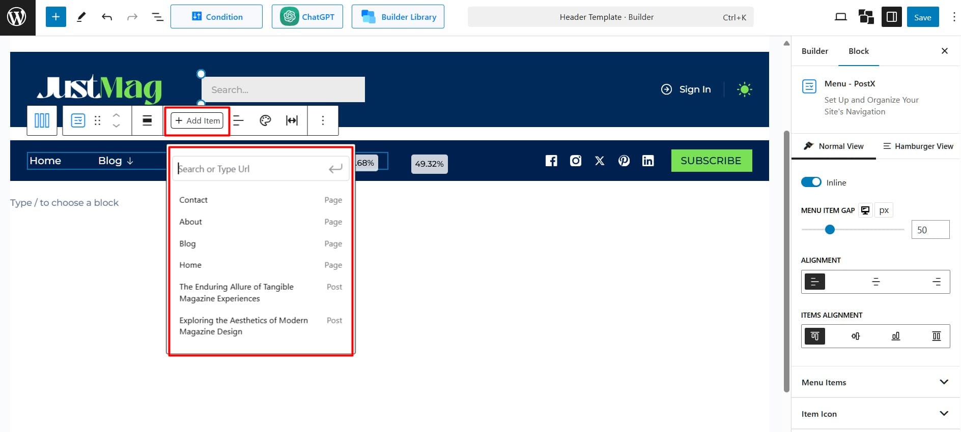
Available pages like Home, About, and Contact will be automatically added. For customization
- Click “+ Add Item” to add pages, categories, or custom links.
- Drag and drop the items to reorder them.
Adding a Mega Menu to the Desired Menu Item
Now that your basic menu structure is in place, it’s time to create a Mega Menu. Here’s how:
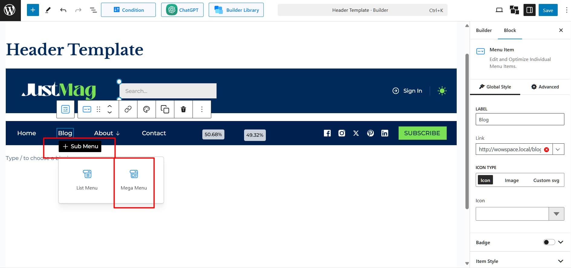
- From the menu block, select the item to which you want to add the Mega Menu.
- Click the ‘+ Sub Menu’ under the selected menu item.
- Select Mega Menu from the list of available submenu types.
Adding Necessary Content Blocks to the Mega Menu
After adding the Mega Menu, add content blocks to display various sections inside it.
Start by adding a row and defining the number of columns to organize your layout. You can adjust the columns later if needed. Then, follow these steps:
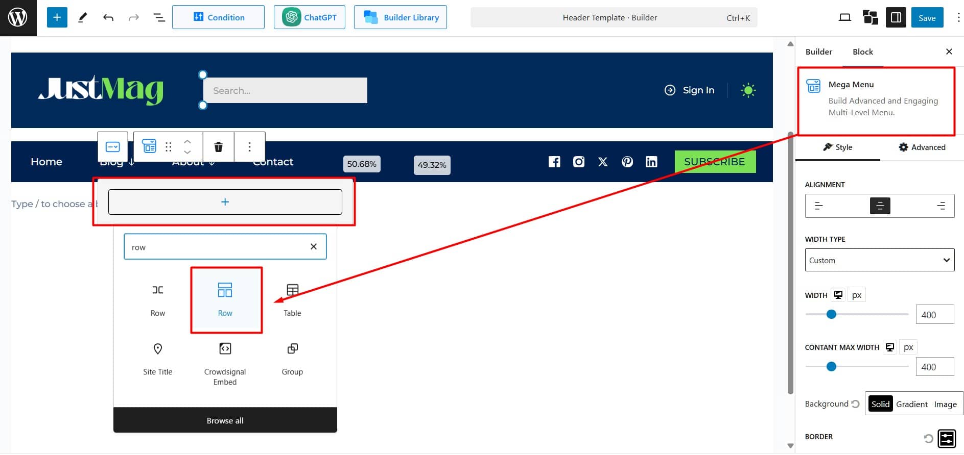
Add Blocks
Choose blocks based on the content you want to display on your Mega Menu. You can select any PostX block, such as Post Grid, Post List, Post Module, Post Slider, Taxonomy, Heading, Image, List, or Button. Additionally, default Gutenberg blocks can also be added.
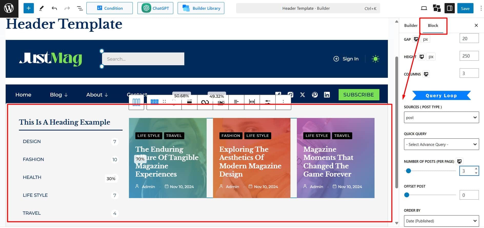
Customize and Design Individual Blocks
Each block has its own settings. Add content to each block and arrange them to create a clean layout. Adjust the design to ensure all blocks align seamlessly on the mega menu canvas.
For more details on each block, check All Blocks – WPXPO
Customizing Mega Menu’s Visuals
After adding the necessary blocks, the final step is to customize the Mega Menu’s appearance to align with your brand’s visual identity.
Alignment: Align your content to the left, center, or right.
Width Type: Controls the width of the content container. There are three options available:
- Window Width: Spans the entire browser width.
- Custom Width: Set a specific width.
- Parent Menu Width: Matches the width of the parent menu.
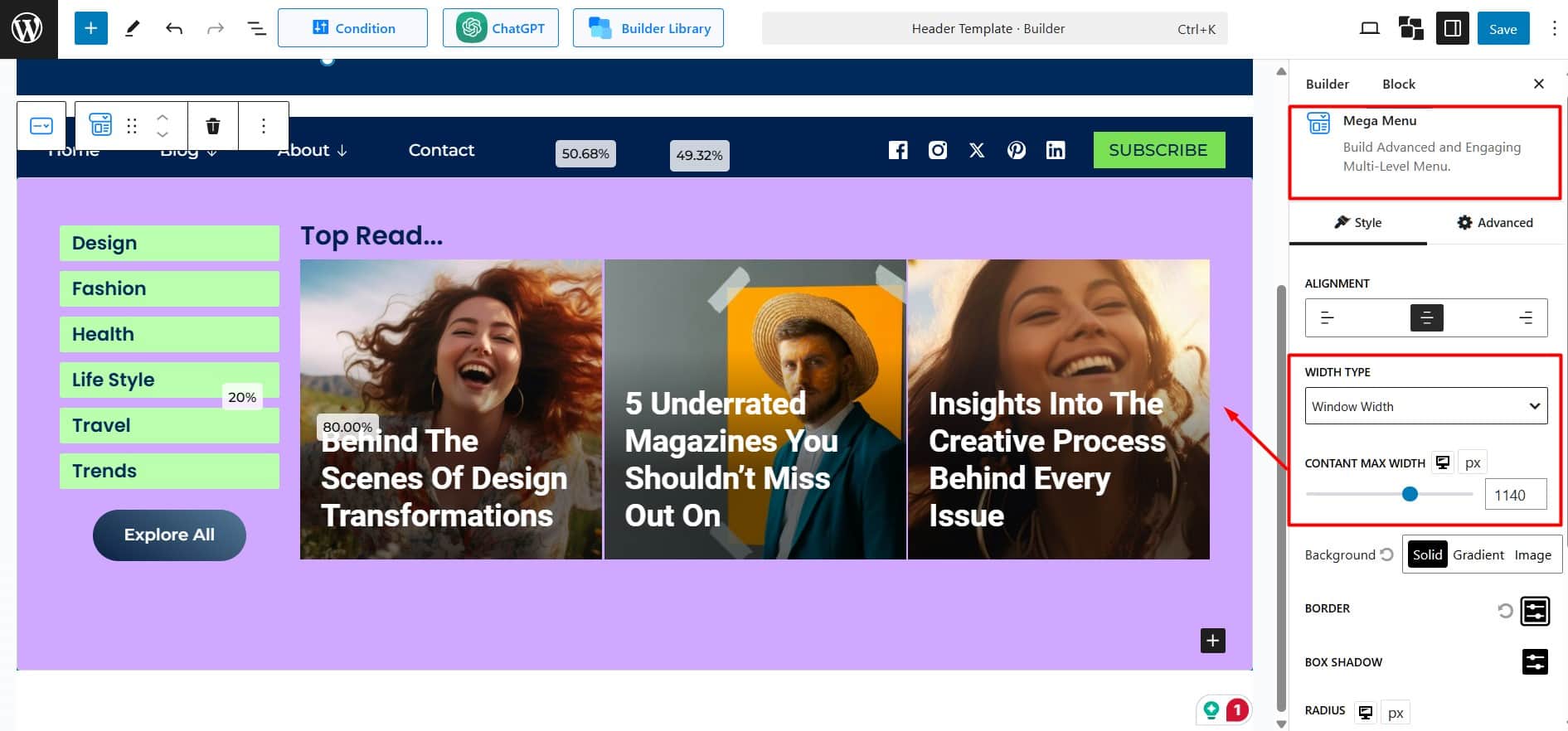
Content Max Width: Define the maximum width for your content, with a default limit of 1800px.
Tips: To create a full-width mega menu, select “Window Width” as the width type and set the Content Max Width to your need.
Background: Choose a background style:
- Solid: Select a single, solid color for the background.
- Gradient: Apply a gradient effect with customizable colors and directions.
- Image: Use an image as the background.
Border: Add a border around your section. Customize the thickness, style (solid, dashed, etc.), and color can be customized.
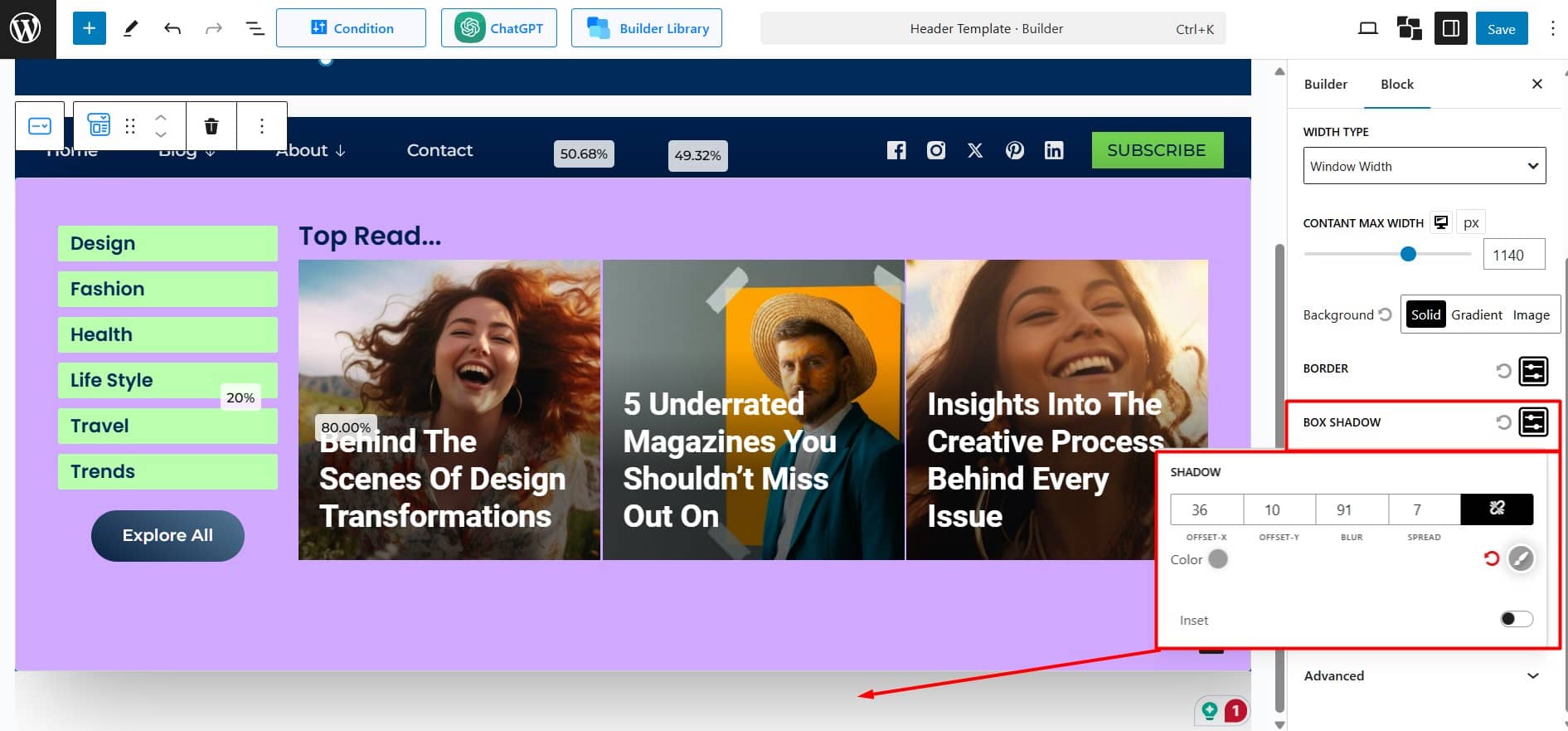
Box Shadow: Add shadows around your section. Adjust size, blur, and color.
Radius: Round the corners of your section. Set individual values for Top, Right, Bottom, and Left, or use the link icon for uniform rounding.
Padding: Adjusts the inner spacing between the content and the container’s edges.
You’ve successfully added and customized your Mega Menu with PostX!
Be sure to test the menu thoroughly for usability before going live on your site.
