The PostX Gallery Block allows you to display a collection of images in a fully responsive and customizable layout. You can create Grid, Masonry, or Tiled galleries, and add features like filters, a “load more” button, and lightbox popups.
All settings are organized into three main tabs: Settings, Style, and Advanced.
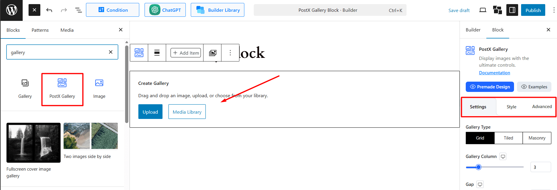
How to Use the Settings Tab
This tab controls the layout, content, and functionality of your gallery.
General Settings
These are the main layout controls at the top of the Settings tab.
Gallery Type: Choose the layout for your images.
- Grid: A standard, uniform grid.
- Tiled: A “collage” style layout.
- Masonry: A layout with fixed-width columns and variable-height images.
Gallery Column: Set the number of columns for your gallery (for Grid and Masonry).
Gap: Control the space (in px) between each image.
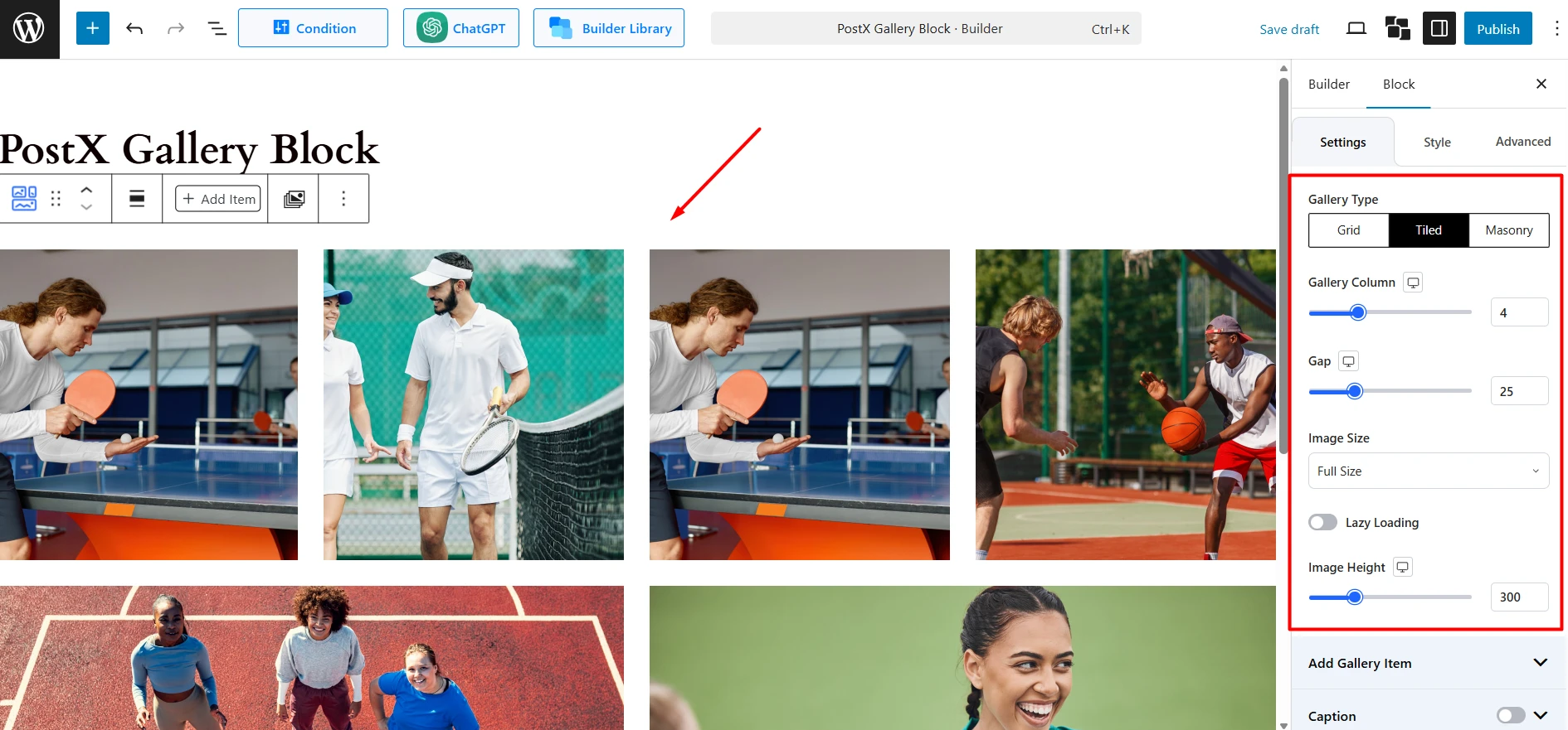
Image Size: Select the image resolution to display (e.g., Full Size, Large, Thumbnail).
Lazy Loading: Toggle to load images only as they scroll into view, improving page speed.
Image Height: Set a fixed height for images, which is useful for creating uniform grids, and Tiled. This option is not required and shown if you select Masonry.
Add Gallery Item
Add Media: Click this button to open the WordPress Media Library and select the images you want to add to the gallery.
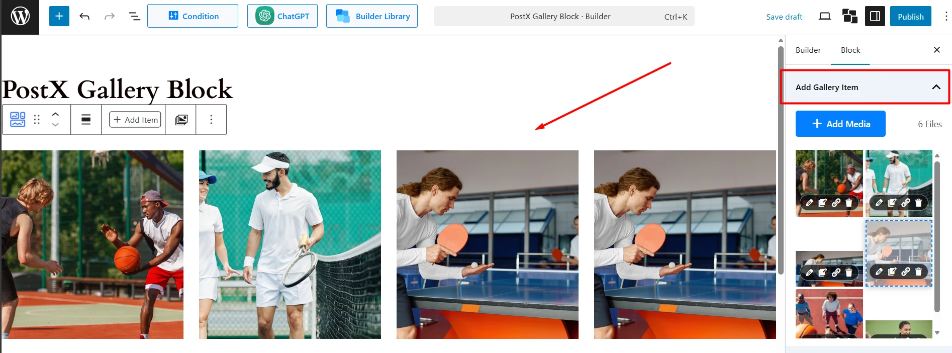
Image List: Once added, images appear in a list. You can drag and drop to reorder them. Each image has a toolbar with four icons:
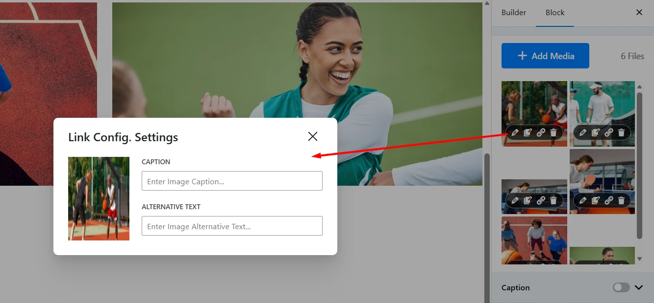
Edit Caption (Pencil Icon): This opens a popup (titled “Link Config. Settings”) where you can add or edit text for the image:
- Caption: Enter the caption text for this specific image.
- Alternative Text: Enter the alt text for this image (important for accessibility and SEO).
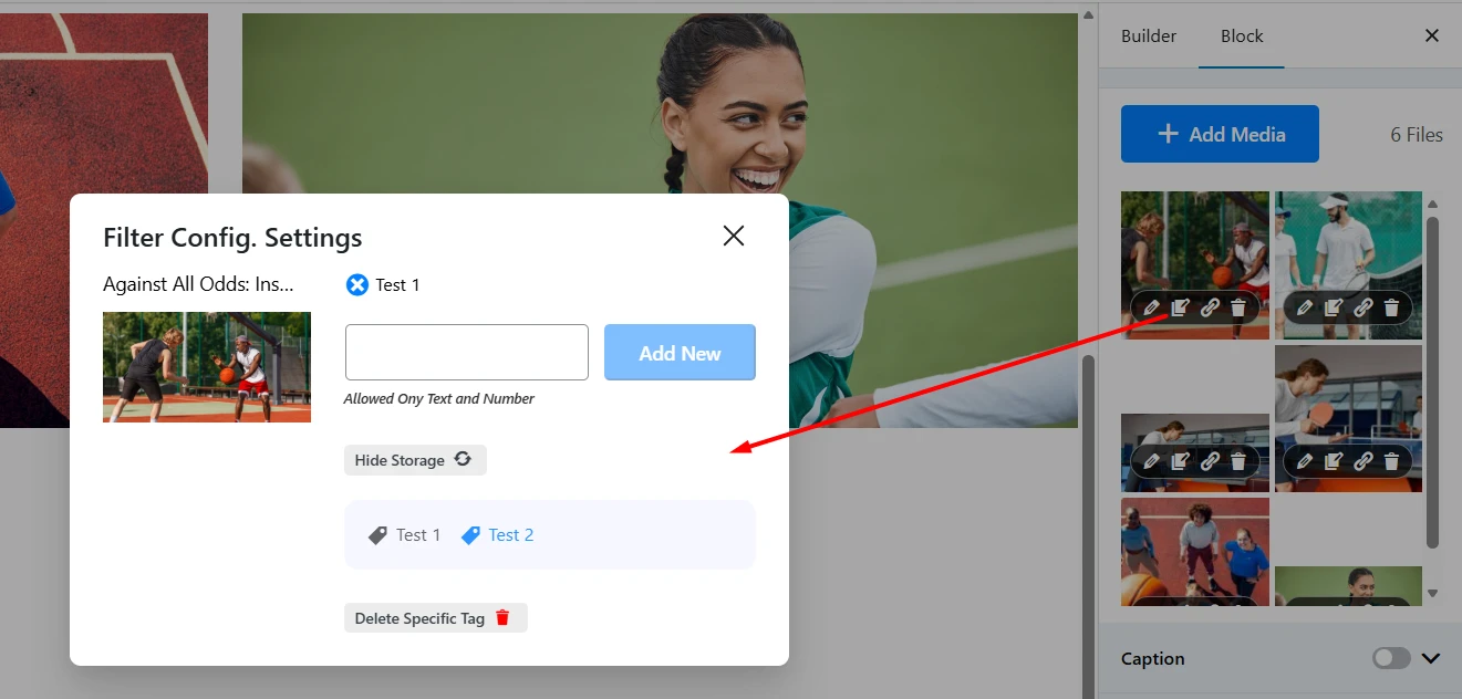
Edit Filter (Tag Icon): This opens the “Filter Config. Settings” popup. This is where you assign categories to the image, which are used by the Filter (Pro) feature.
- Add New Tag: Type a category name (e.g., “Test 4”) into the text field and click “Add New” to create and assign it to the image.
- Tag Storage: You can click “Get from Tag storage” to see a list of all tags you’ve already created. You can click any tag in this list to assign it. Click “Hide Storage” to hide the list.
- Manage Tags: Assigned tags appear at the top. You can click the “x” on an assigned tag to remove it from the image. You can also “Delete Specific Tag” from the storage entirely.
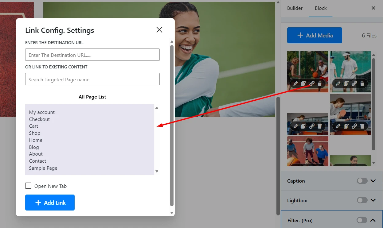
Edit Link (Link Icon): This opens the “Link Config. Settings” popup, which allows you to make the individual image a clickable link.
- Enter The Destination URL: Paste an external or internal URL.
- Or Link to Existing Content: Search for an existing page or post on your site and select it from the list below.
- Open New Tab: Check this box to have the link open in a new browser tab.
- Click “Add Link” to save.
Delete (Trash Icon): Click this to remove the image from the gallery.
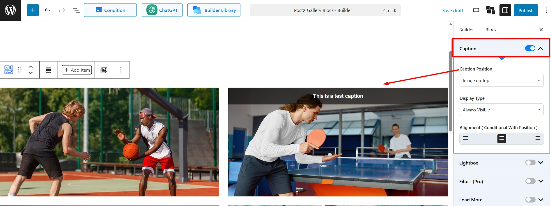
Caption
First, toggle this on to display image captions.
Caption Position: Choose where the caption appears (e.g., Image on Bottom).
Display Type: Make the caption Always Visible or Show on Hover.
Alignment: Align the caption text (Left, Center, Right).
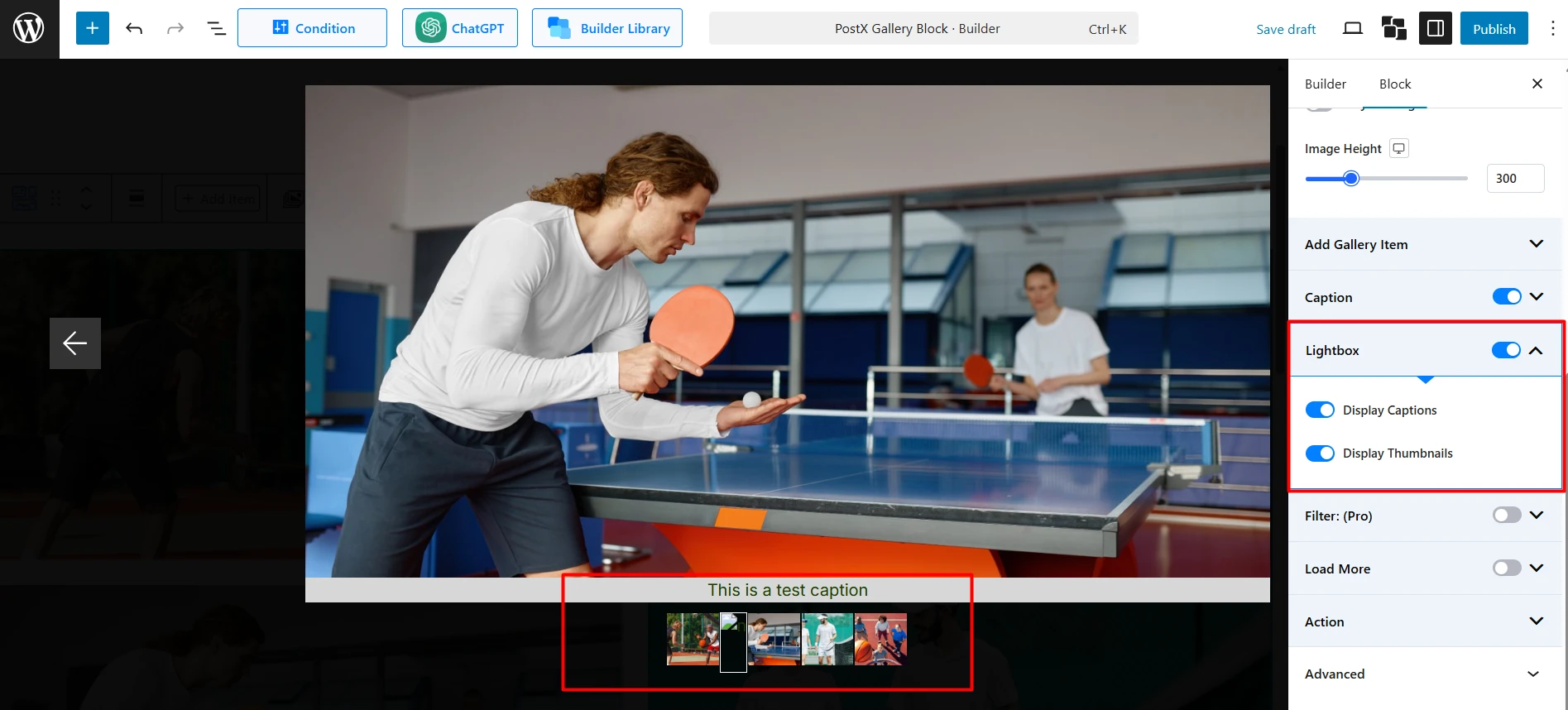
Lightbox
Toggle on to allow users to click an image to see a full-size version in a popup.
Display Captions: Show the image caption inside the lightbox.
Display Thumbnails: Show a gallery of thumbnails below the lightbox for easy navigation.
Filter (Pro)
Toggle on to display a filterable menu above your gallery. (You must add filter categories to your images via the “Edit” icon in the “Add Gallery Item” section).
Enable “All”: Show a button that displays all image categories.
“All” Text: Customize the text for the “All” button.
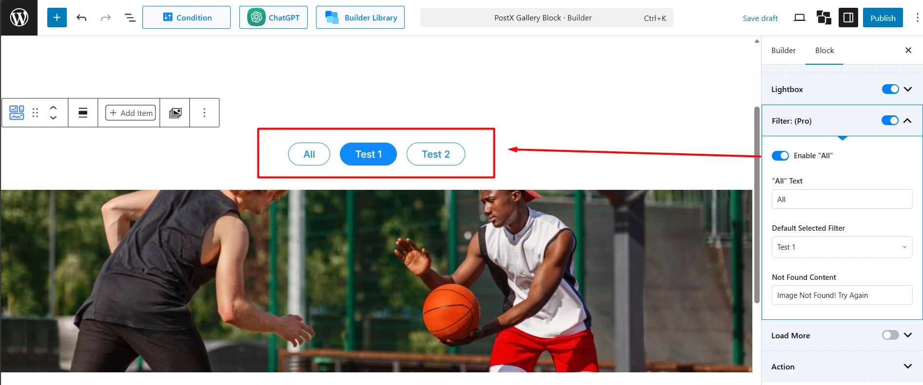
Default Selected Filter: Choose which category is active by default when the page loads.
Not Found Content: Set the message to display if no images match a filter.
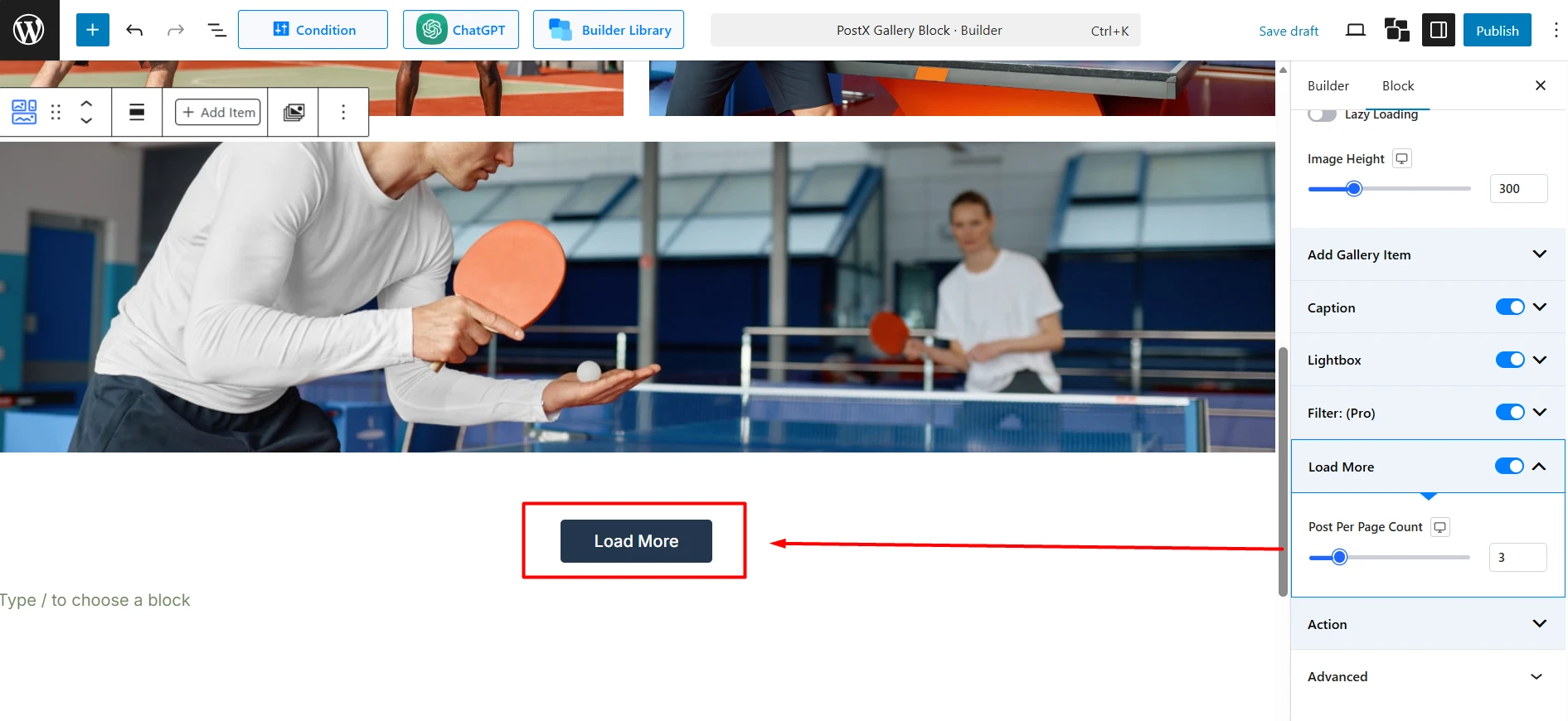
Load More
Toggle on to add a “Load More” button, which is useful for large galleries.
Item Per Page Count: Set the number of images to display initially and how many to load with each click.
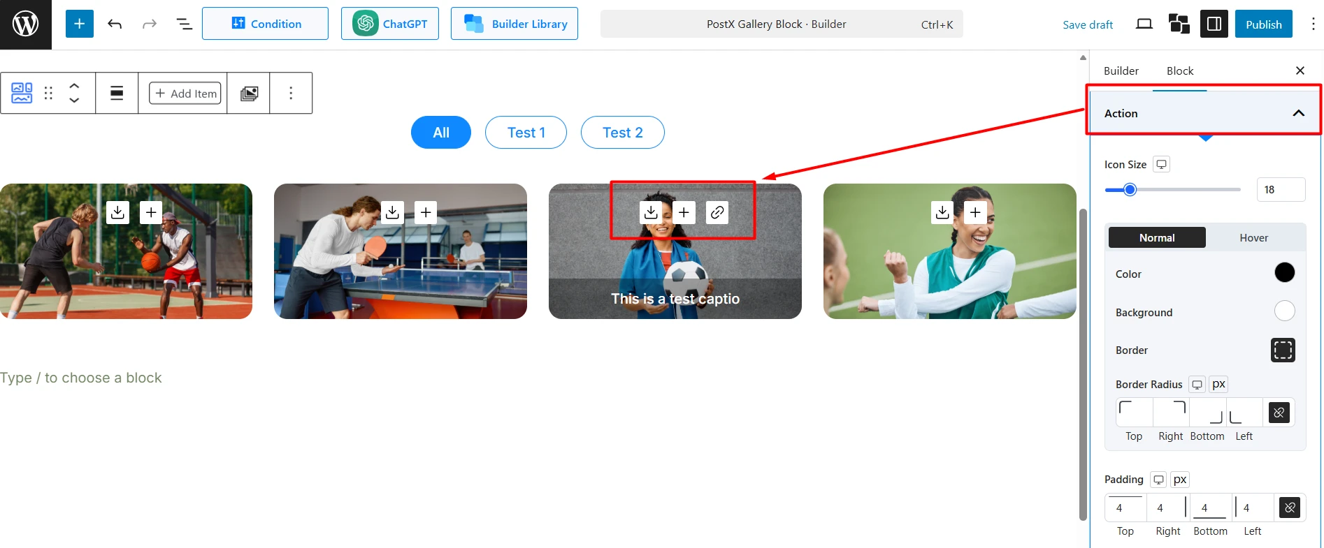
Action
This section controls the icons that appear over your gallery images (e.g., link, lightbox, download).
Enable Link: Show an icon for the custom link (set in “Add Gallery Item”).
Enable Light Box: Show a lightbox icon (requires the main Lightbox setting to be on).
Enable Download: Show a download icon.
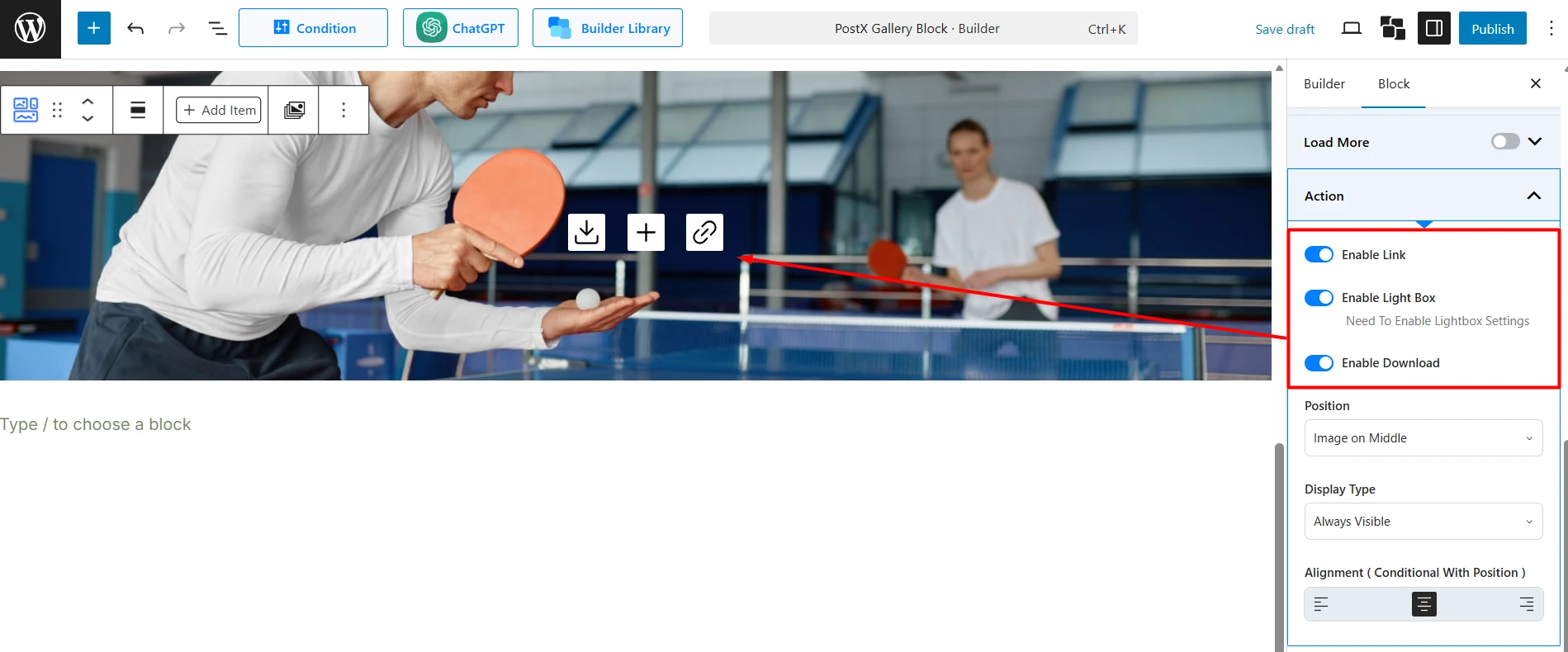
Position: Choose where the icons appear on the image (e.g., Image on Top, Center).
Display Type: Make the icons Always Visible or Show on Hover.
Alignment: Align the icons (Left, Center, Right).
How to Use the Style Tab
This tab controls the visual design of your gallery elements.
Images
Image Hover: Apply an animation to the image when a user hovers over it. There are 7 animation types to choose from, including: Zoom In, Zoom Out, Opacity, Rotate Left, Rotate Right, Slide Left, and Slide Right.
Image Effect: Apply a persistent filter effect to the image. There are 8 effect types to choose from, including: Grayscale, Sepia, Saturate, Opacity, Vintage, Earlybird, Toaster, and Myfair.
Image Hover: Apply an animation to the image when a user hovers over it.
Image Effect: Apply an effect like Grayscale or Sepia.
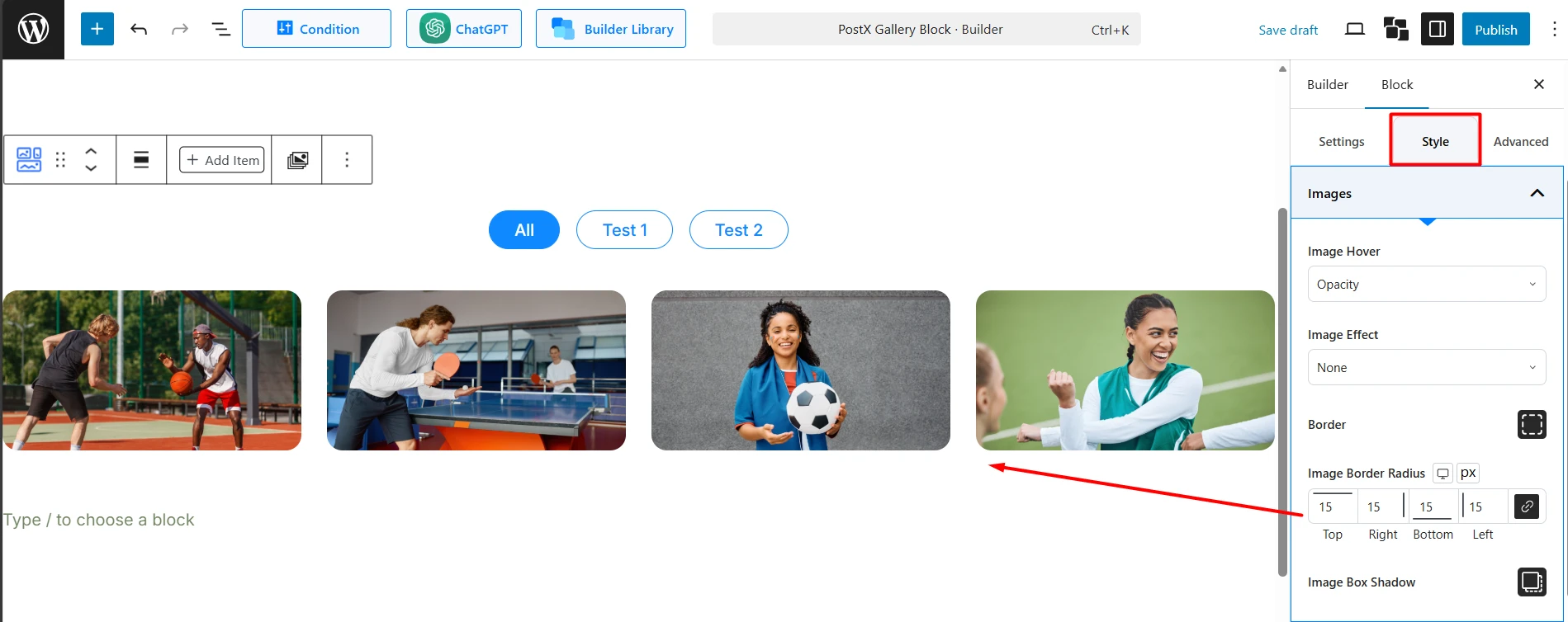
Border: Set a border for the images.
Image Border Radius: Create rounded corners for the images.
Image Box Shadow: Add a shadow effect to the image container.
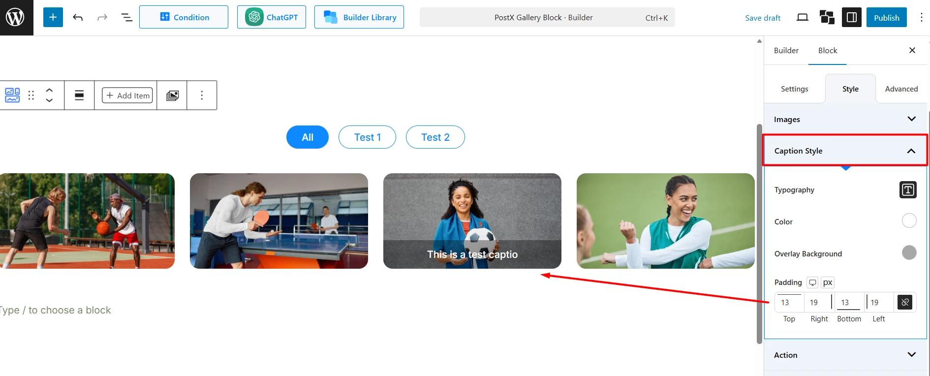
Caption Style
Typography: Control the font settings for the caption text.
Color: Set the caption text color.
Overlay Background: If the caption is positioned over the image, you can set a background color or gradient for readability.
Padding: Adjust the spacing inside the caption area.
Action
This section styles the action icons you enabled in the Settings tab.
Icon Size: Control the size of the action icons.
Normal / Hover: Set the Color, Background, Border, and Border Radius for the icons in their normal and hover states.
Padding & Margin: Control the spacing inside and outside the icons.
Spacing Between: Adjust the gap between multiple action icons.
Load More
This section styles the “Load More” button.
Typography: Control the font settings for the button text.
Normal / Hover: Set the Color, Background, Border, and Border Radius for the button.
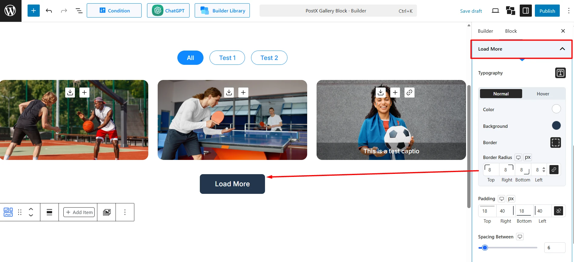
Padding: Adjust the spacing inside the button.
Spacing Between: Control the space between the gallery and the “Load More” button.
Filter (Pro) Style
This section styles the filter navigation buttons.
Typography: Control the font settings for the filter text.
Normal / Hover: Set the Color, Background, Border, Border Radius, and Box Shadow for the filter buttons in their normal and active/hover states.
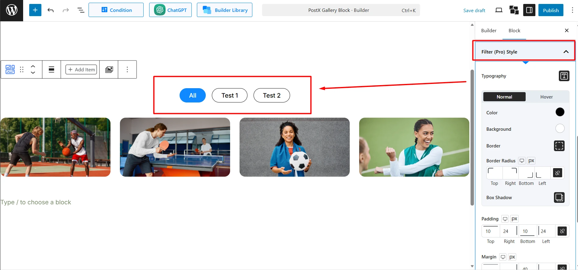
Padding & Margin: Control the spacing inside and outside each filter button.
Gap: Set the space between the filter buttons.
Alignment: Align the entire filter bar (Left, Center, Right).
How to Use the Advanced Tab
This tab contains standard block controls for deeper customization.
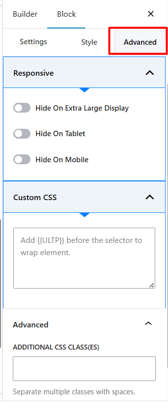
Responsive: Hide the entire gallery block on specific devices (Extra Large Display, Tablet, Mobile).
Custom CSS: Add your own CSS code to style the block.
Advanced: Add one or more ADDITIONAL CSS CLASS(ES) to the block’s wrapper for custom styling.