The accordion block is the newest addition to the PostX blocks library. It helps you share content vertically, with collapsible dropdowns for better access on your site.
Here’s how it works:
How to Use the Accordion Block [from the Block Library]
To use the accordion block on a page of your site, you need to:
- Go to the page and click on the “+” icon
- Search for the “Accordion” block
- Drag it to the page
Or, you can simply use a “\” backslash and type ‘Accordion’ to bring that block to the page. You’re now ready to use the block.
Accordion Block Settings
Pre-made patterns
The PostX Accordion block comes with a couple of pre-made design patterns. You can simply import the design you like and use it on your page. You can preview the block designs as well.
Accordion Block Setup
Here are the things you can do to set up the accordion block:
The accordion will be collapsed initially if you enable auto-collapse. You can also select which accordion section will be collapsed initially from the “initially opened accordion” dropdown.
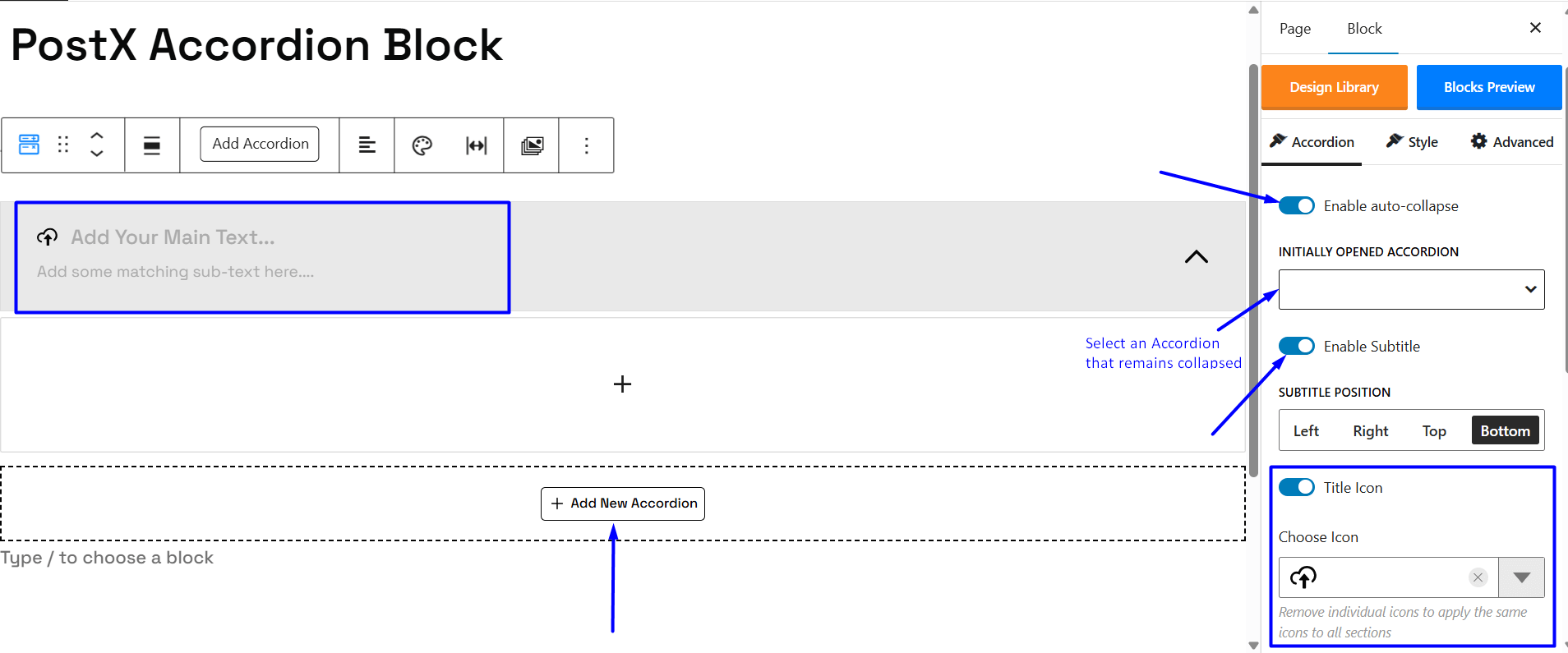
You can enable subtitle for the accordion block as well. You can even choose the positioning of the subtitle.
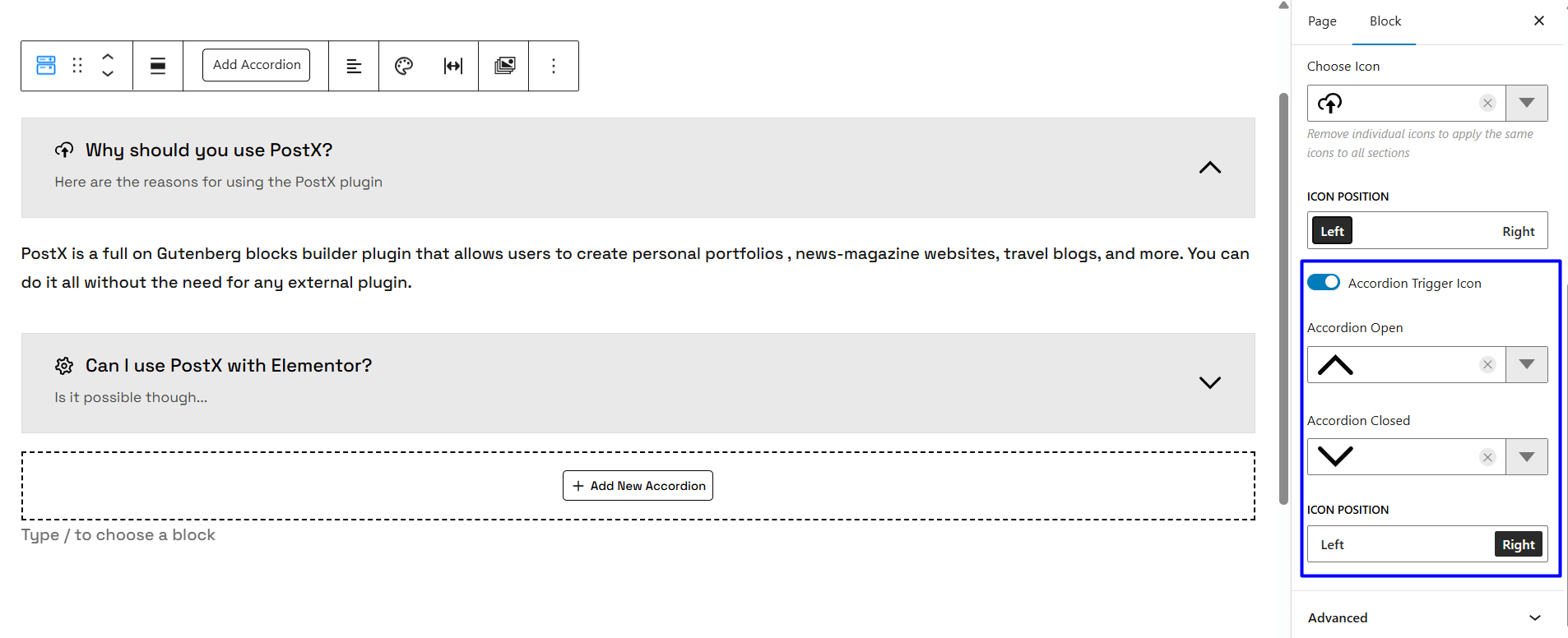
Furthermore, you can select the icons for the individual accordion sections. Once you set the “Title Icon” you can select the icon you want to show for the main text/heading text. Remember, you can set the title icon for the individual accordion sections.
The Accordion Trigger Icon is simply the icons that get triggered when the accordion opens or closes. You can enable or disable them and set the ‘open’ and ‘close’ icons. You can change the positioning of the icons as well.
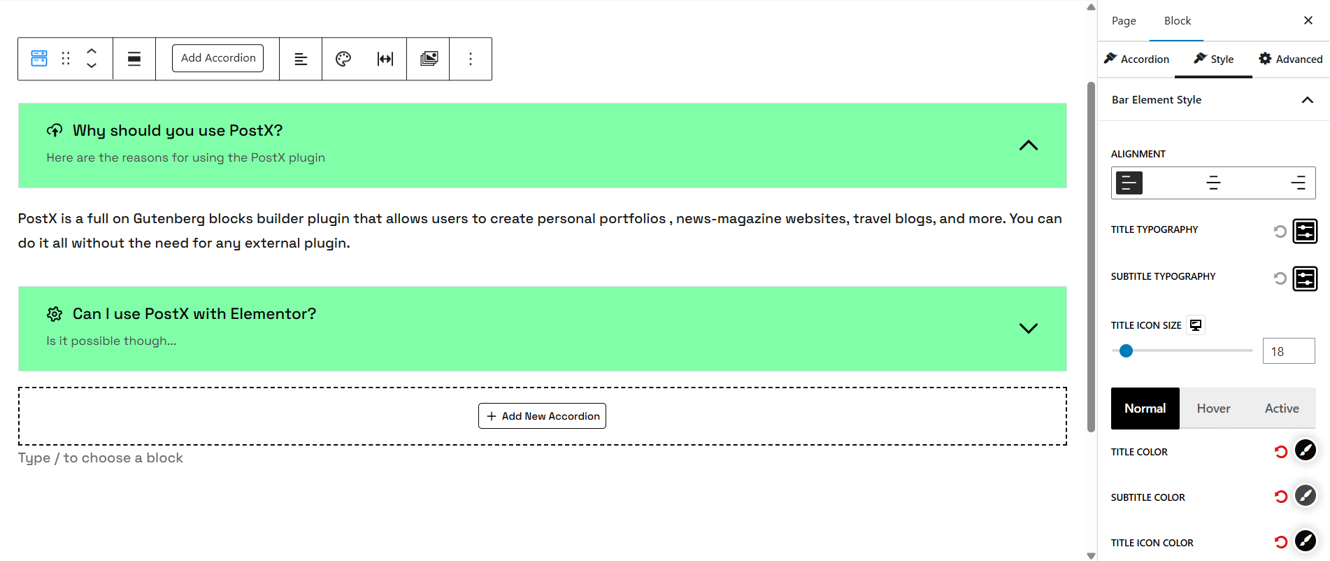
Style Settings
You can change the style of elements in the accordion bar. You can change the typography, alignment, color, and even the icon size for the accordion bar elements.
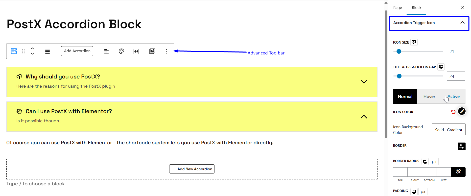
The Accordion Trigger Icon lets you change the icon size, color, border, border radius, padding, and even the title and icon gap.
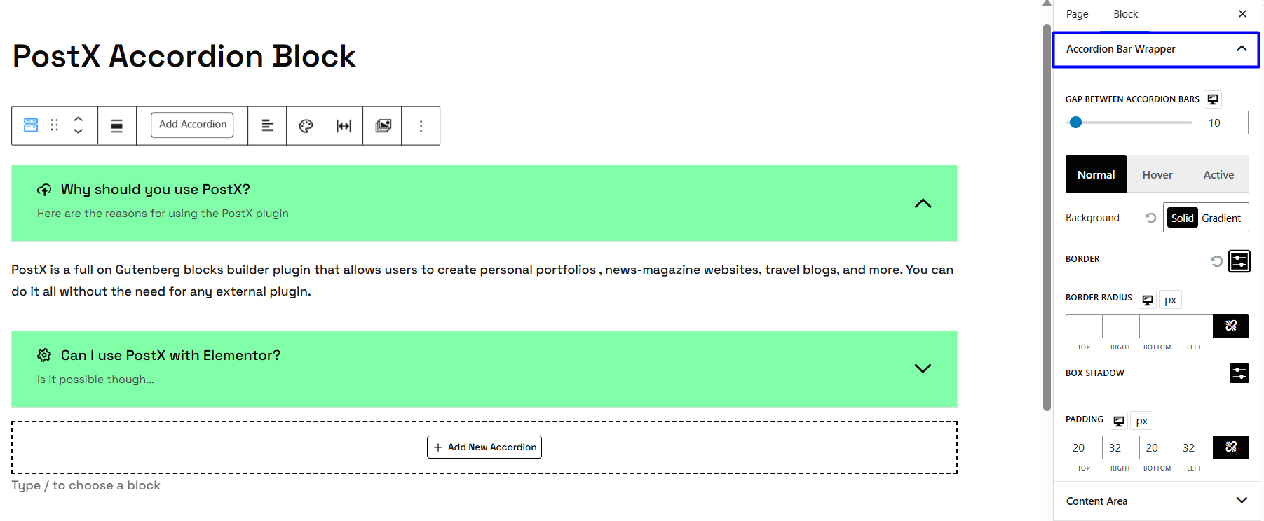
Then there’s the accordion bar wrapper. This setting allows you change the accordion bar colors, the gap between accordion bars, and more.
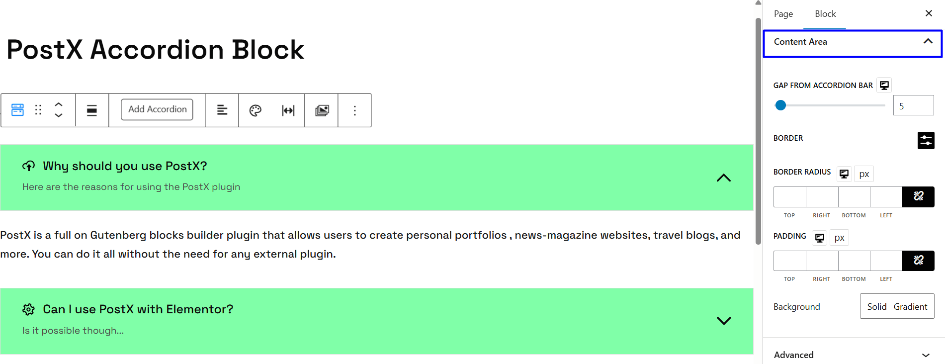
You can change the style of the content area as well. There are different styles you can work with – it’s highlighted in the image below.
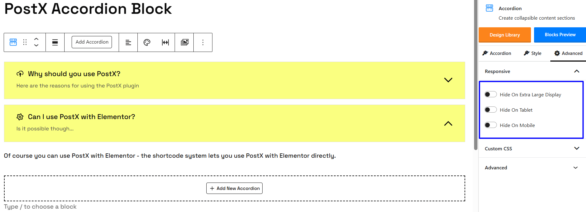
Responsiveness
Device responsiveness settings can be accessed from the advanced tab. You can change the device responsiveness from this section:
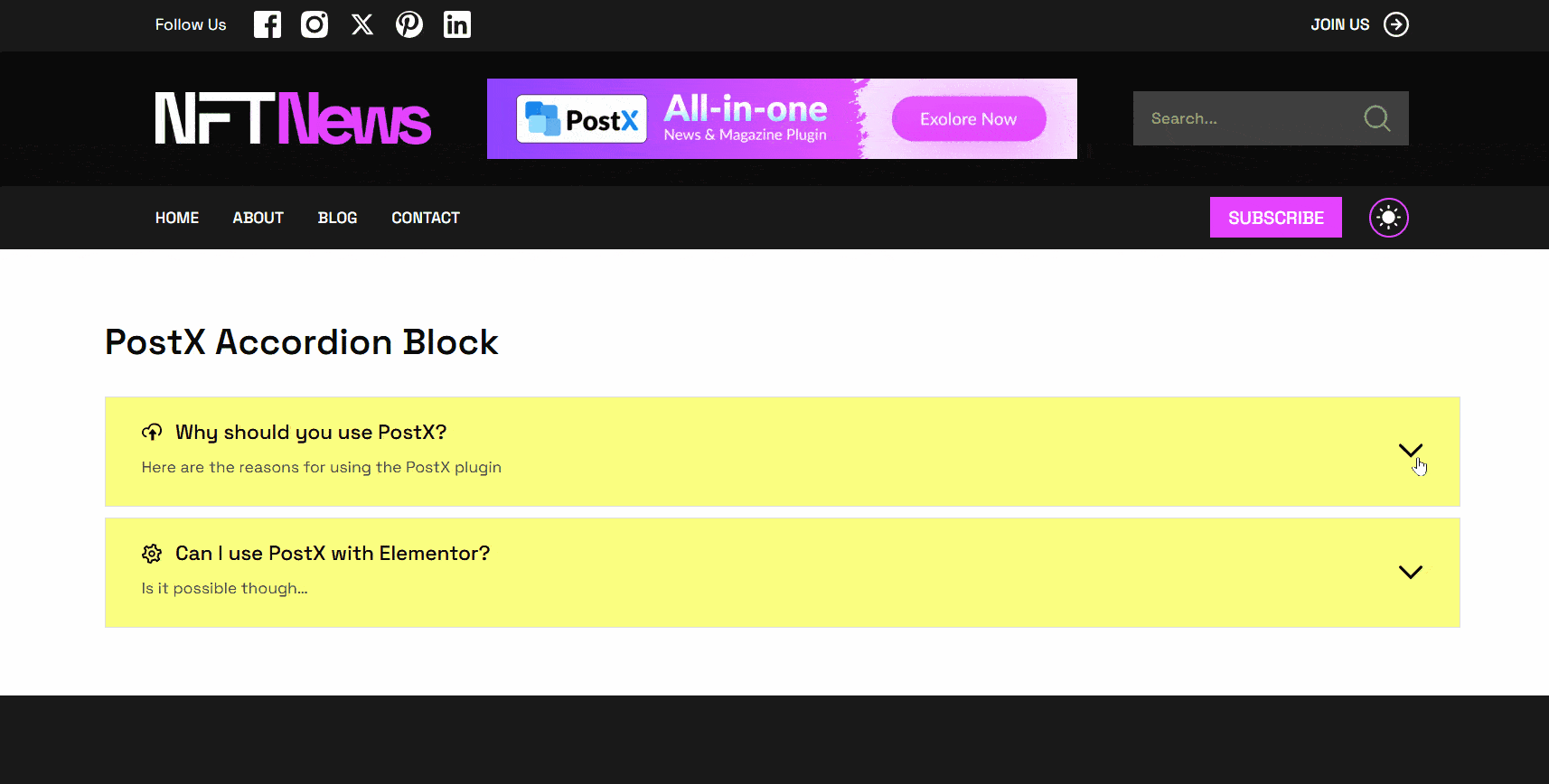
Here’s the frontend view:
Please note that there are Advanced CSS class settings – meaning you can use custom CSS with the accordion block.