The Tabs Block allows you to organize your content into a clean, tabbed interface. This helps save space and makes it easy for users to find information by separating it into logical sections.
To get started, add the Tabs Block from the WordPress block inserter. You will find all customization options in the block settings sidebar, which is divided into two main categories: Layout and Advanced.
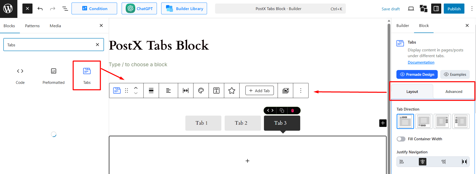
How to Use the Layout Settings
This tab controls the core functionality and styling of your tabs. It is broken down into several sections. Let’s explore each section one-by-one.
General Layout
These are the primary controls for the tab structure and behavior:
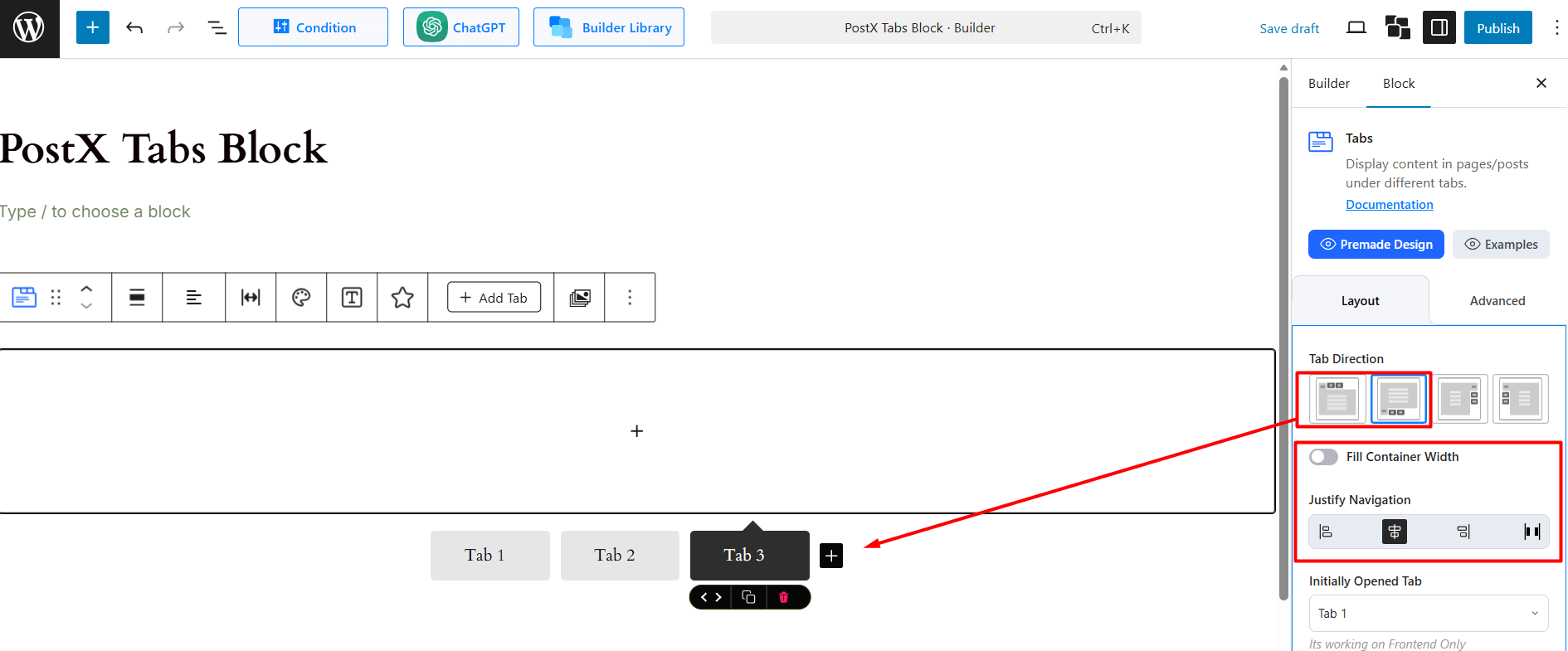
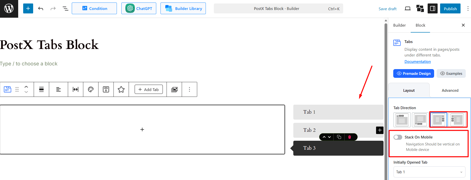
Tab Direction: Choose the orientation of your tabs.
- Horizontal: Top (default) or Bottom.
- Vertical: Left or Right.
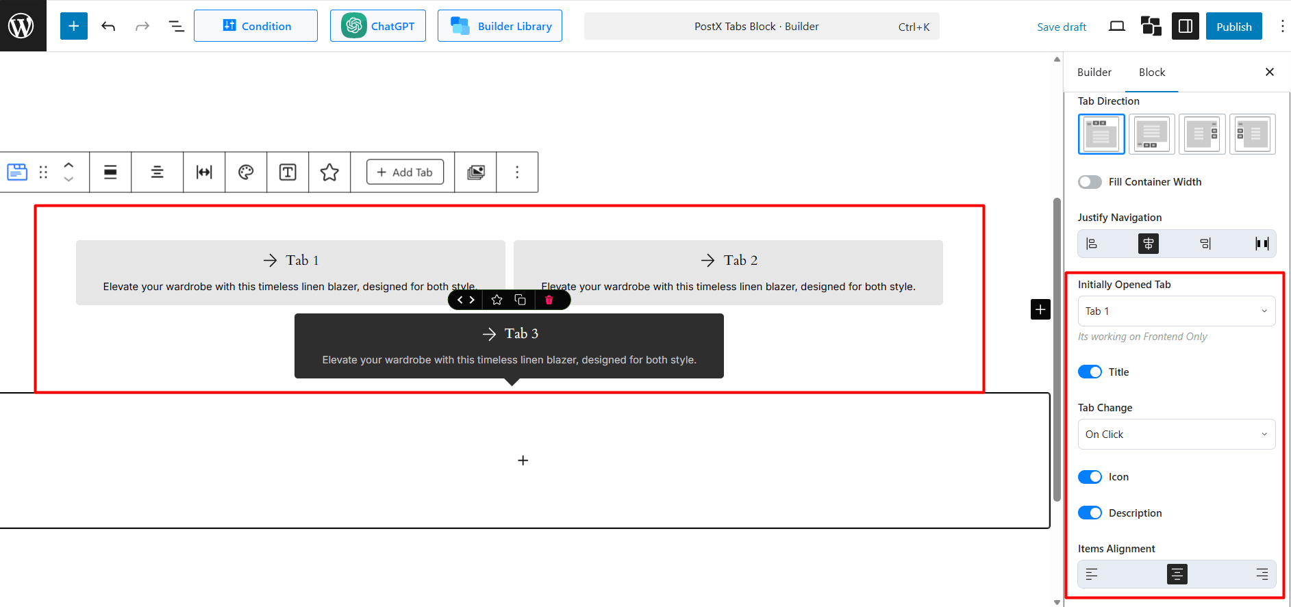
Fill Container Width: (Available for horizontal tabs only) Toggle on to make the tab navigation bar span the full width of its container.
Justify Navigation: (Available for horizontal tabs only) Align the tab buttons. Options include Left, Center, Right, and Justified (distributed evenly).
Initially Opened Tab: Select which tab (e.g., “Test Tab 3”) you want to be open by default when the page loads. Note: This setting’s preview is only visible on the frontend of your site.
Title: Toggle the main tab text on or off.
Tab Change: Choose the action that switches tabs: On Click or On Hover.
Icon: Toggle to enable an icon next to the tab title.
Description: Toggle to enable a short description under the tab title.
Items Alignment: If you use a combination of Title, Icon, and Description, use this to align them inside the tab button (Left, Center, or Right).
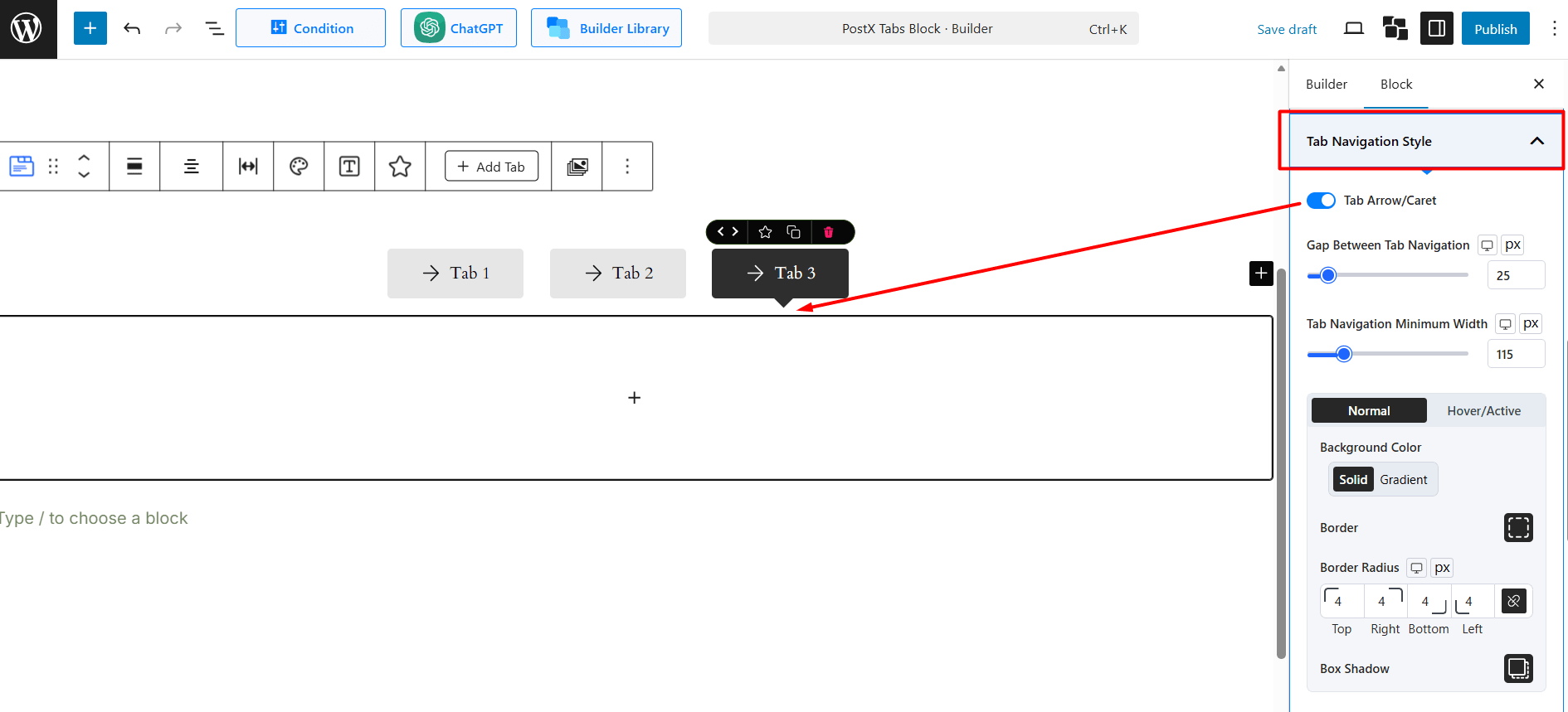
Tab Navigation Style
This section styles the individual tab buttons (the navigation items you click on).
- Tab Arrow/Caret: Toggle on to show a small arrow or caret on the active tab.
- Gap Between Tab Navigation: Sets the space (in px) between each tab button.
- Tab Navigation Minimum Width: Sets a minimum width for each tab button.
Normal vs. Hover/Active:
- Background Color: Set a solid or gradient background for tabs in their normal state and when hovered or active.
- Border: Add a custom border.
- Border Radius: Adjust to create rounded corners for the tab buttons.
- Box Shadow: Apply a shadow effect.
- Padding: Controls the space inside the tab buttons, around the text/icon.
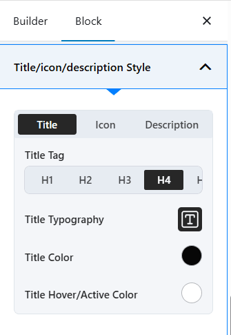
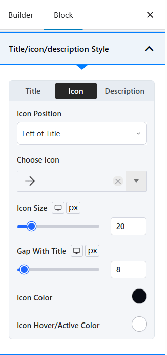
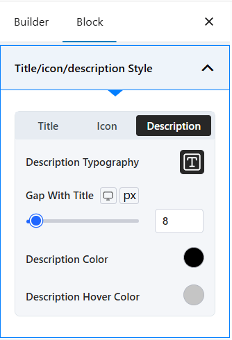
Title/Icon/Description Style
This section styles the content inside the tab buttons. This settings panel is context aware. You will see separate tabs for Title, Icon, and Description based on which toggles you enabled in the General Layout section.
Title: (Always visible if the main “Title” toggle is on)
- Title Tag: Set the HTML tag for the title (H1-H4) for SEO and structure.
- Title Typography: Access full typography controls (font family, size, weight, etc.).
- Title Color: Set the text color for the title in its Normal state.
- Title Hover/Active Color: Set the text color for when the tab is hovered over or active.
Icon: (This tab appears only if you enable the “Icon” toggle)
- Icon Position: Place the icon relative to the title (e.g., Left of Title, Right of Title).
- Choose Icon: Select an icon from the library.
- Icon Size: Control the size of the icon in pixels.
- Gap With Title: Adjust the space between the icon and the tab title.
- Icon Color: Set the icon’s color for the Normal state.
- Icon Hover/Active Color: Set the icon’s color for the Hover/Active state.
Description: (This tab appears only if you enable the “Description” toggle)
- Description Typography: Access full typography controls for the description text.
- Gap With Title: Adjust the space between the description and the tab title.
- Description Color: Set the text color for the description.
- Description Hover Color: Set the text color for the description when the tab is hovered.
Tab Content/Body
This section styles the content area that appears when a tab is selected.
Gap From Tab Menu: Controls the vertical or horizontal space between the tab navigation bar and the content area.
Tab Content Minimum Height: Set a minimum height (in px) for the content area to maintain a consistent look, even if one tab has less content.
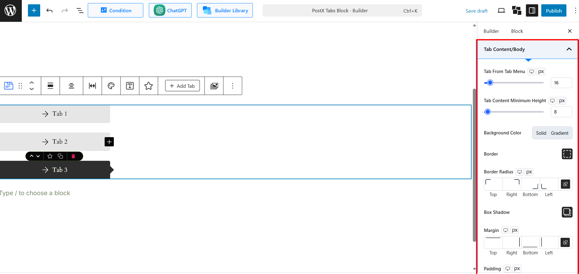
Styling Options:
- Background Color: Set a solid or gradient background for the content box.
- Border: Add a border to the content area.
- Border Radius: Create rounded corners for the content box.
- Box Shadow: Apply a shadow effect to the content box.
- Margin & Padding: Adjust the spacing outside (margin) and inside (padding) the content area.
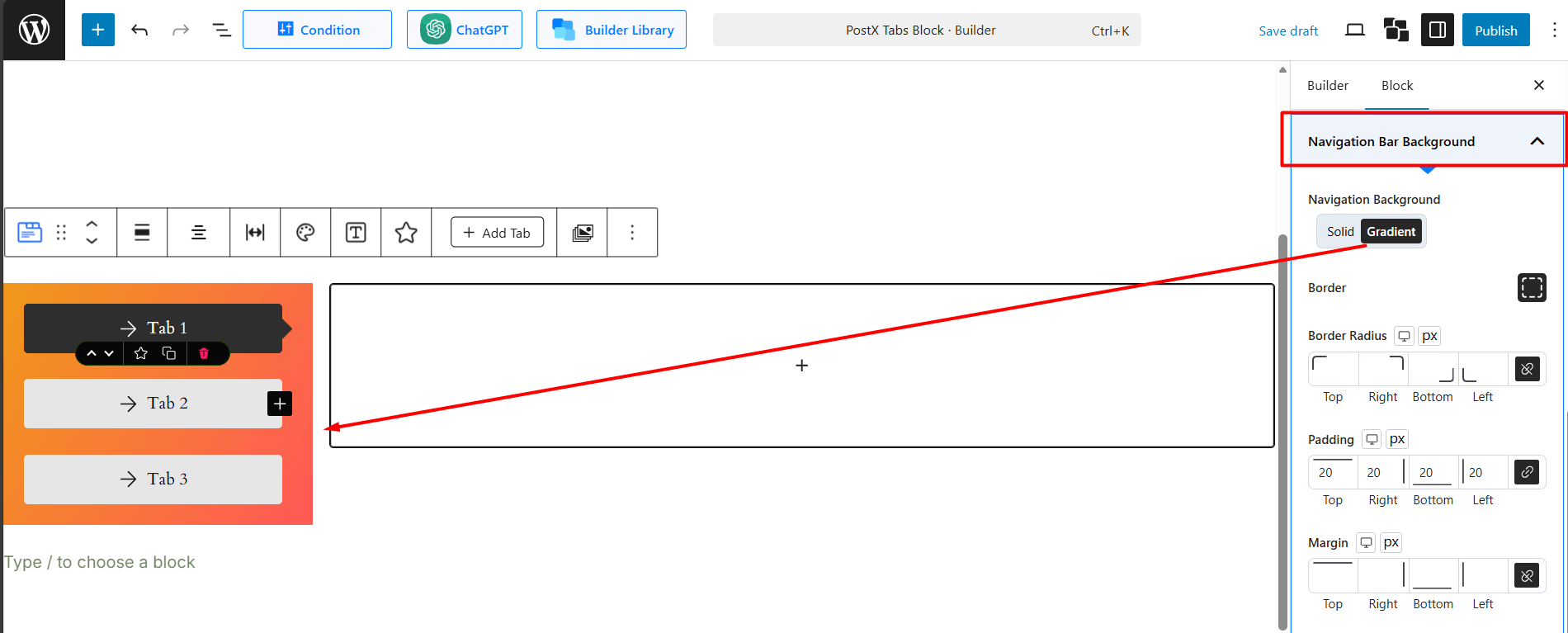
Navigation Bar Background
This section styles the entire container that holds all the tab buttons.
Navigation Background: Set a solid or gradient background for the whole navigation bar.
Border, Border Radius, Padding, Margin: Apply spacing and border styles to the navigation bar as a whole.
Tab Responsive
This section controls how your tabs adapt to smaller screens, like tablets and mobile phones.
Responsive Style: This dropdown menu lets you choose how the tabs will behave on mobile devices.
- Normal: The tabs will try to stay in their original layout, which may cause overflow.
- Slider: The tabs will transform into a horizontal slider, allowing users to swipe through them.
- Accordion: The tabs will convert into a vertical accordion, where clicking a title expands the content below it.
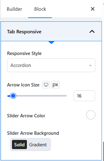
Arrow/Slider Settings: If you select the Slider style, further options will appear to customize the navigation arrows.
- Arrow Icon Size: (As seen in the previous image) Adjust the size of the slider arrows.
- Slider Arrow Color: Pick a color for the slider navigation arrows.
- Slider Arrow Background: Set a solid or gradient background for the arrows.
How to Use the Advanced Settings
This tab contains standard PostX block settings for more granular control.
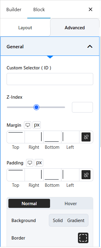
General Settings
- Custom Selector (ID): Assign a unique CSS ID to the block.
- Z-Index: Control the block’s stack order (how it overlaps other elements).
- Margin & Padding: Apply margin or padding to the entire block wrapper.
Background & Border Styling: Apply Background, Border, Box Shadow, and Border Radius to the entire block wrapper (both Normal and Hover states).
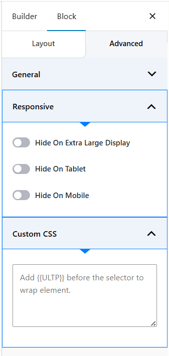
Responsive: Choose to Hide the entire Tabs Block on specific devices (Extra Large Display, Tablet, or Mobile).
Custom CSS: Add your own custom CSS code to style the block further. Remember to use the [[ULTP]] prefix to target the block correctly.