The PostX Menu Block is a powerful and easy-to-use tool for building navigation systems on your website. From simple list menus to advanced mega menus, it provides the foundation for a seamless navigation experience.
PostX Menu is designed with responsiveness in mind. It includes specialized Hamburger View settings to ensure seamless functionality across desktops, tablets, and mobile devices.
Let’s uncover all the details of the PostX Navigation!
How PostX Menu Work?
The PostX Menu is built with four blocks:
- Menu Block: The core block serves as the foundation of navigation.
- Menu Item Block: Represents individual items within the menu.
- List Menu Block: Creates a menu in a list-style format.
- Mega Menu Block: Enables advanced menu layouts with rich content.
The last three blocks (Menu Item, List Menu, and Mega Menu) are designed to work as inner blocks. It means they are embedded and function within the main Menu Block.
PostX Menu Setup: Step-by-Step
Here’s a quick guide to setting up a sleek and functional menu with PostX.
Step 01: Start with Menu Block: Add the Menu Block as the main container for your menu.
Step 02: Customize Menu Items: Use Menu Item Blocks to configure and customize each menu item individually.
Step 03: Decide on Submenus: Place List Menu or Mega Menu inside the relevant Menu Item Block.
- Mega Menu: Use Mega Menu Block for rich content menus.
- List Menu: Use List Menu Block for a simple list-style submenu.
Step 04: Configure Mobile/Hamburger View: Go back to the Menu Block and enable the hamburger view for mobile devices.
Step 05: Preview and Finalize: Preview your menu and check that all links, submenus, and the hamburger menu icon work as expected.
Organizing and Customizing the Menu Block
Once you’ve added the Menu Block, it’s time to organize and customize your navigation. Here’s how to create a simple and clear menu structure:
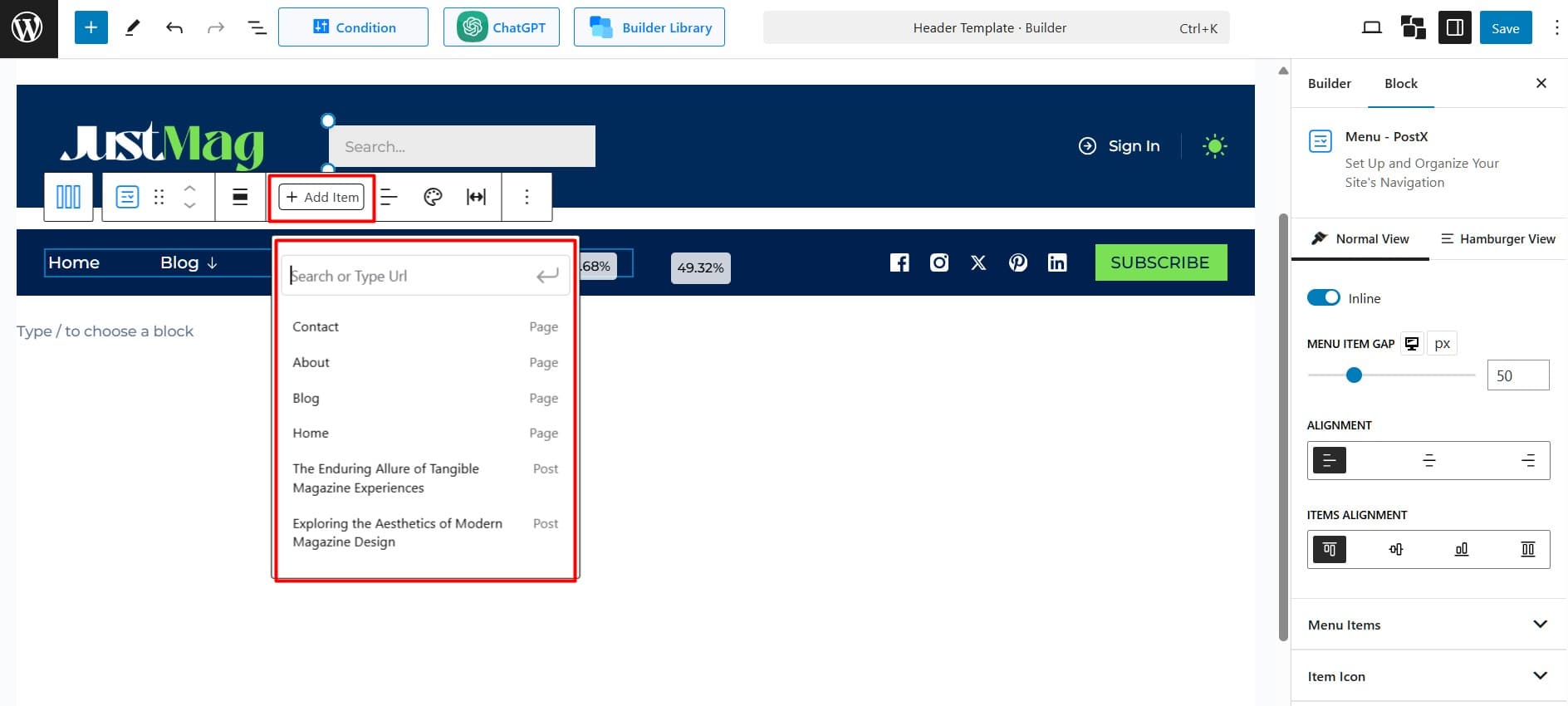
- Click “+ Add Item” to add pages, categories, or custom links.
- Drag and drop the items to reorder them.

Here’s more to customize:
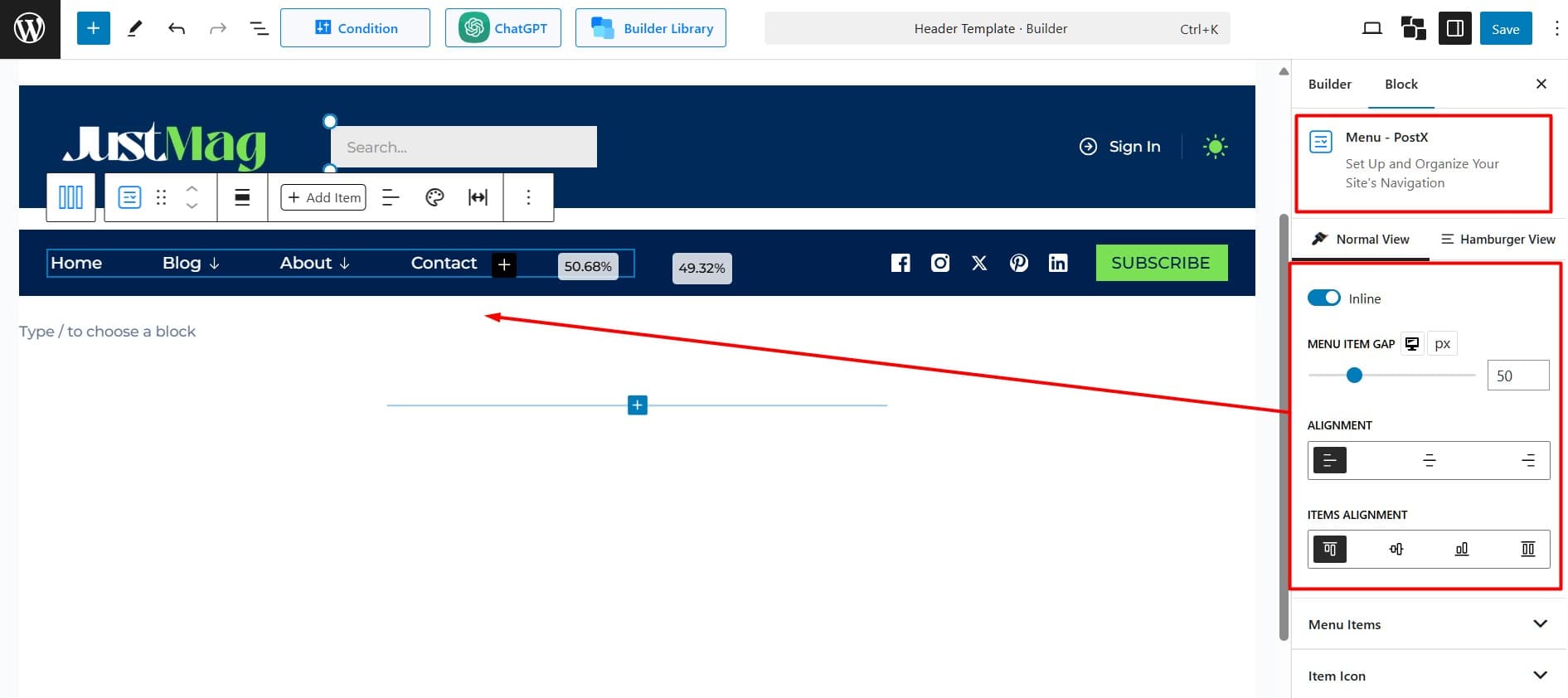
Controls the menu layout: Enable inline to show items in a row or disable to stack them vertically.
Menu Item Gap: Adjusts the spacing between individual menu items. Drag or enter a specific value in pixels or percentage

Alignment: Sets the horizontal alignment of the menu items to left, center, or right.
Align Items: Defines how the menu items align vertically within the menu container.
- Top Alignment: Aligns items to the top.
- Center Alignment: Aligns items to the center (default).
- Bottom Alignment: Aligns items to the bottom.
- Stretch Alignment: Ensures all items occupy equal vertical space.
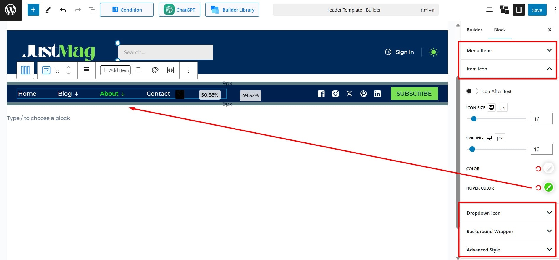
Menu Items: Configure individual menu items’ design, color, and typography.
Item Icon: Choose the icon color, size, and spacing. You can also choose whether the icon appears before or after the menu item.
Dropdown Icon: Select the dropdown indicator icon and adjust its size and the spacing between the menu item and the dropdown indicator.

Background Wrapper: Define the menu container’s background styles, borders, and spacing.
