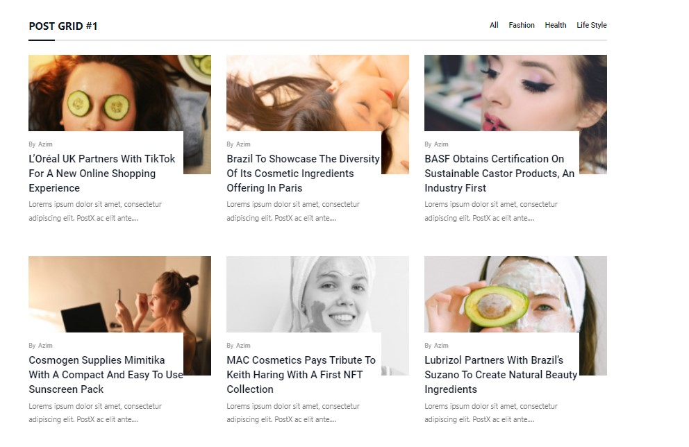
You will find 7 styles of the first category (Post Grid #1). All 7 styles have the same customization options available.
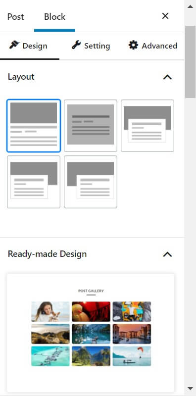
Design
Choose layouts (available in the pro version) from the design tab. You also have the option to choose ready-made pro layouts from a wide variety of choices.
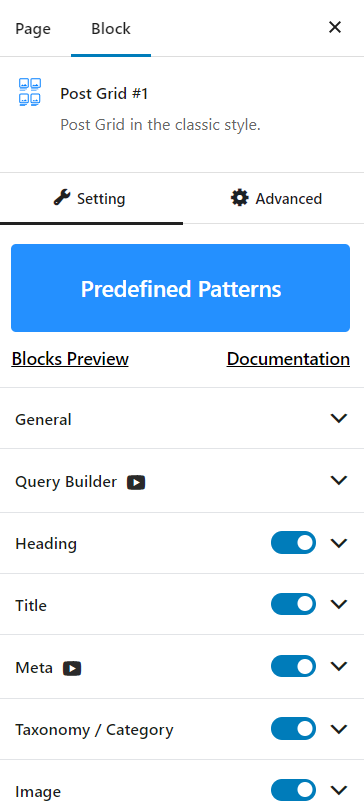
Setting
In the settings tab, you can find the following customizations:
- General, Query, Heading, Title, Meta, Category, Image, Content Wrap, Excerpt, Pagination, Separator
General Tab
In the general Tab, you will find options to:
- Increase/decrease the column numbers and column gaps
- Enable/Disable the options for Heading, Title, Excerpt, Category, Meta, Image, Read More, Filter, Pagination, New tabs, Equal heights
- There is also an option for the alignment of the posts in the block
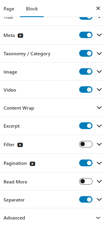
General Settings
Heading and Title
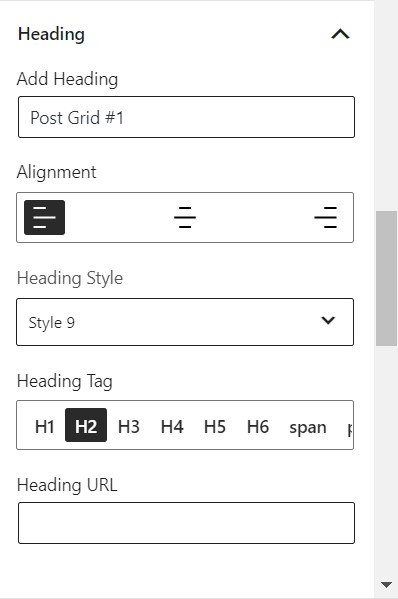
From the heading settings, you can choose to:
- Add your heading
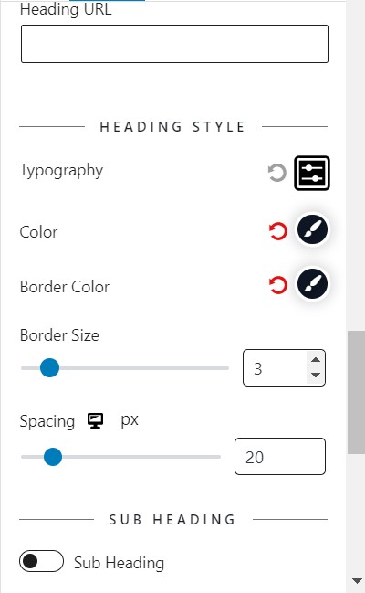
- Enable/Disable Subheading
- Set the alignment and heading style
- Change the heading tag and URL
- Play with the typography, border, and color settings
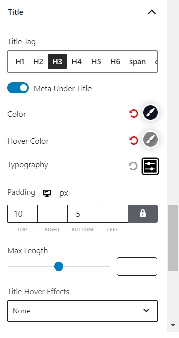
The Title settings have the following options for you to play with:
- Blend the specific color (Pro feature)
- Play with the hover color, typography, and padding settings
- The maximum length of the title that will preview in the block
Meta
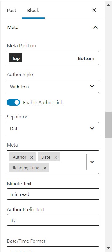
In the Meta Settings, you can change:
- The positioning of the Meta
- The styling of the meta from a dropdown style list.
- The separator from a predefined dropdown list.
- Which properties the Meta will show (e.g. Author, Date, Reading Time etc.)
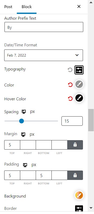
You can also play with the typography, color, and spacing properties of your post meta. Furthermore, you can change the margin, padding, background, and border settings.
Separator
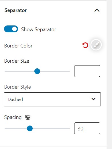
If you wish to show the separator with every post, then you can enable the ‘show separator’ option. Then you can adjust the border color and sizing. You can also increase/decrease the spacing per post grid as well.
Excerpt
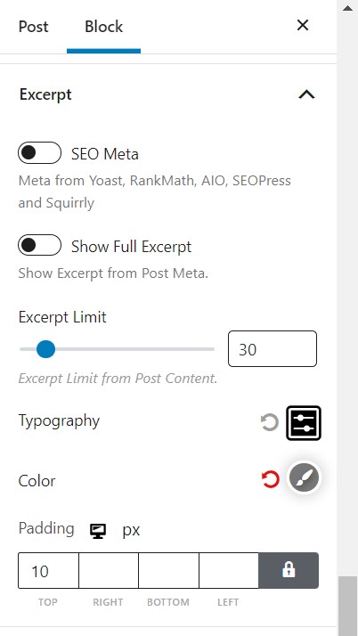
You can change the typography, color, and padding settings for the post excerpts. You can also enable/disable the full excerpt and set an excerpt limit.
Query Settings
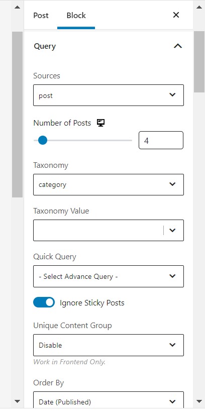
It is one of the more powerful features of the PostX-Gutenberg post blocks. The Query settings come with a handful of pro and free features.
Sources
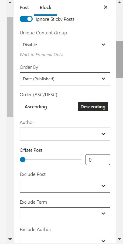
The first exciting one is the “Sources” option. Our users can now customize any pages, posts, or custom post types as per their demand in the block.
Quick Query
You can find posts based on comments, popularity and more. This pro feature is very helpful when you wish to filter out specific posts based on specific criteria.
Post Type and Number
You can choose your post type and how many posts you want to show using the dropdown and slider in the query menu.
Taxonomy and Taxonomy value
Based on the post tag, format, or category, you choose which posts to show. The ‘taxonomy value’ feature helps to show specific posts on your page based on categories.
Order by
You can choose to order your posts by ‘Order By’ dropdown. Here you have several options like post title, comment count, meta value, and more.
You can also order your posts by ascending or descending order based on the ‘order by’ criteria.
Include/Exclude Post
You can include/exclude post based on the post ID.
Offset post
You can choose how to offset posts using the slider.
Category Settings
The category settings give you a lot of freedom when customizing your posts and page.
Styling and positioning
The styling and positioning are baked-in features of the PostX plugin. You can easily change the ‘category style’ and positioning from the dropdown menu.
Color Settings
With the free version of PostX, you can keep the default color.
But the ‘specific color’ feature allows you to make your posts appear more vibrant. The ‘category specific’ and ‘only category color’ come with pro version as well.
But you get access to the border and padding settings with the free version.
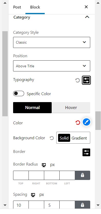
Image Settings
You can do a lot with the PostX post blocks image settings.
Large Item Settings
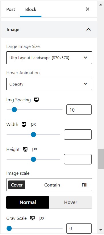
The ‘Large Item’ setting lets you choose from a list of options. You can choose the way you want to show your posts on a page from the dropdown.
Hover animation, Width and Height
PostX blocks give you the option to choose the hover animation for your individual posts. Also, you can select the width and height of each post element to make them more dynamic.
Image Spacing
The ‘image spacing’ dial allows you to size up the post images (as they are shown on the page).
Gray Scaling and Image Overlay
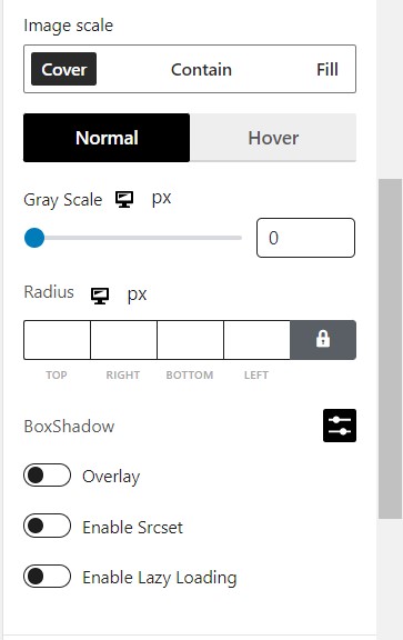
You can choose to grayscale the featured images of posts with PostX. Also, once enabled, the image ‘overlay’ option lets you add a specific overlay to your images.
Finally, you can play with box shadow and radius image properties as well.
Content Settings
With these particular stylings, you have can show some of the content on the post face.
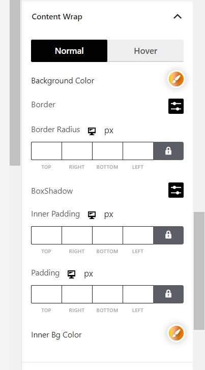
Content Positioning
You can choose the way the content is positioned in the post face.
Content Animation and background
You can choose how the content appears when someone hovers over it. Also, you have control over the content background as well. Both the content animation and the background support are pro features.
Padding
You can set the content padding as per your choice.
Filter Settings
AJAX filtering is one of the key features of the PostX WordPress blocks plugin.
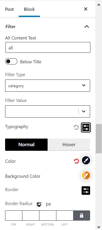
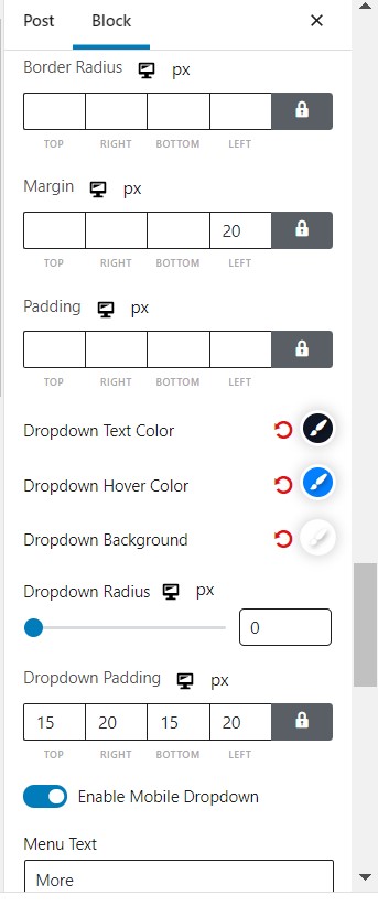
Filter type and value
Based on what posts you want to show, you can choose your preference from the ‘filter type’ dropdown. Also, you can specify the ‘filter value’ as well.
Other filter settings include:
- Typography
- Border Settings
- Margin and padding settings
- Dropdown text, hover color, radius settings, and more.
Pagination Settings
Pagination gives your website the added flexibility it needs. And the makers of the PostX plugin understands this. For this reason, you get excellent pagination settings with this WordPress blocks plugin.
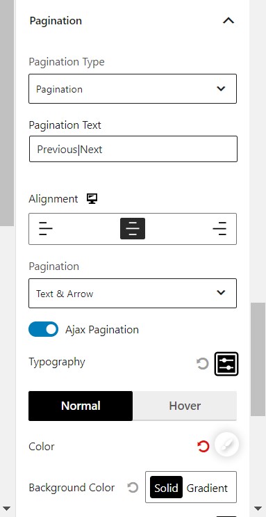
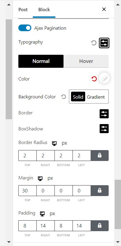
Pagination
Pagination type
From the ‘pagination type’ dropdown, you can easily choose your pagination type. And the ‘load more’ text allows you to personify the pagination.
Alignment
You also have the option to align your pagination as per your preference.
Others
Other settings include hover border, background, padding and color settings. You can choose between the normal showcase and the hover showcase.
‘Read More’ Settings
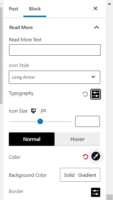
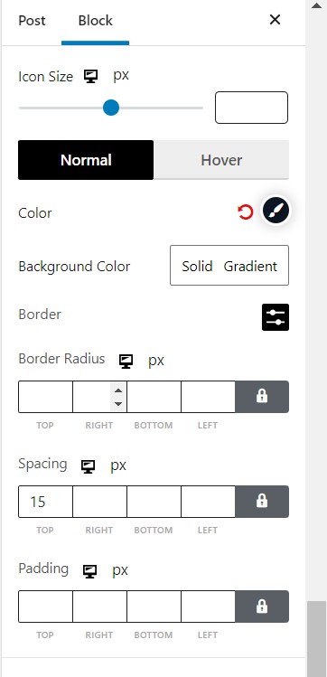
You can customize the ‘read more’ text and the icon style. There are some decent icon style choices from the dropdown menu.
You can also change the icon size using the slider.
Other settings include the typography, spacing, padding, background color and more.
Advanced Styling
The advanced styling lets you play with the core basic customization options.
