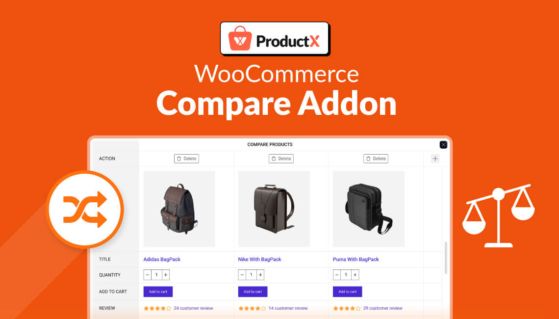
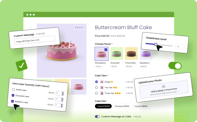
The WooCommerce ‘Product Compare’ addon is a great way to help shoppers compare product attributes like pricing, design, etc. This helps them to make the right purchase decision.
Since the first iteration of the ProductX WooCommerce Product Compare Addon, the dev team has been hard at work to provide the best possible solution.
And so they did. So, did it change how to enable the WooCommerce Product compare feature in your WooCommerce Store? Here’s the new way of adding the WooCommerce comparison feature:
- Install the WooCommerce and the ProductX Plugin
- Enable the ‘Compare Products’ addon
- Modify the settings to show the compare feature
- Change the design properties for the ‘products compare’ table
- Save the settings
Once you complete this 5 stage process, the user will be able to compare products with ease.
To make this tutorial an effective one, let’s say you’re the owner of a WooCommerce store. You want to add a custom product comparison feature to the store, allowing users to compare products.
How do you do that?
Step 1: Installing and Activating the Plugins
The installation and activation of plugins is step 1 because it is the fundamental step. Without it, the WooCommerce Product Compare Feature will not work.
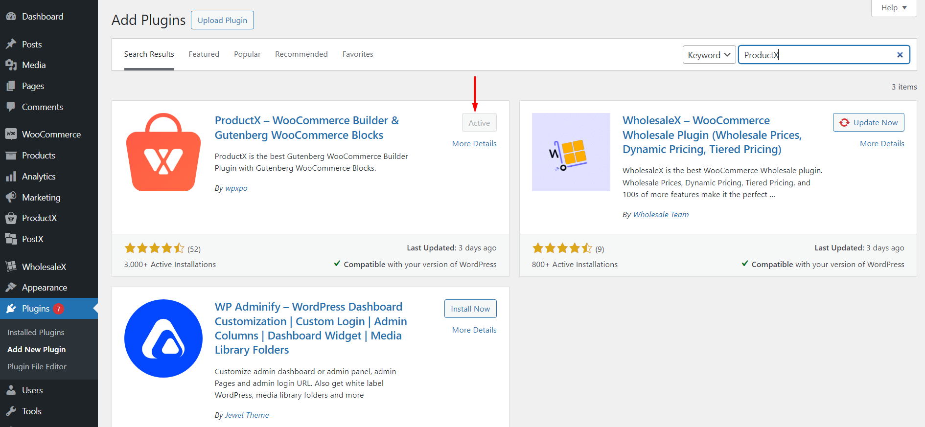
The installation process is very straightforward – for both the WooCommerce and the ProductX plugins. We have an installation guide that will take you through the complete process.
ProductX is now WowStore! We’re very excited to bring you this experience, packed with unique features. Please note that the features, blocks, starter packs, etc. all work the same. If you have used ProductX, you’ll feel right at home with WowStore.
Step 2: Enabling the Compare Addon
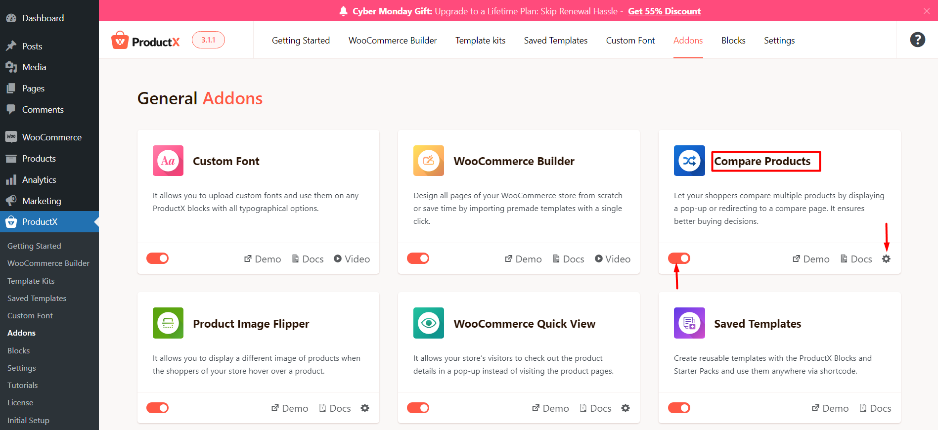
To make the compare feature, you need to enable it from the ProductX Addon library. The plugin has a wide selection of add-ons. The ‘products compare’ is just one of the options.
While we’re at it, it’s probably worth mentioning that the ProductX plugin is on SALE this Cyber Monday!
You can save a whole lot for a set of features that’s going to help boost your online game. Access to features like the WooCommerce Builder, the banner maker, custom fonts, etc. are available for an unbelievable price.

Now, you are ready to work on the core of the compare feature.
Step 3: Modify the Settings for WooCommerce Product Compare
This step is a combination of steps. You can work on it however way you like. Since you are a WooCommerce store and want to offer the best experience, you should use elements that are crucial to your products:
Working on the Product Attributes
Adding the product attributes to the comparison table should be your first thought. You need to list out which items you want to show when a user compares different items.
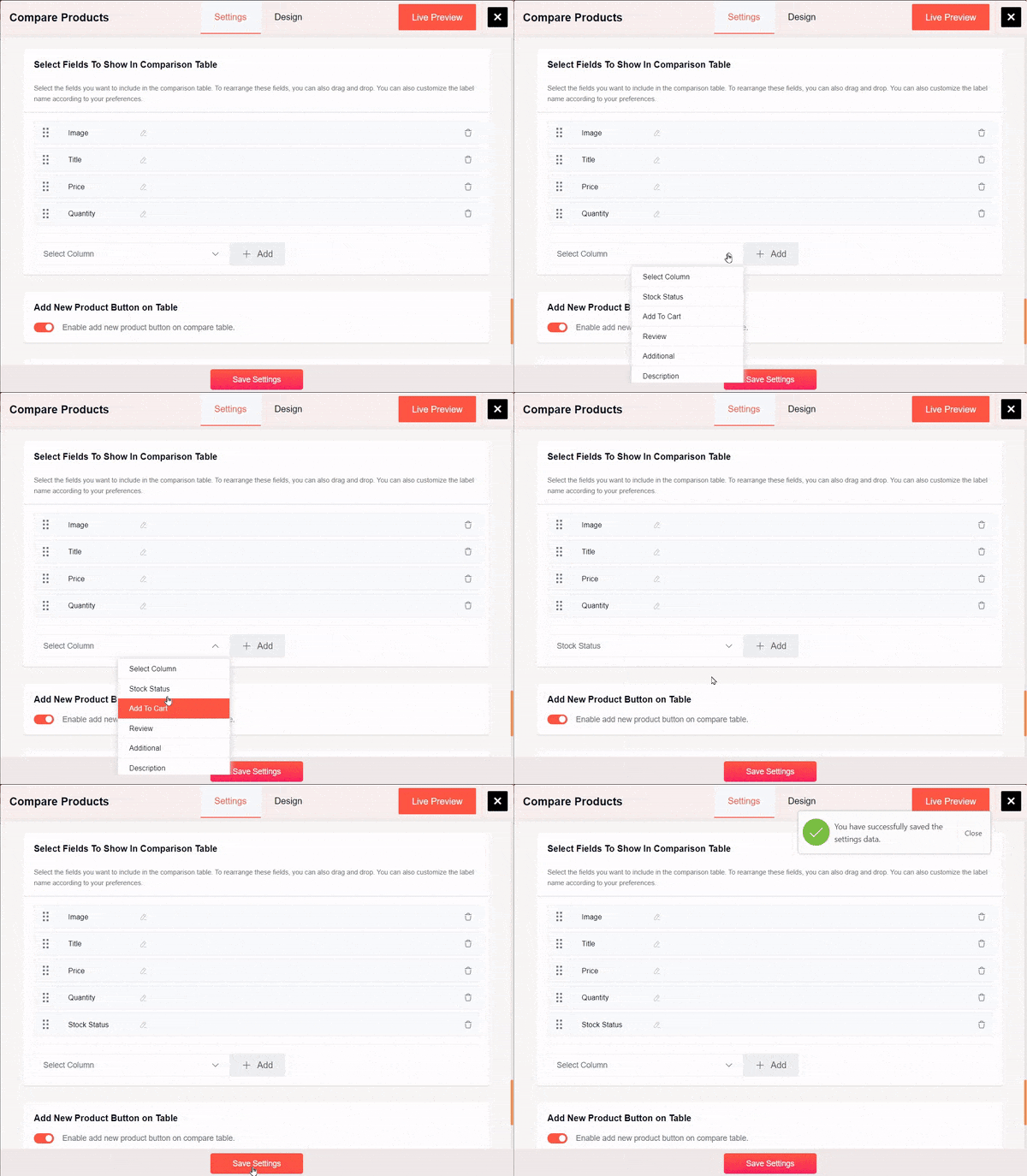
In general, you’d show the following attributes:
- The Name (product title in this case) of the product
- How many reviews it got
- The product price
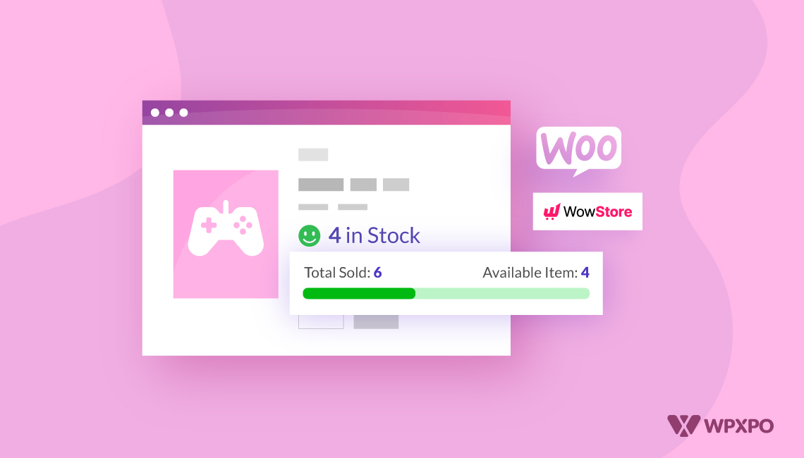
- Product availability (the stock status)
- The Product Quantity
- The Add to Cart Button
- The Product Review
In general, you’d have these 7 attributes listed on the compare page. The ProductX team thought of this – and they’ve added custom options for you to add to the table as well.
Furthermore, you can add other custom fields as well.
Moreover, there’s the option to change the field names and rearrange them. For example, if you want to show the product title first and the product image after that, you can rearrange it.
You will find more information on this in our detailed documentation. Follow the link below to access the doc:
Where to Show WooCommerce Products Compare?
In general, shop admins like to show WooCommerce Product Compare on the following pages:
- The Shop Page
- The Single Product Page
This is pretty much the norm. Because users like to add Products Compare and see the comparison from these pages.
The ProductX plugin allows you to do both. Also, if you feel like you want to show the Comparison on a different page, you can do that as well. To do that, you need to:
- Copy the shortcode
- Paste it on the compare page

- Save the Page
- Go to the Compare Addon Settings
- Select the page to show the comparison table
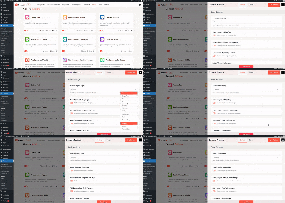
- Save the settings
There may be some technicalities with this step. As a WooCommerce store owner, the recommendation is to check the documentation for details.
What Happens After Buyer Adds a Product to Compare?
There are 4 possible outcomes in this scenario. Once a customer adds a product for comparison:
- A pop-up will open up and show the products added to the comparison table
- The user will be redirected to the compare page
- A sidebar will appear that shows the compared products
- A message appears that shows a product has been added for comparison
Here’s an example:
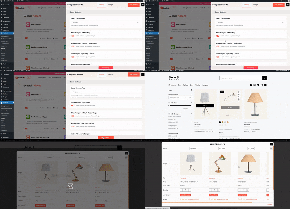
***The 4th outcome will require you to show the comparison page in the menu section or any other section of the website where the user finds the ‘Products Compare’ button. Although the message allows the user to see the list, it is a good practice to keep the Compare Feature available, either on the menu or on a custom section of the menu (ProductX has this feature as well, check out the documentation to learn more).
Can you add custom animations for loading the compare feature?
You, the WooCommerce Store Owner, can do this from the “Compare Modal Loading” section within the ProductX WooCommerce Product Compare Addon Setting.
You can select the loading icon from a range of options and select the animations as well.
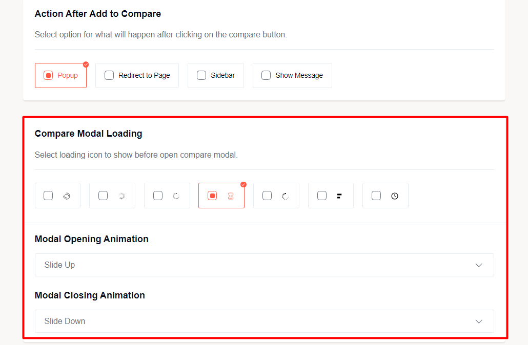
This enables you to add a custom feel to your site!
***Please note that the modal animations are only available for the first 3 outcomes mentioned above.
How to Add the Products Compare Feature to the Menu?
If you want to add the Compare feature to your navigation menu, you can simply create a page, paste the shortcode on it, and save it.
But, if you wanted to add a custom button for WooCommerce comparison, then you could do that by enabling the ‘Add Compare Menu in Navbar’ from the compare addon setting. You can customize the icon and change how to show it as well.
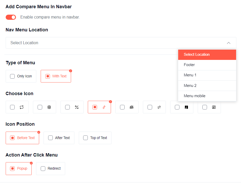
However, if you add the compare feature (it would be like a WooCommerce Compare Button), you a user can only be able to see 2 outcomes – either a popup or redirection to a page. You will need to select between the two.
And yes, you can show the button in a custom position on the navigation as well.
How to Change the Compare Button Settings?
You can create a custom compare button to show on the shop page and single product page. Here’s a quick list of steps to create a custom button from the available settings:
- Select whether you want a button or a link
- Enable or disable the button icon
- Choose whether to show only an icon for the compare addon
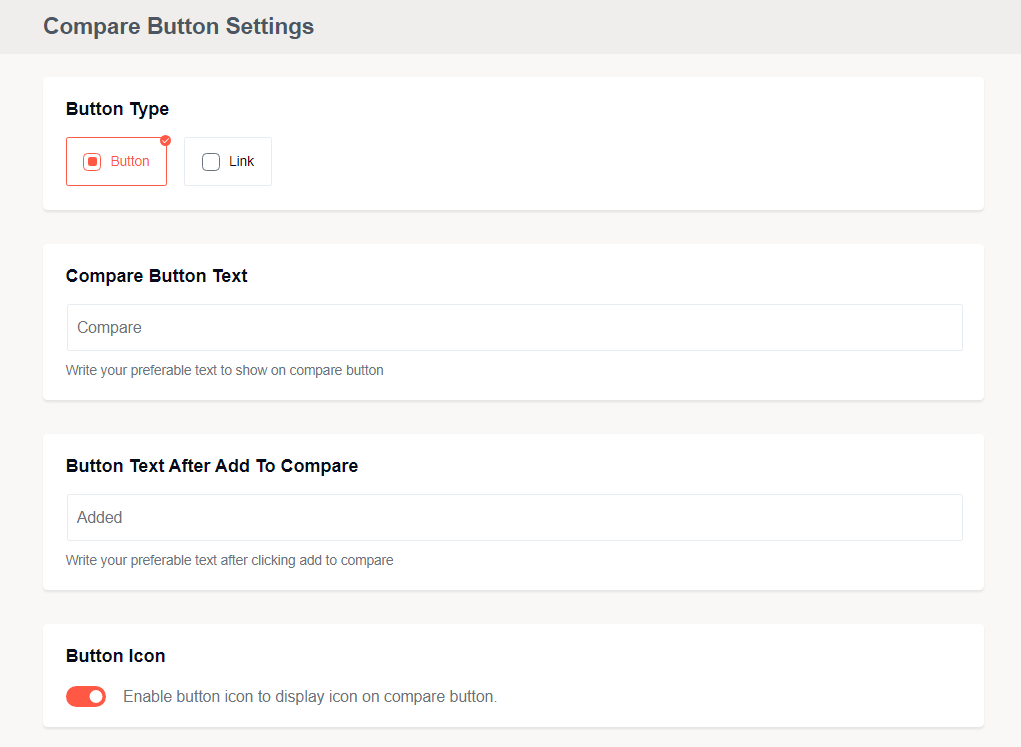
- Choose the icon design
- Select where to position the icon
Where to Show the Compare Button on Different Pages?
By ‘different pages’, we mean the shop page and the single product page. You can show the compare button icon from a selection of defined positions from the dropdown.
Making the Product Compare ‘More Usable’
There are some quality-of-life settings that can help make the product comparison feature more usable to the user:
- You can close the table if there are no items on the table
- You can freeze the first row and the first column of the comparison table
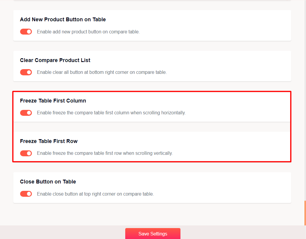
- Enable an “Add New Product” Button in the table
- Enable a button to clear the compare table with 1-click
Now, it’s time to work on the design of the WooCommerce Product Compare Table.
Step 4: Designing the Product Compare Table
There are 2-ways you can design the Product Compare Table:
Use the Pre-made Layouts and Color Presets
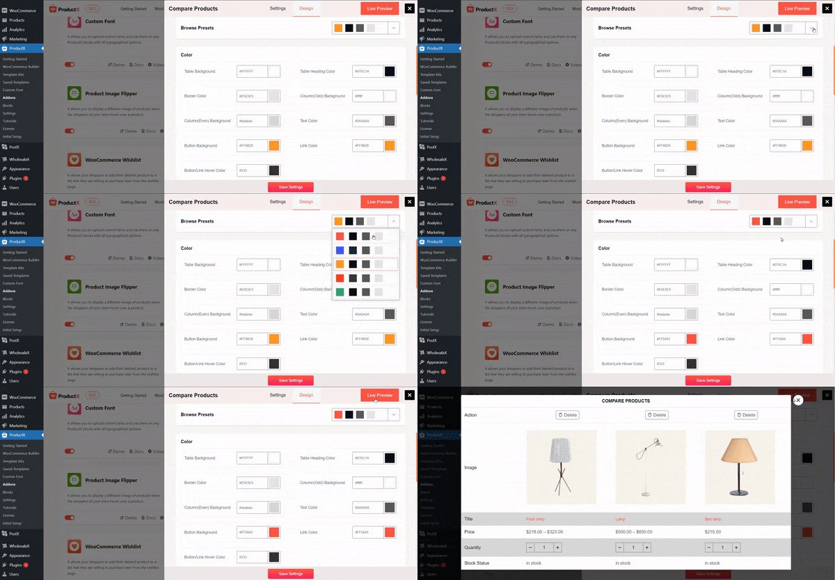
This is the easiest way to show the WooCommerce Product Compare Table on your WooCommerce store. There are 4 steps here:
- Go to the Design Tab in the Compare Addon Settings
- Select one of the Preset Designs
- Choose one of the color presets
- Save the Settings
You don’t need to do anything else.
Here’s how a comparison table looks like the custom ProductX Design:
Use Custom Settings
If you want to introduce a custom feel, then you need to change some of the design settings. The things you can work on are the typography, layout, and color. These individual settings will have sub-settings.
Again, it is wise to check out the documentation to get a clear idea of how these things work.
Step 5: Save The Settings
The final step is to save the settings and view the changes.
Key Takeaways
You now have a clear idea of how to show a proper WooCommerce Product Compare on your website.
Now, if you were to take something from today’s discussion, it would be the steps to create a proper compare feature that your buyers will appreciate:
- Go to the Compare Addon Settings from the ProductX Addon Setting
- Choose where to show the product compare feature
- Enable or disable the quality-of-life settings
- Customize the comparison button
- Select a design preset and color preset
- Change some of the custom design settings if you like
- Save the settings
In the beginning, the compare addon had very limited offerings. Now, the addon has evolved – allowing WooCommerce store owners to offer a more custom, user-friendly experience to the buyers.
Benefits of WooCommerce Products Compare
So, you can now add the Products comparison feature to your WooCommerce store. But do you know why it is necessary online stores?
There are numerous advantages of giving the option to users to compare products. Some of the major benefits are:
- Conversion Rate: It is frustrating when your online store is getting a huge amount of traffic but most of them are not converting as buyers. If you want to increase the conversion rate of your online store, the Product Comparison feature is one of the most effective ways to do so.
- Time on site and Bounce Rate: All SEO experts confirmed that Time on Site and Bounce Rate are two of the most important ranking signals. For this reason, we always try to increase the time on site and decrease the bounce rate. These data represent that the visitors are satisfied with the content we are providing. One of the ways to get the best results is letting users compare products. It can help to keep them longer on the site. This results in increased page views.
- Make the Users Happy: We always love to get extra attention, especially when we want to purchase something. As an online store owner, you have to know whether your users are happy or not. But the question is how can you make them happy? The simplest answer giving the users flexibility to choose the right products. This can be achieved by the Product Comparison feature.
- Increase in Returning Customer: Customers are likely to buy products from the trusted online shops. If you can satisfy the customer with the right products they are looking for, they will come again later for more products. So, all online stores should let the users find the right products by comparing them with similar types of products.
Conclusion
Did you like our WooCommerce Product Compare feature? Well, there’s more to come. Keep your eyes on our social media channels to learn more.
Also, do share your feedback. Let us know what more you’d want to see from us. Cheers!
