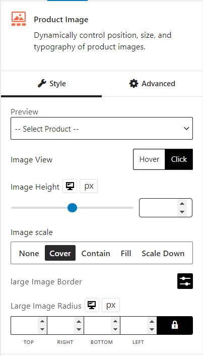
The product image block dynamically controls the position, size, and typography of product images.
Let’s see what customization settings it offers.
General
You can select the image view between hover/click. Also, you can change image height, image scale, large image border, and large image radius.
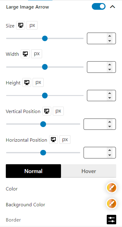
Large Image Arrow
You can enable/disable the large image arrow and customize its size, width, height, and vertical/horizontal position. Color, background color, border, border radius, and box shadow for normal and hover can also be customized.
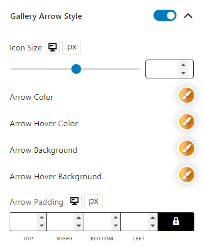
Gallery Arrow Style
You can enable/disable the gallery arrow style and customize its icon size, color, hover color, background, hover background, and padding.
Gallery
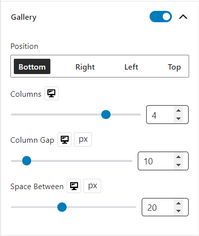
You can enable/disable the gallery and customize its position, columns, column gap, and space.
Sales
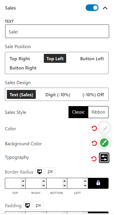
You can enable/disable the sales and customize its text, position, design, style, color, background color, typography, border radius, padding, and sales margin.
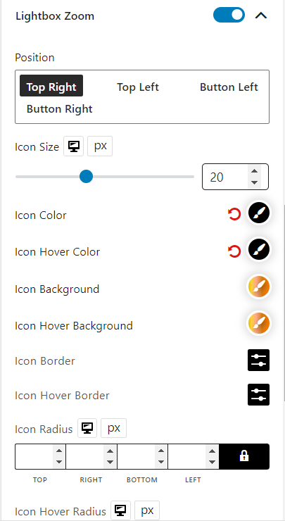
Lightbox Zoom
You can enable/disable the lightbox zoom and customize its position, icon size, color, hover color, background, hover background, border, hover border, radius, hover radius, padding, and margin.
