Website optimization for different devices is possible with PostX. You can change how the settings look on different devices. Here’s a quick video to help you out:
There are 3-notable ways to optimize website for different devices. You can go through 3-types of views to make optimizations on various devices (desktop, tablet, and mobile).
Device Types for View Optimization
You can optimize your websites for 3-types of devices : Desktop, Tablet, and Mobile.
Let’s see how you can optimize the number of columns, number of posts, and images for different types of devices:
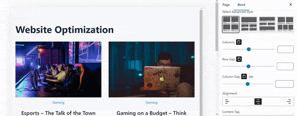
Column Optimization
You can choose to show different number of columns for different devices. Just click on the device type (as shown in the image above) and change the number of columns you want to show on that particular device.
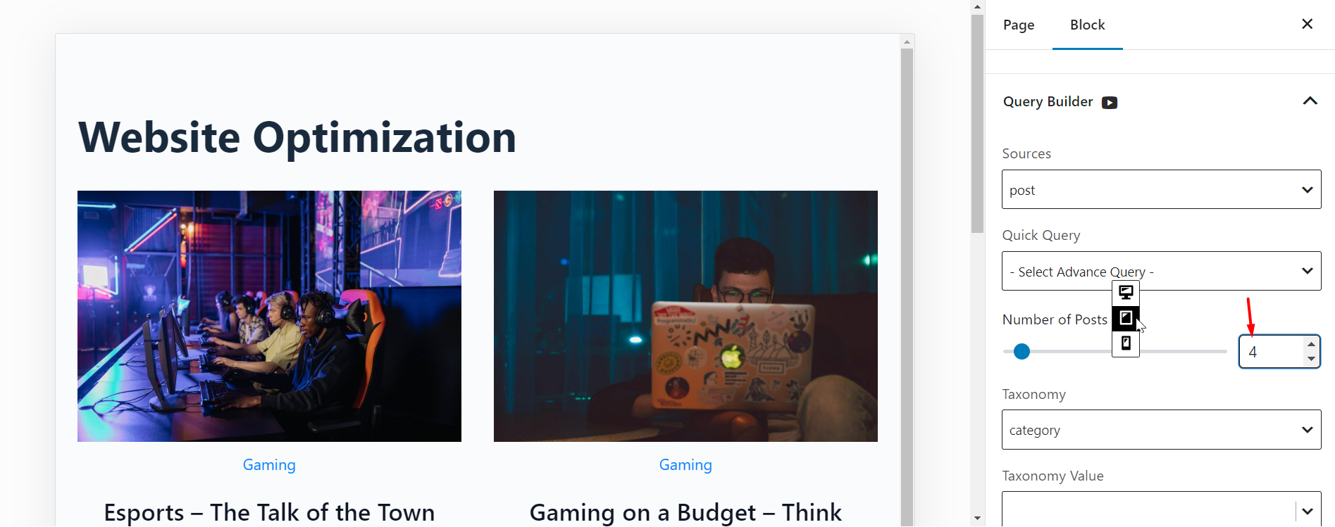
Change the Number of Posts
You can change the number of posts for different devices:
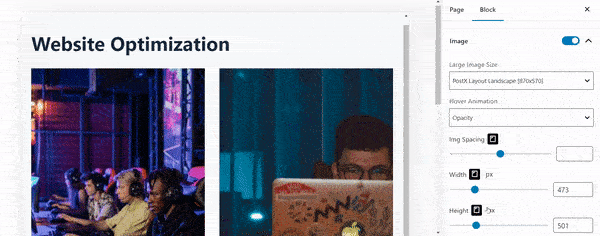
Change the Image Width and Height
You can change the width and height of images for various device types. Here’s an example: