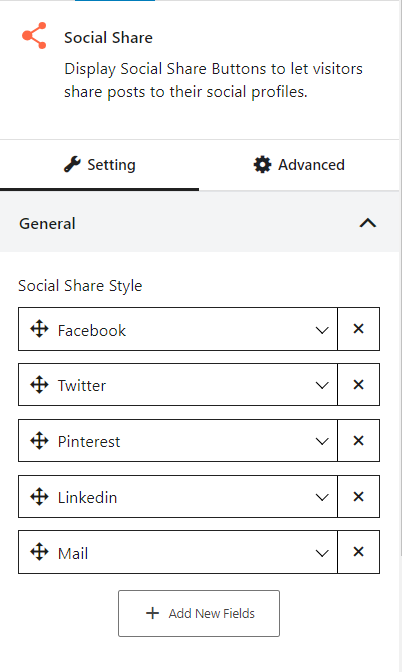
The social share block displays social share buttons to let visitors share posts to their social profiles.
Let’s see what customization settings it offers.
General
In the general settings, you can customize the social share styles and color, hover color, background, and hover background colors. Also, you can select your preferred social media options from the dropdown and add new fields by clicking the “+ add new fields” button.
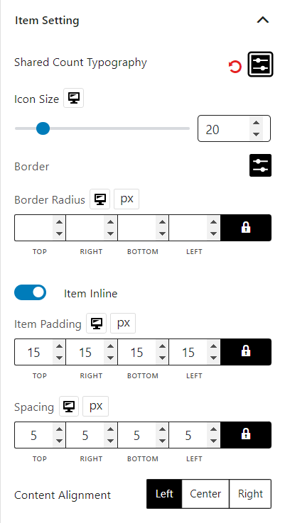
Item Settings
In the item settings tab, you can customize shared count typography, icon size, border, border radius, enable item inline, item padding, spacing, and content alignment.
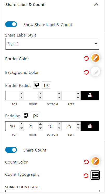
Share Label & Count
You can show share label & count, select share label style, border color, background color, border radius, padding, enable share count, count color, count typography, change share count label text, label color, and label typography.
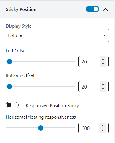
Sticky Position
You can make the social share sticky, select different display styles, modify left offset, bottom offset, enable responsive position sticky, and adjust horizontal floating responsiveness.