The product tab block dynamically controls product tabs’ position, size, and typography.
Let’s see what customization settings it offers.
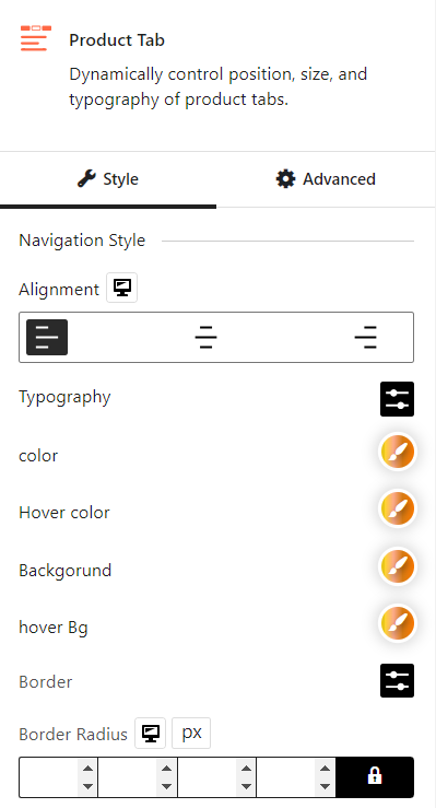
Navigation Style
You can align the tabs to the left, center, or right, depending on your design preferences. Also, you’ll get the typography, color, hover color, background, hover background, border, border radius, and padding settings for the tab.
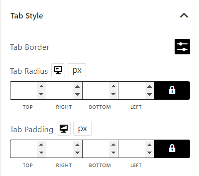
Tab Style
In the tab style setting, you can modify the tab border, tab radius, and tab padding.
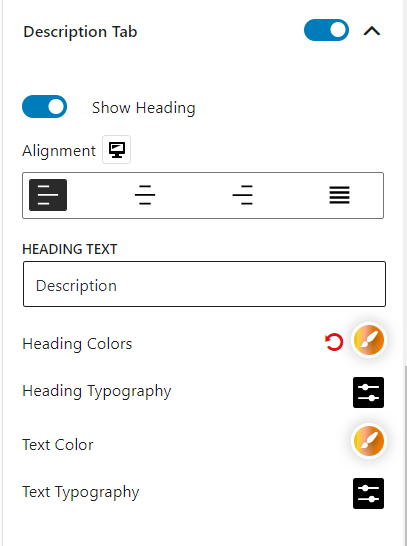
Description Tab
You can enable/disable the description tab and modify its alignment, color, and typography.
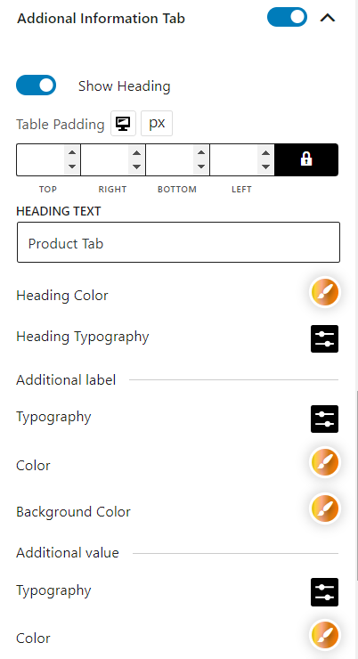
Additional Information Tab
You can enable/disable the additional information tab and modify its table padding and heading color. You can change typography, color, and background color in the additional label. Make the same changes in typography, color, and background color in the additional value.
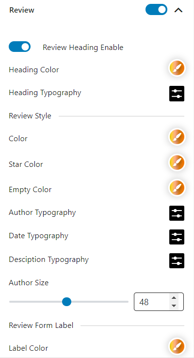
Review
You can enable/disable the review tab and modify its heading color. In the review style, you can change color, star color, empty color, author typography, date typography, description typography, and author size.
In the review form label, you can change the color, required color, and typography.
In the review form input, you can change the input color, input border color, input focus color, input typography, space, input radius, and input padding.
In the button style, you can change typography, color, background color, border, border radius, box shadow, padding, and spacing.
In the hover style, you can change the hover color, hover background color, hover border, hover radius, and hover box shadow.