***ProductX is becoming WowStore. If you see the new working interface of WowStore, then you can follow along – the working process for product blocks, starter templates, and features all work the same way as it did for ProductX. So, if you’re working with WowStore, you can follow the doc and use the instructions. Essentially, there’s no difference between WowStore and ProductX when it comes to using the product in general.
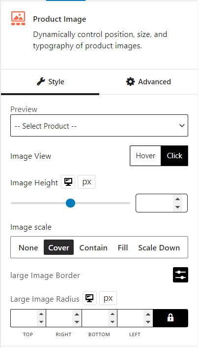
The product image block dynamically controls the position, size, and typography of product images.
Let’s see what customization settings it offers.
General
You can select the image view between hover/click. Also, you can change image height, image scale, large image border, and large image radius.
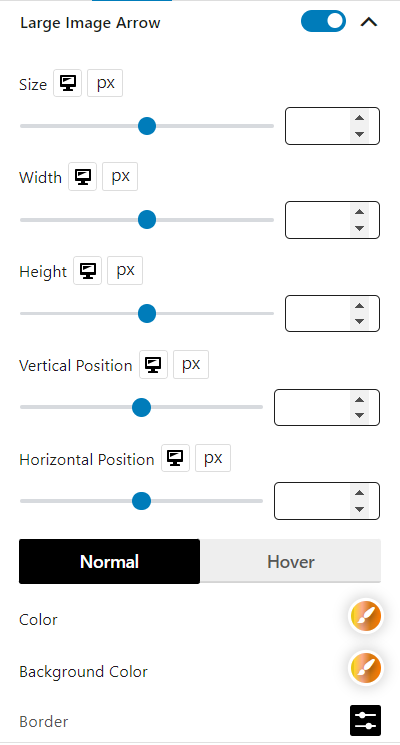
Large Image Arrow
You can enable/disable the large image arrow and customize its size, width, height, and vertical/horizontal position. Color, background color, border, border radius, and box shadow for normal and hover can also be customized.
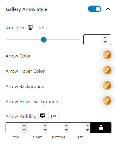
Gallery Arrow Style
You can enable/disable the gallery arrow style and customize its icon size, color, hover color, background, hover background, and padding.
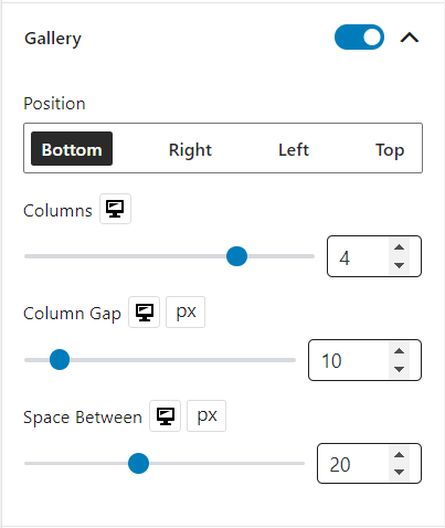
Gallery
You can enable/disable the gallery and customize its position, columns, column gap, and space.
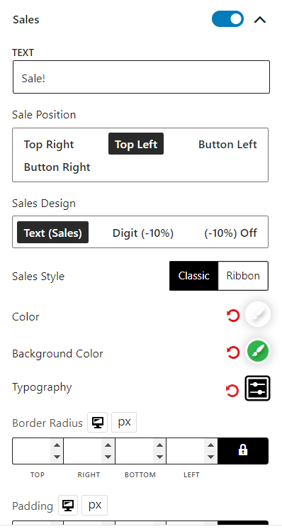
Sales
You can enable/disable the sales and customize its text, position, design, style, color, background color, typography, border radius, padding, and sales margin.
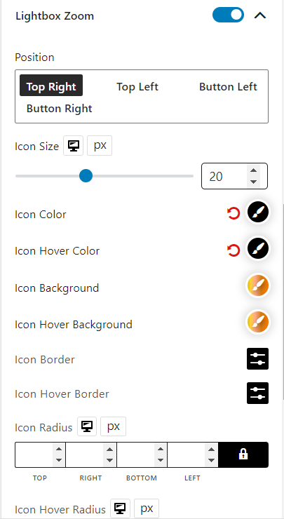
Lightbox Zoom
You can enable/disable the lightbox zoom and customize its position, icon size, color, hover color, background, hover background, border, hover border, radius, hover radius, padding, and margin.