The checkout login block helps the shoppers to add additional information if required.
Let’s see what customization settings it offers.
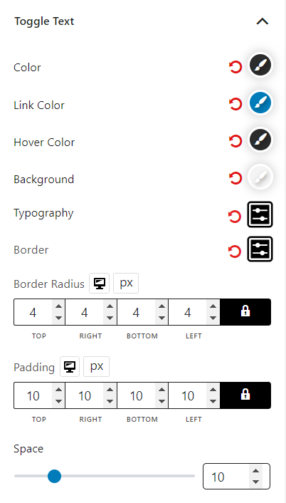
Toggle Text
In the toggle text settings, you can customize the color, link color, hover color, background, typography, border, border radius, and padding.
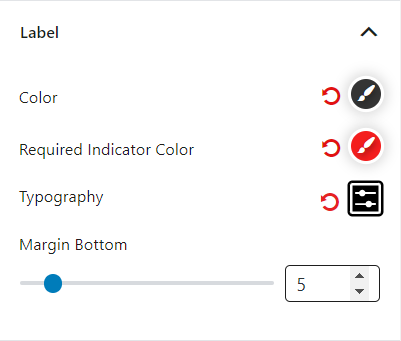
Label
You can customize the label color, required indicator color, typography, and margin bottom in the label settings.
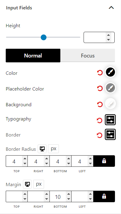
Input Fields
You can customize the height, color, placeholder color (for both normal and focus), background, typography, border, border radius, and margin.
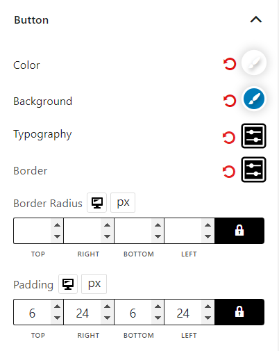
Button
You can customize the button’s color, background, typography, and border.
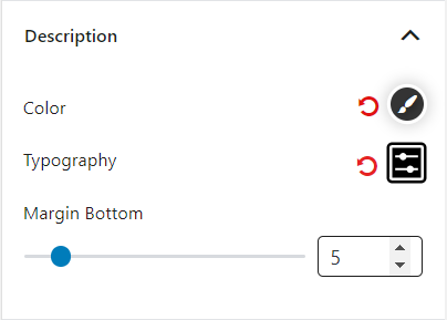
Description
You can customize color, typography, and margin bottom in the description settings.
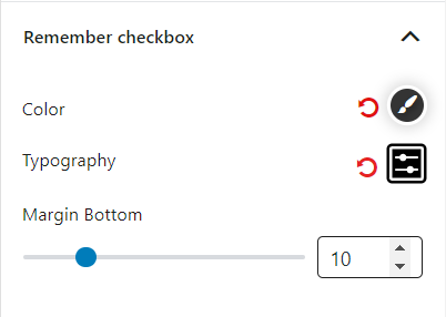
Remember Checkbox
You can customize color, typography, and margin bottom in the remember checkbox settings.
Field Container
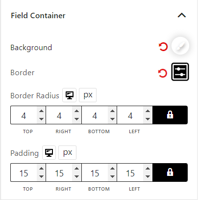
In the field container settings, you can customize the background, border, border radius, and padding.