Let’s explore the Row/Column block of WowStore.
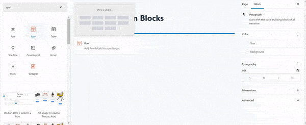
Importing Row/Column Block
Go to a Page, and click the “+” icon to see all blocks. Click or drag and drop the “Row/Column” block on a page.
WowStore Row/Column Block Customization Guide
Welcome to the WowStore Row/Column Block Customization Guide! This quick documentation will walk you through the versatile customization options of the WowStore Row/Column Block, helping you create captivating layouts for your website.
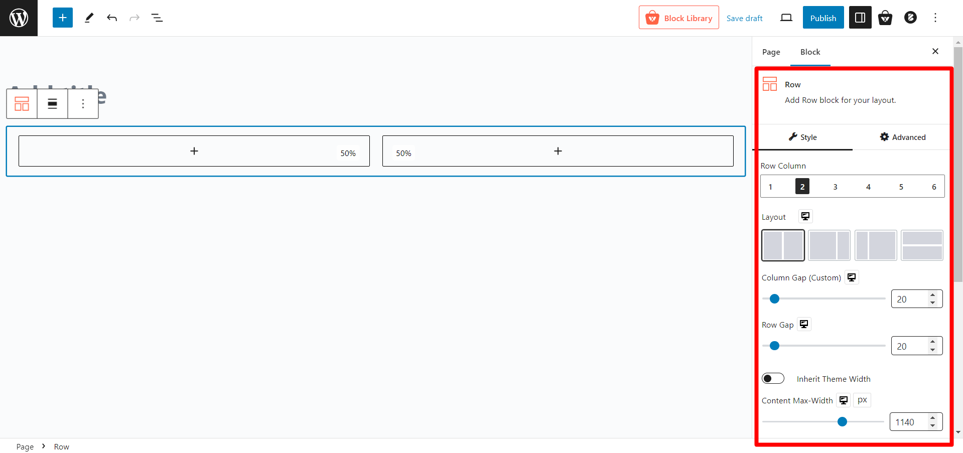
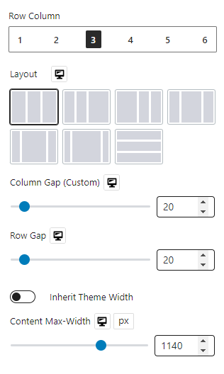
Choosing Layouts
Select from various predefined layouts to suit your design. Adjust column width, Row Gap, and Column Gap with easy-to-use sliders. Simplify by inheriting theme width with the toggle bar.
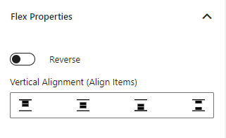
Flex Properties
Align child elements horizontally or vertically with Flex in Column settings. In Row settings, align contents vertically or toggle reverse.
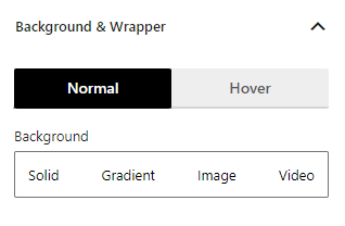
Customizing Background (Color, Image, Video)
Enhance your design with solid colors, gradient colors, images, or even videos as backgrounds. Choose different backgrounds for Row and Column settings.
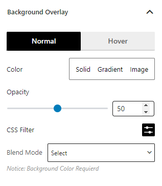
Background Overlay
Apply overlay backgrounds like solid colors, gradients, or images, even on hover. Fine-tune visuals with CSS filters and blend modes.
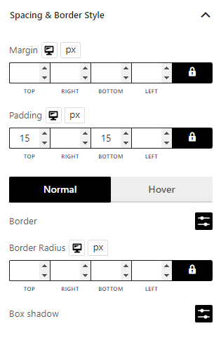
Spacing and Border Style
Adjust margins, padding, border color, radius, and box shadow effortlessly.
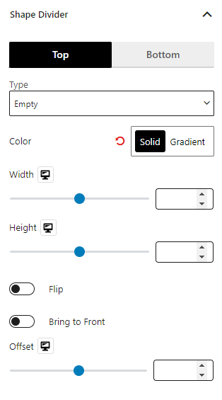
Shape Dividers
Elevate your content layout with 8 premade shapes, optionally reversed for 16 variations. Enhance your content section by adding colorful shapes at the top and bottom.
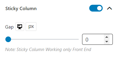
Sticky Column
Keep important content prominent using sticky columns. Enable sticky columns and adjust gap placement easily.
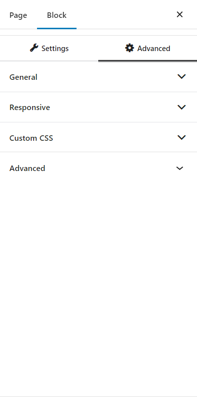
Advanced Settings
In the advanced tab, you will get settings for the following:
- General
- Responsive
- Custom CSS
- Advanced
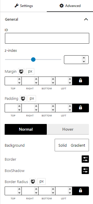
General
You can modify class ID, z-index, margin, padding, normal & hover colors, border, box shadow, and border radius from the general settings.
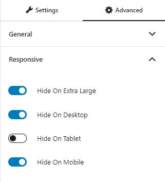
Responsive
You will have the responsiveness settings for the blocks if you want to show the block on particular devices or not.
Use the toggle bar to enable the following options:
- Hide On Extra Large
- Hide On Desktop
- Hide On Tablet
- Hide On Mobile
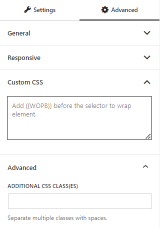
Custom CSS & Advanced
You can manually add your custom CSS to modify your blocks in the custom CSS field. And in the advanced field, you can add custom CSS classes.
Here’s a demo of the row column block in action: