***ProductX is becoming WowStore. If you see the new working interface of WowStore, then you can follow along – the working process for product blocks, starter templates, and features all work the same way as it did for ProductX. So, if you’re working with WowStore, you can follow the doc and use the instructions. Essentially, there’s no difference between WowStore and ProductX when it comes to using the product in general.
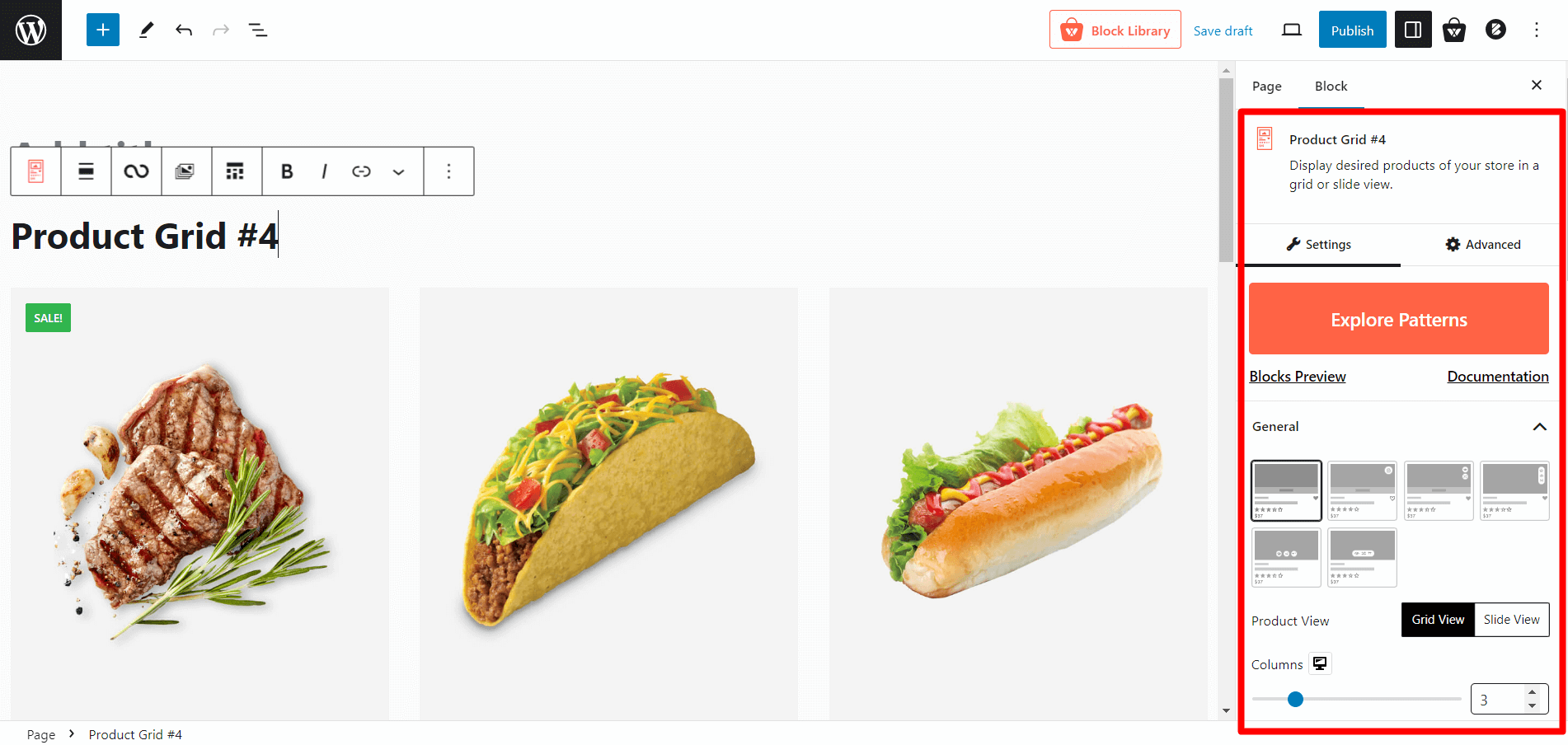
Let’s explore Product Grid #4.
Importing Product Grid #4
Go to a Page, and click the “+” icon to see all blocks. Click or drag and drop the “Product Grid #4” block on a page.
Customization Options of Product Grid #4
WowStore’s product blocks have vast customization options to meet your needs. Let’s show you what options Product Grid #4 provides.
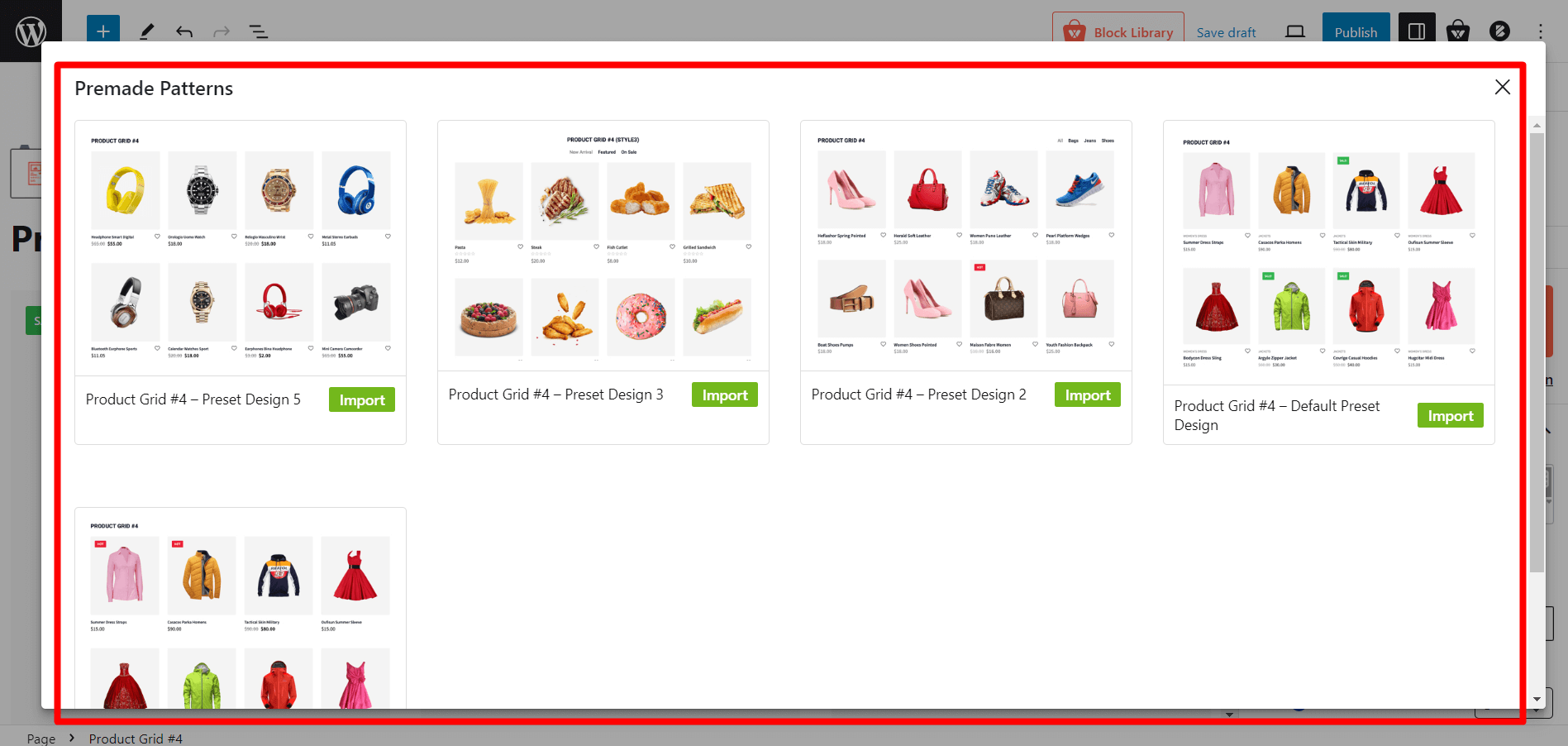
Readymade Patterns
This block comes with five ready-made patterns that can be imported with a single click. This provides a hassle-free way to get started with the block. You can still customize the block after importing a ready-made template.
Layouts
You will be able to choose from six different layout styles to meet your specific requirements. Simply click on the layout of your choice, and it will be displayed accordingly. You will also be provided with two separate content layouts to showcase the product title and category in different positions.
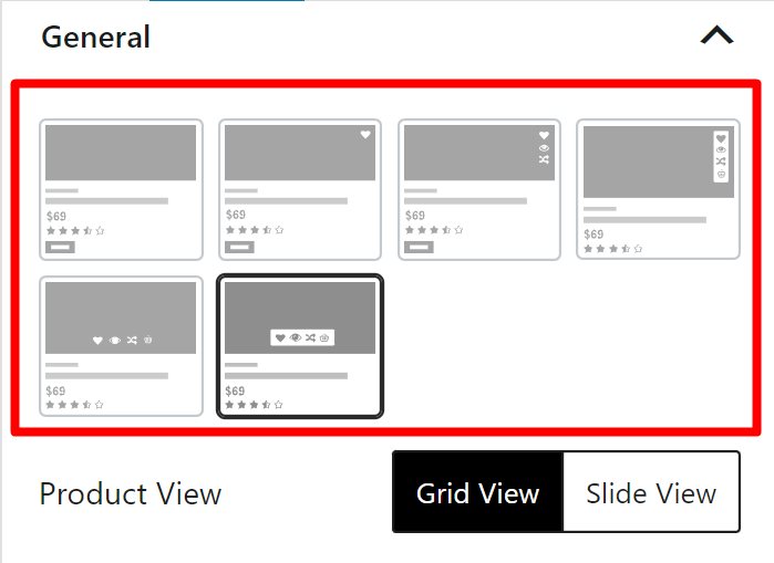
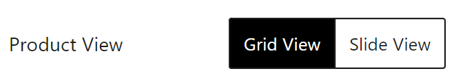
Grid/slide View
You can choose to display your products in a grid or slide view, which will give your store a visually appealing and well-designed look.
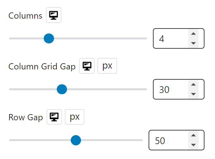
Row/Column Option
The number of products displayed in this block is determined by the row/column settings. The number of columns, the column grid gap, and the row gap can be adjusted to suit your preferences.
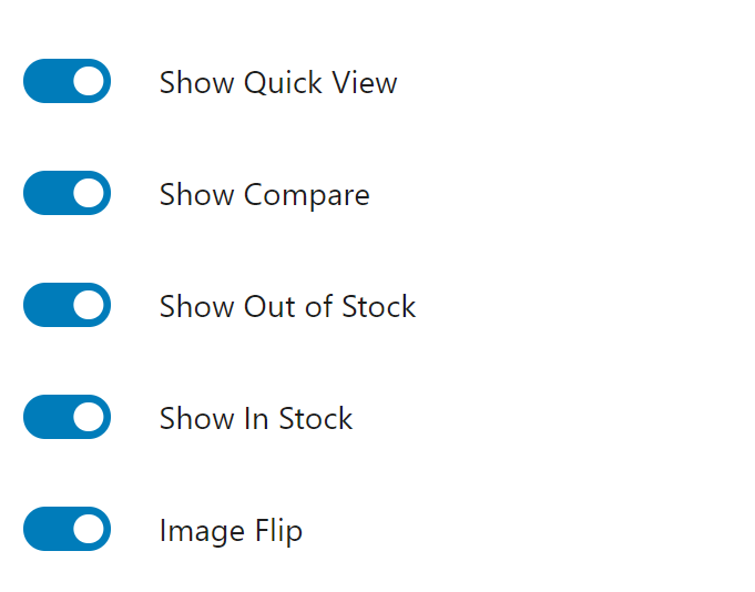
Show/Hide Elements
You can show or hide different elements for the blocks, like:
- Show Quick View
- Show Compare
- Show Out of Stock
- Show In Stock
- Image Flip
Note: Please note that these elements rely on the layout, so choose the layout carefully before enabling them. Otherwise, they will not function.
Product Sorting
WowStore’s amazing query builder allows you to sort your products using both basic and advanced sorting options.
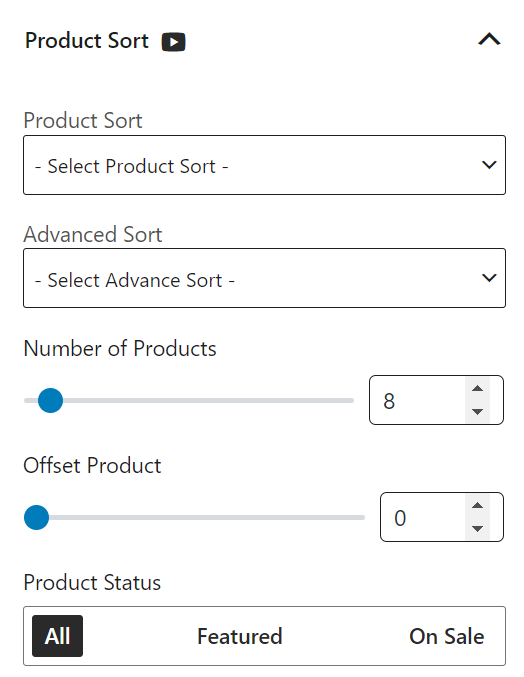
Check out more about the query builder for product sorting.
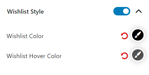
Wishlist Style
A customizable wishlist button can be added to the website. The color of the wishlist button and the hover color can be adjusted to match the overall design of the website.
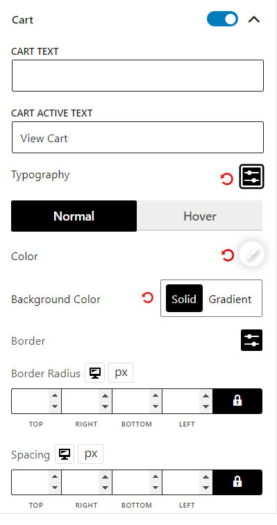
Cart Settings
This setting activates the “Add to Cart” and “View Cart” buttons when a user hovers over a product. The text of the “Add to Cart” and “View Cart” buttons, the typography, colors (normal and hover), background colors, border, border radius, spacer, and padding can all be customized.
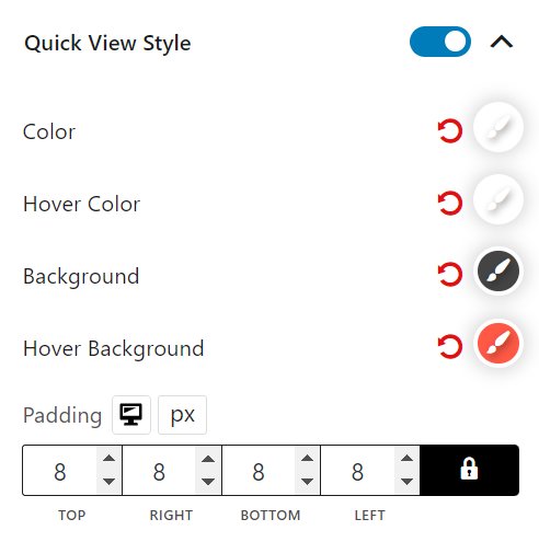
Quick View Style
This feature enables a “Quick View” button to appear when a user hovers over a product. The color, hover color, background, hover background, and padding of this option can be customized.
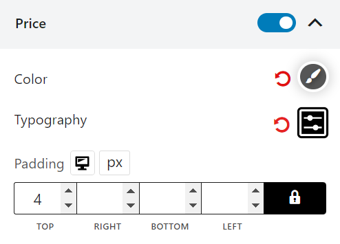
Price Settings
This setting enables you to customize the price-related settings for products. You can choose to show or hide the price, and adjust the color and typography for this block in the price settings.
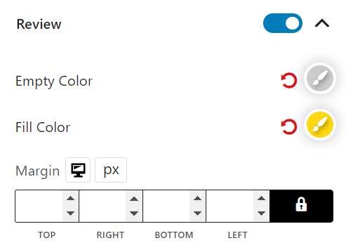
Review Settings
The review settings control the rating section of this block. You can activate or deactivate the rating stars, adjust the regular and filled colors, and modify the margins.
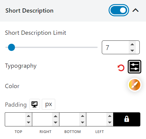
Short Description Settings
You can display or hide a brief product description, and change the character limit for it.
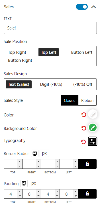
Sales Settings
You can customize product sales tags by showing or hiding them, and by changing their text, position, style, color, background color, typography, border radius, and padding.
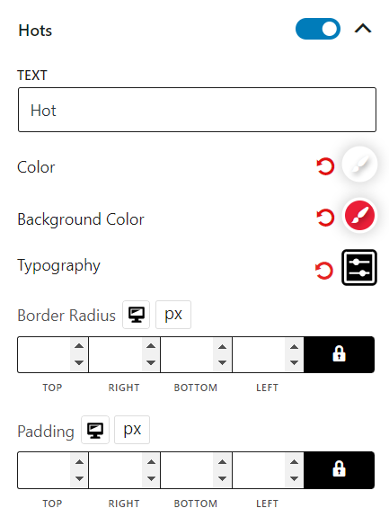
Hots Settings
The product highlights can be enabled or disabled, and the text, colors, background, typography, border radius, and padding can be modified.
Deal Settings
Deal settings determine the duration of a deal’s availability for products. You can activate or deactivate it, and adjust the background color, number of colors, typography, day typography, border radius, spacer, and padding.
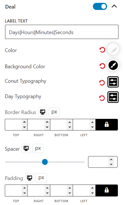
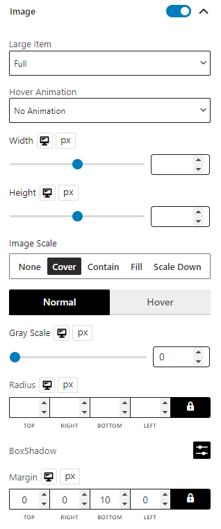
Image Settings
The block can be displayed or hidden by using the image control options, altering the image size, selecting an animation, adjusting the width, height, image scaling, gray scale, radius, box shadow (for both normal and hover), and margins.
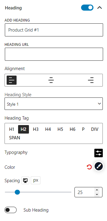
Heading Settings
This is the settings for the block heading. You can customize block headings with options such as disabling, editing text, adding URLs, and adjusting styling and color.
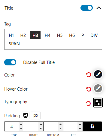
Title Settings
This setting controls the title of the product. It can be disabled if desired. The tag, full title, color, hover color, typography, and padding can also be modified.
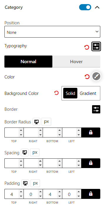
Category Settings
The product category can be shown or hidden, and its typography, color (normal and hover), background color, border, border radius, spacing, and padding can be customized.
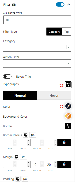
Filter Settings
Filters are similar to query sorting, but they provide users with more control over the results. Users can view products based on category and tags, if these filters are enabled. The filter type (Category & tag) can be selected, and multiple categories and tags can be chosen.
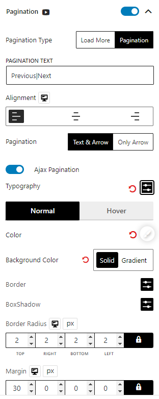
Pagination Settings
The pagination (numeric/load more) options for this block can be customized. The text, alignment, typography, colors (normal & hover), background color, border, box shadow, border radius, margin, and padding of the pagination can be modified.
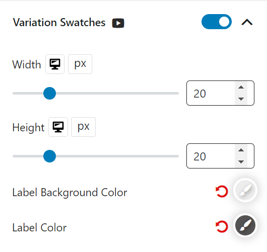
Variation Swatches Settings
To activate variation swatches for variable products, the default drop-down variation will be replaced by a clickable image/color-based swatch. The width, height, label background color, and label color for variations can be customized.
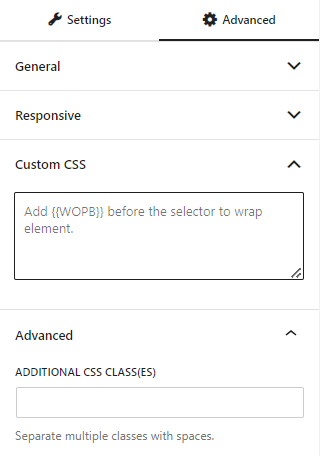
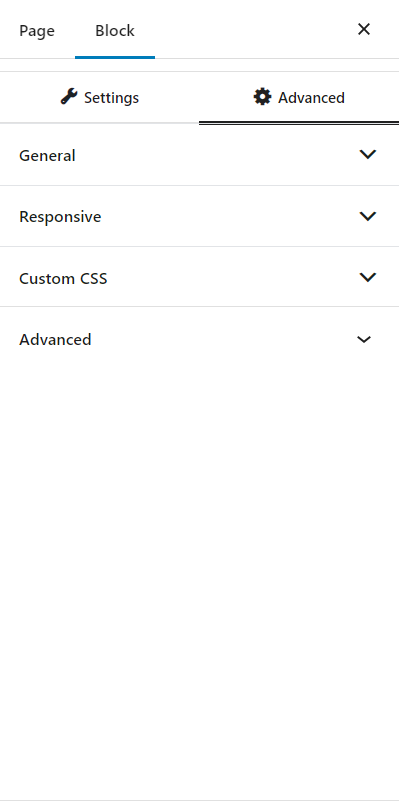
Advanced Settings
In the advanced tab, you will get settings for the following:
- General
- Responsive
- Custom CSS
- Advanced
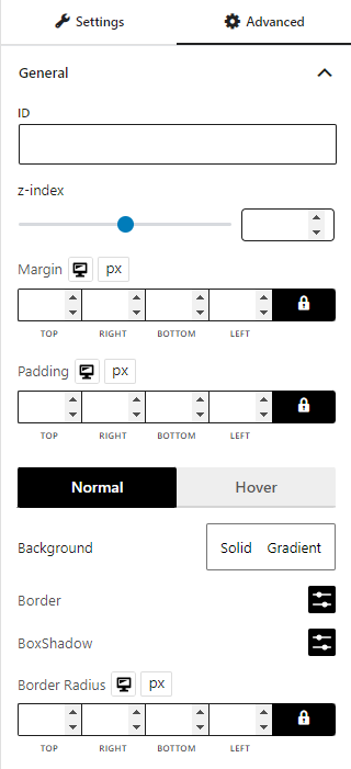
General
You can modify class ID, z-index, margin, padding, normal & hover colors, border, box shadow, and border radius from the general settings.
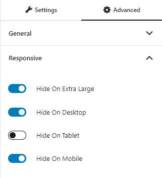
Responsive
You will have the responsiveness settings for the blocks if you want to show the block on particular devices or not.
Use the toggle bar to enable the following options:
- Hide On Extra Large
- Hide On Desktop
- Hide On Tablet
- Hide On Mobile
Custom CSS & Advanced
You can manually add your custom CSS to modify your blocks in the custom CSS field. And in the advanced field, you can add custom CSS classes.