Let’s explore Product Grid #1.
Importing Product Grid #1
Go to a Page, and click the “+” icon to see all blocks. Click or drag and drop the “Product Grid #1” block on a page.
Customization Options of Product Grid #1
WowStore’s product blocks have vast customization options to meet your needs. Let’s show you what options Product Grid #1 provides.
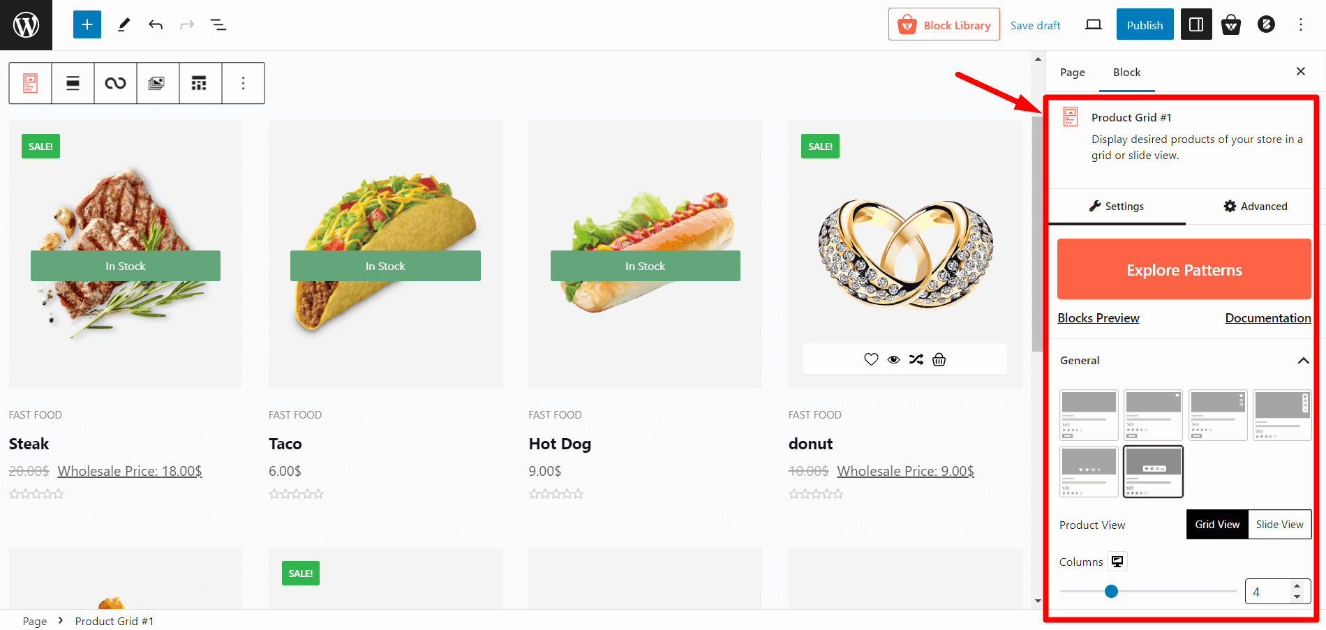
Readymade Patterns
This block has 5 readymade patterns for you to select. Giving you hassle-free 1-click import.
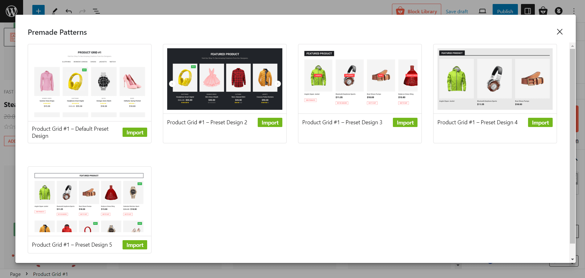
You can still customize the block after importing a readymade template.
Layouts
You will also have 6 different layout styles to match your requirements. Simply click on the layout and it will be displayed accordingly.
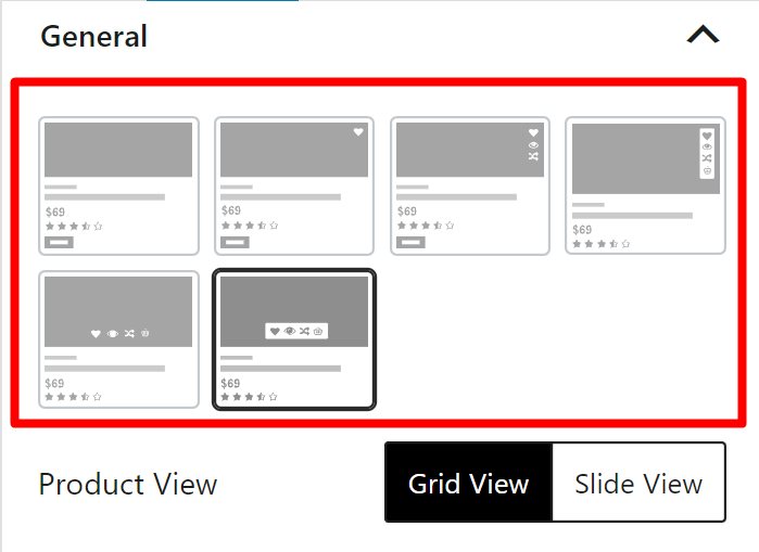
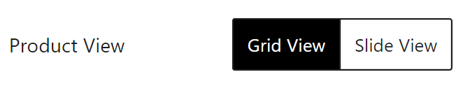
Grid/slide View
You can show your products in grid or slide view, giving you amazing designed output for your store.
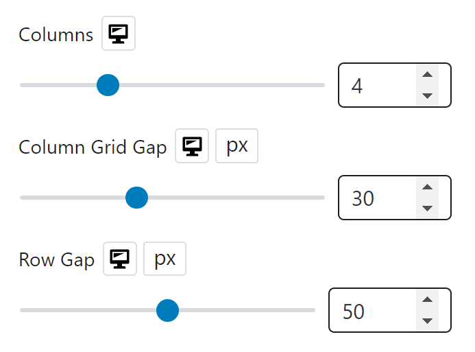
Row/Column Option
Row/column controls the number of products displayed. For this block, you can adjust Columns, Column Grid Gap & Row Gap.
Show/Hide Elements
You can show or hide different elements for the blocks, like:
- Show Quick View
- Show Compare
- Show Out of Stock
- Show In Stock
- Image Flip
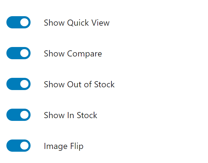
Note: These elements have layout dependencies, so choose the layout appropriately before enabling elements. Otherwise, it won’t work.
Also, you will have an alignment control for product title, meta & excerpt together.
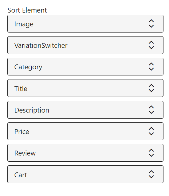
Element Sorting
You can change the elements of the product to sort which information to show where.
You’ll have dragging options to adjust the following elements to place:
- Image
- VariationSwitcher
- Category
- Title
- Description
- Price
- Review
- Cart
Product Sorting
You can sort out your products with WowStore’s amazing query builder. It provides both basic and advanced product sorting options for this block.
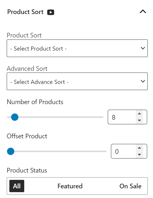
Check out more about the query builder for product sorting.
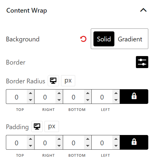
Content Wrap
Content wrap is the settings for the text based content section. This setting section allows you to customize color, border, border radius, and padding-based settings.
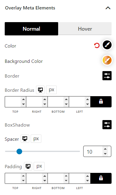
Overlay Meta Elements
Some layouts in this block have overlay meta elements. And you can change its color (regular, hover, background) and adjust the border, border radius, box shadow, spacing, and padding for the best output.
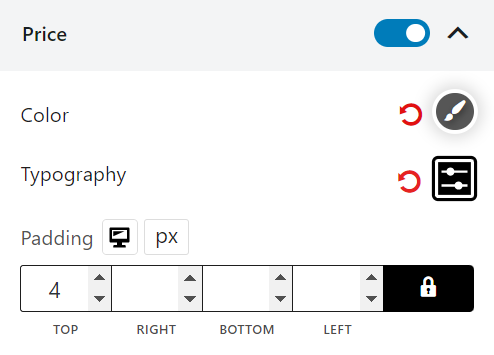
Price Settings
This setting customizes the price related settings for products. In the price settings, you can show/hide the price and adjust the color and typography for this block.
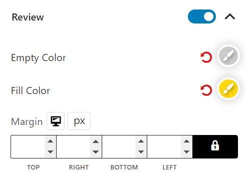
Review Settings
The review setting defines the rating section of this block, meaning you can enable/disable the rating stars, adjust the regular and filled colors, and modify the margins.
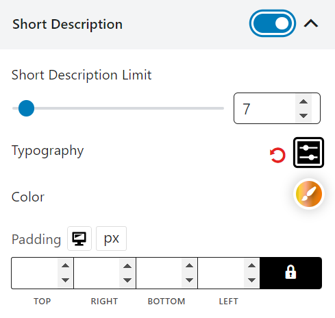
Short Description Settings
Show/hide a short description of products, and adjust the character limit for it.
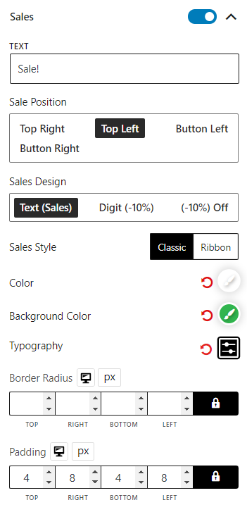
Sales Settings
Show/hide product sales tags and adjust the text, position, style, color, background color, typography, border radius and padding.
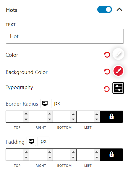
Hots Settings
Turn hots for products on/off and adjust texts, colors, background, color typography, border radius and padding.
Deal Settings
Deal settings showcase the time of a deal duration for products. You can turn it on or off and adjust the color background, color count, typography, day typography, border radius, spacer and padding.
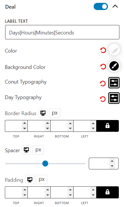
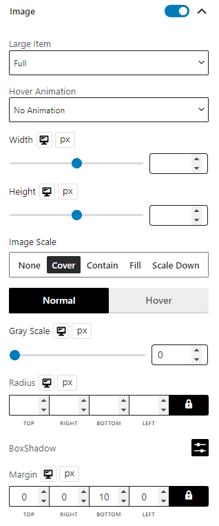
Image Settings
If you want to show/hide it, you’ll have image control options, change image size, select an animation, adjust the width, height, image scaling, gray scale, radius, box shadow (for both normal and hover), and margins for this block.
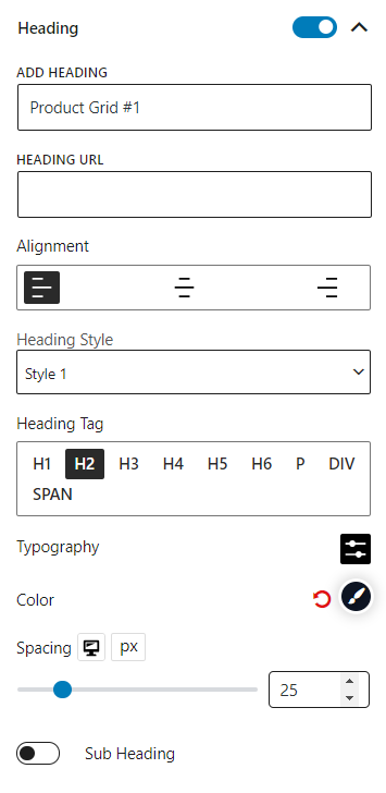
Heading Settings
This is a heading of the block; you can turn it off, change the heading text, add a URL, alter the alignments, choose heading styles and tags, add subheadings, and modify typography and colors for this block.
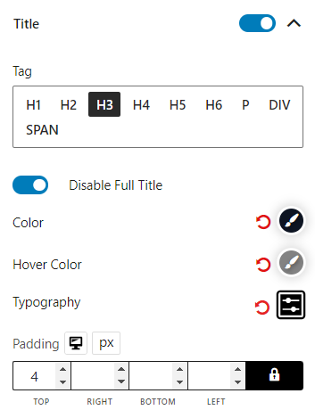
Title Settings
This setting is for the product title. You can turn it off if you want. You’ll also have the settings to adjust the tag and turn off the full title, color, hover color, typography, and padding.
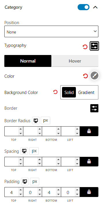
Category Settings
You can choose to display the product category and even turn it off. Also, options to adjust typography, color (normal & hover), background color, border, border radius, spacing, and padding.
Filter Settings
Filters work similarly to query sorting. However, the major difference is users/customers will have some control, as they can see products based on category and tags if enabled.
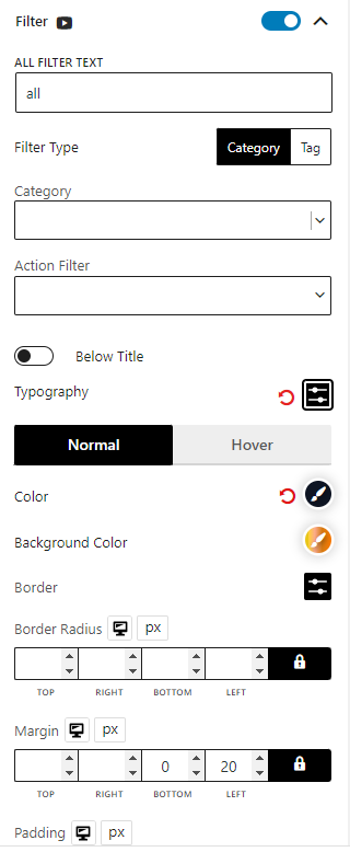
You can select the filter type (Category & tag), choose multiple categories and tags,
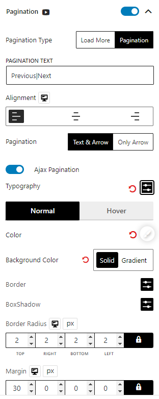
Pagination Settings
Enable pagination (numeric/load more) options for this block. Change text, alignment, typography, colors (normal & hover), background color, border, box shadow, border radius, margin, and padding of the pagination.
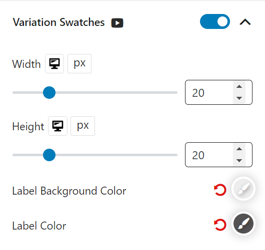
Variation Swatches Settings
Enable variation swatches for variable products meaning the default dropdown variation will be changed with a clickable image/color based swatch. You can modify the width, height, label background color, and label color for variations.
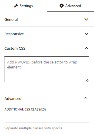
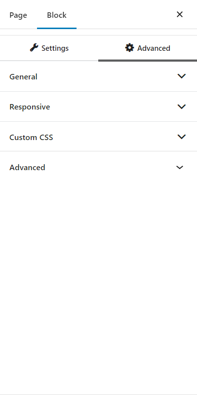
Advanced Settings
In the advanced tab, you will get settings for the following:
- General
- Responsive
- Custom CSS
- Advanced
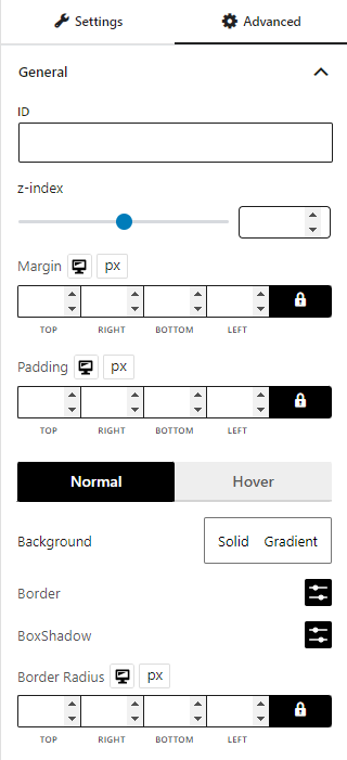
General
You can modify class ID, z-index, margin, padding, normal & hover colors, border, box shadow, and border radius from the general settings.
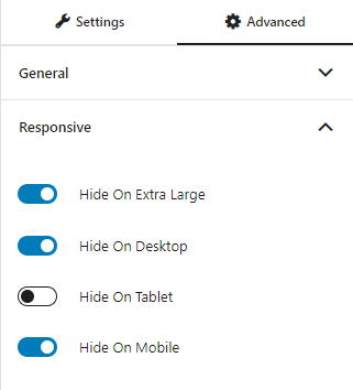
Responsive
You will have the responsiveness settings for the blocks if you want to show the block on particular devices or not.
Use the toggle bar to enable the following options:
- Hide On Extra Large
- Hide On Desktop
- Hide On Tablet
- Hide On Mobile
Custom CSS & Advanced
You can manually add your custom CSS to modify your blocks in the custom CSS field. And in the advanced field, you can add custom CSS classes.