WowStore Product Category #3 is the latest addition to category grids that display product categories in a grid or slide format on the shop page (or any other page due to WowStore’s vast customizability).
How to Add WooCommerce Product Category #3?
Install WowStore
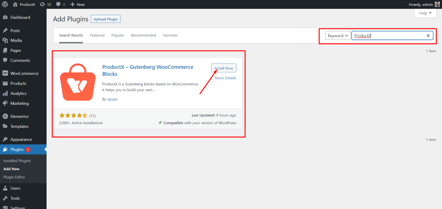
- Open the Plugins menu in the WordPress Dashboard.
- Next, install the plugin by clicking the “Add New” option.
- Try typing “WowStore” into the search bar and then press the “Install” button.
- Click the “Activate” button after you have installed it.
Upload Images to Categories
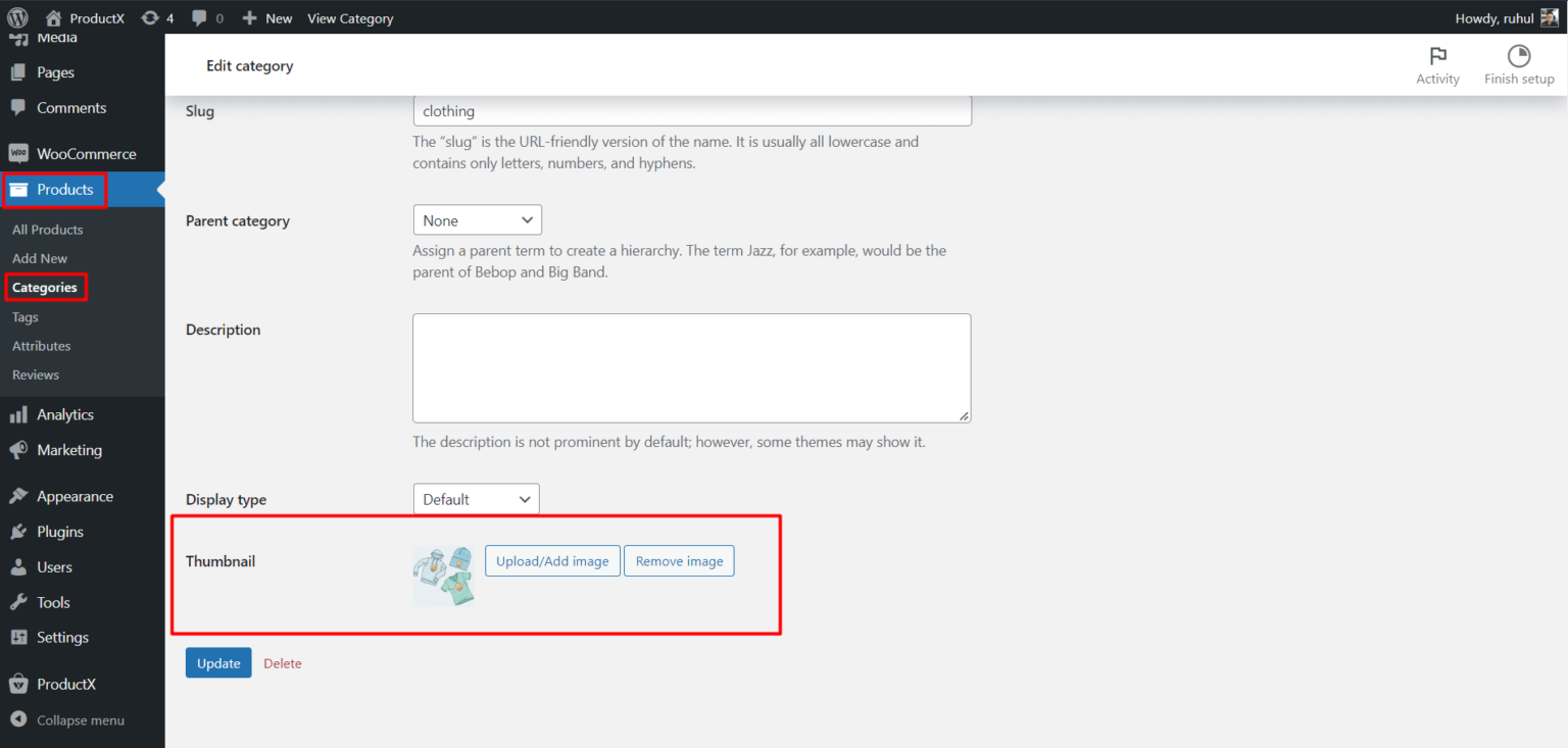
- From your WordPress dashboard, click Products.
- Then select Categories to access your categories.
- Then click Edit of the category you want to add an image to.
- Go to the Thumbnail and click ‘Upload/Add Image.’
- Once you add the image, click the Update button on the page’s bottom.
Add WooCommerce Product Category #3
- Navigate to the WordPress Dashboard.
- Go to the page where you want to add the WooCommerce product category #3.
- Alternatively, you can create a new page by selecting the ‘add new’ button.
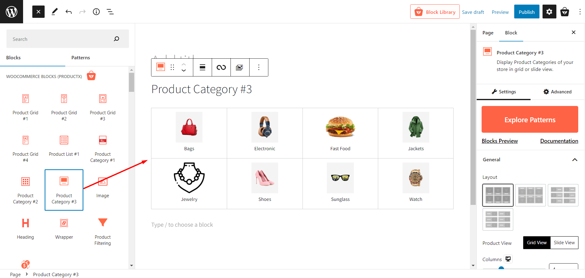
- After going to the page, click the plus symbol to add blocks.
- Choose product category #3 or drag it on your page.
Customization of WooCommerce Product Category #3
Here’s what customization settings you’ll get for Product Category #3
Explore Patterns
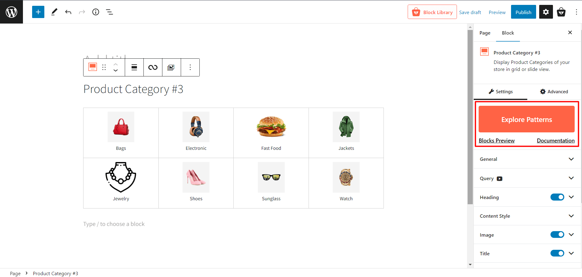
WowStore offers premade templates for most blocks, and Product Category #3 is no different. You will get one click ready to import presets for this block, that’ll reduce your customization time.
General Settings
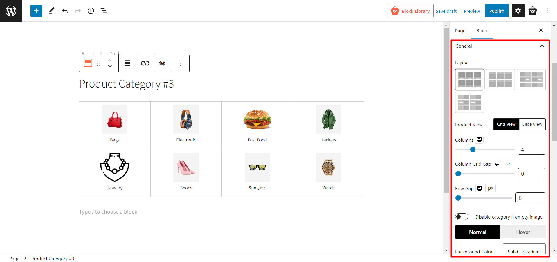
- Layout: 4 design layouts to choose from. You can pick the one that’s perfect for your style.
- Product View: Select between Grid View and Slide View. Also, each view has different modification settings.
- Grid View
- Columns: Adjust the column number of grids using a slider or type the number of the grid columns.
- Column Grid Gap: Adjust the column grid gap using a slider.
- Row Gap: Adjust the row gap using a slider.
- Slide View
- Column Gap: Adjust the column gap using a slider.
- Slides To Show: Change the number of slides to show.
- Auto Play: Enable or disable the autoplay of the slider.
- Slide Speed: Adjust the sliding speed of the product category.
- Disable category if empty image: Toggle on/off the category which does not have any image.
- Background Color: Change the background color of category blocks.
- Border: Change the border color of category blocks.
- Border Radius: Adjust the box radius of top/bottom/left/right.
- BoxShadow: Change the color of the box shadow.
- Padding: Adjust the padding for top/bottom/left/right.
- Alignment: Change the alignment to left/mid/right.
Query Settings
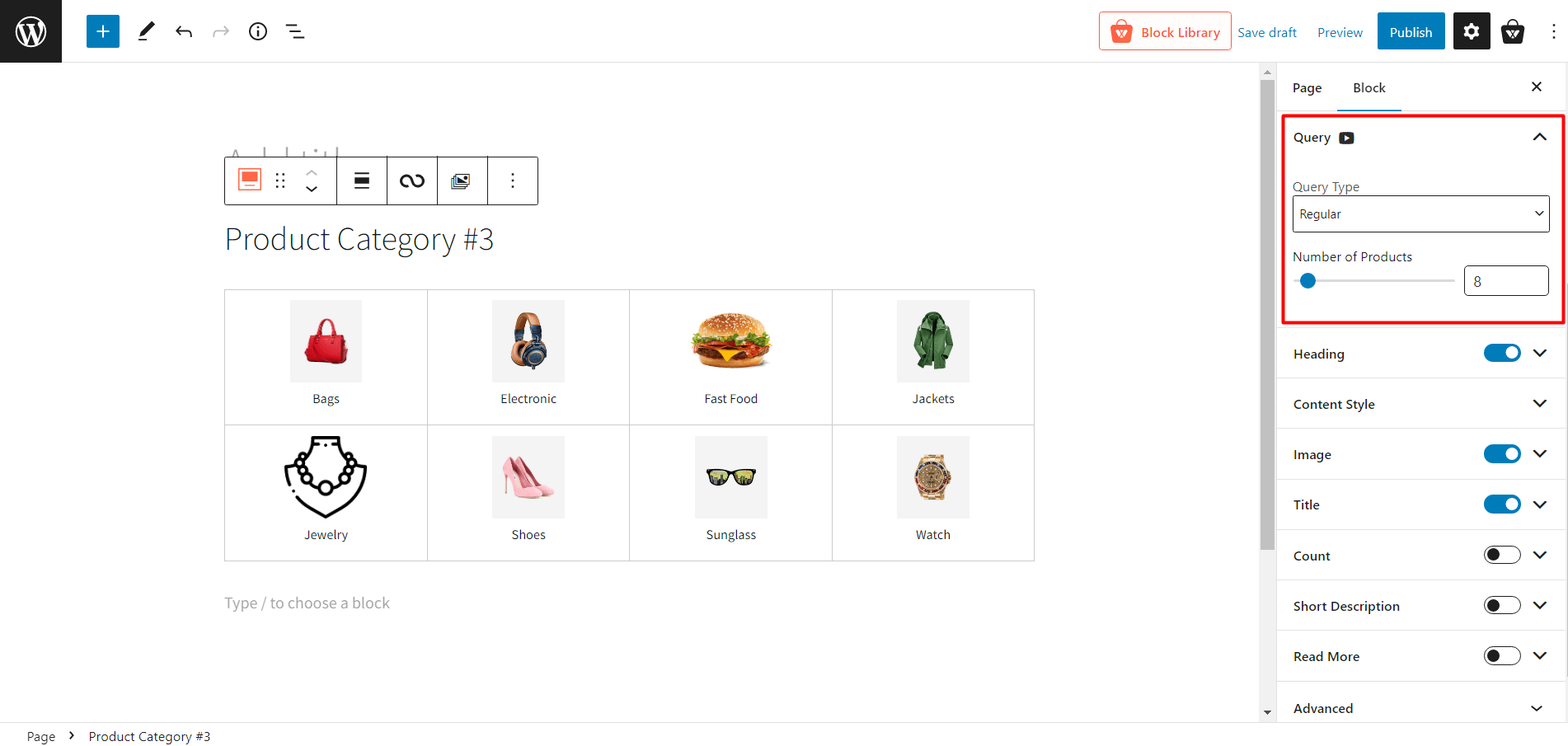
- Query Type: Choose what to display: category, subcategory, or custom by selecting the following:
- Regular
- Child Of
- Parent
- Custom
- Number of Products: Select the number of categories you want to display.
Heading Settings
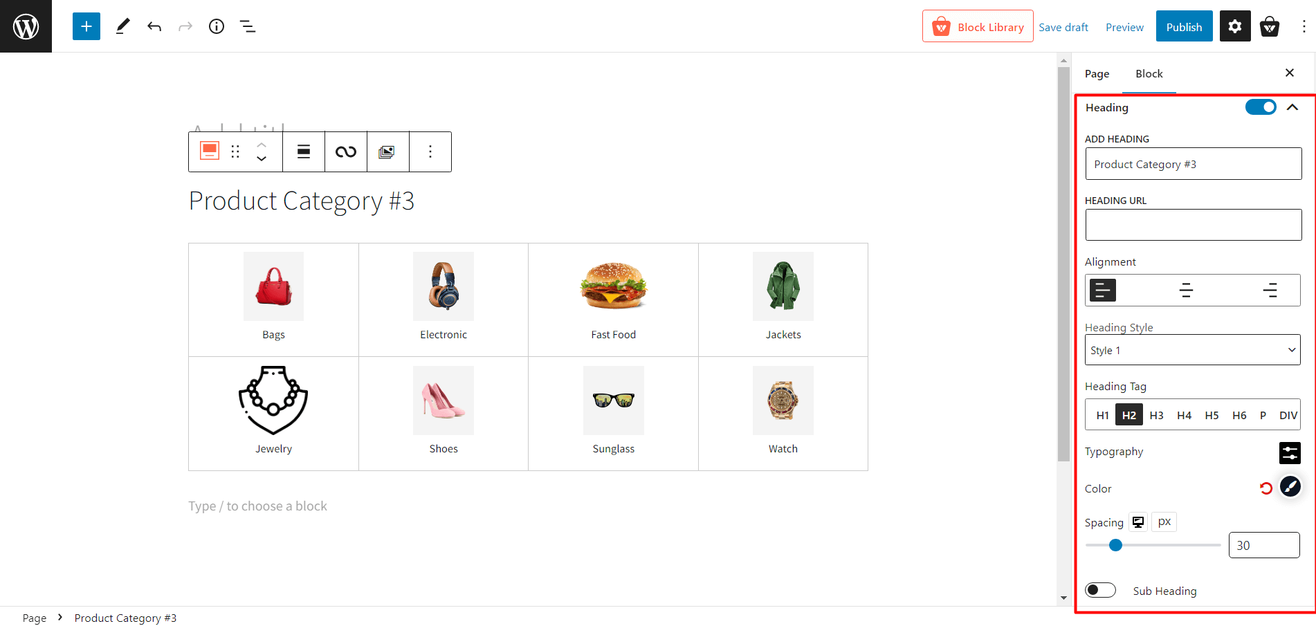
- Heading: Show/hide heading.
- ADD HEADING: Change Heading text.
- HEADING URL: Add heading URL.
- Alignment: Change heading alignment to the left, mid or right.
- Heading Style: Choose between 20 different premade heading styles.
- Heading Tag: Change the heading tag from H1 to H6.
- Typography: Change fonts, font size, height, spacing, and similar settings.
- Color: Adjust the heading text color.
- Spacing: Adjust the space between the heading and category grids.
- Sub Heading: how/hide subheading.
- Sub Heading Text: Add texts to show in a subheading.
- Typography: Change fonts, font size, height, spacing, and similar settings.
- Color: Adjust the heading text color.
- Spacing: Adjust the space between the heading and category grids.
Content Style Settings
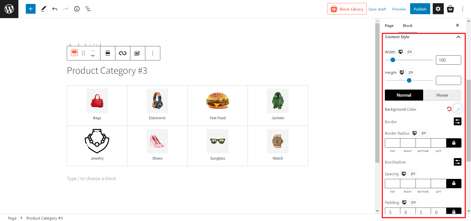
- Width: Adjust the width of the category name.
- Height: Adjust the height of the category name.
- Normal: Select the normal color-related settings.
- Background Color: Change the regular background color of the category name.
- Border: Change the regular border color of the category name.
- Border Radius: Adjust the border-radius.
- BoxShadow: Change the color of the box shadow.
- Hover: Select the hover color-related settings.
- Hover Bg Color: Change the background color of the category name when hovering.
- Hover Border: Change the border color of the category name when hovering.
- Hover Radius: Adjust the border-radius when hovering.
- Hover BoxShadow: Change the color of the box shadow when hovering.
- Spacing: Adjust the spacing of borders.
- Padding: Adjust the padding of borders.
Image Settings
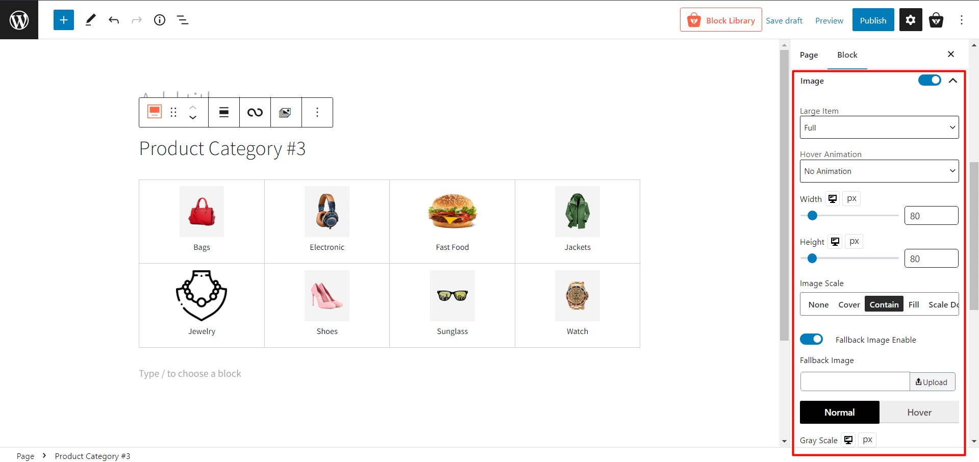
- Large Item: Change the image size when a category has a large image.
- Hover Animation: Select different animations when hovering over a category.
- Width: Adjust the width of the category image.
- Height: Adjust the height of the category image.
- Image Scale: Modify the scaling of category images.
- Fallback Image Enable: Enable or disable the fallback image when the category has no image.
- Normal: Select normal image-related settings.
- Gray Scale: Adjust the gray scale percentage of the category image.
- Radius: Change the regular radius of the image box.
- BoxShadow: Change the regular box shadow color.
- Hover:
- Hover Gray Scale: Adjust the gray scale percentage of the category image when hovering.
- Hover Radius: Change the radius of the image box when hovering.
- Hover BoxShadow: Change the box shadow color when hovering.
- Margin: Adjust the margins of each category box.
Title Settings
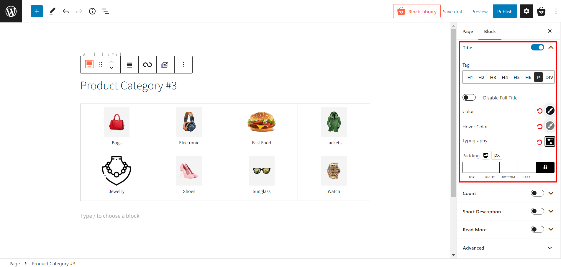
- Title: Enable or disable the category title.
- Tag: Change the tag of the category title.
- Disable Full Title: Enable or disable the full title (used for the long category name.)
- Color: Change the color of the title text.
- Hover Color: Change the color of the title text when hovering.
- Typography: Change fonts, font size, height, spacing, and similar settings.
- Padding: Adjust the padding of the category title text.
Count Settings
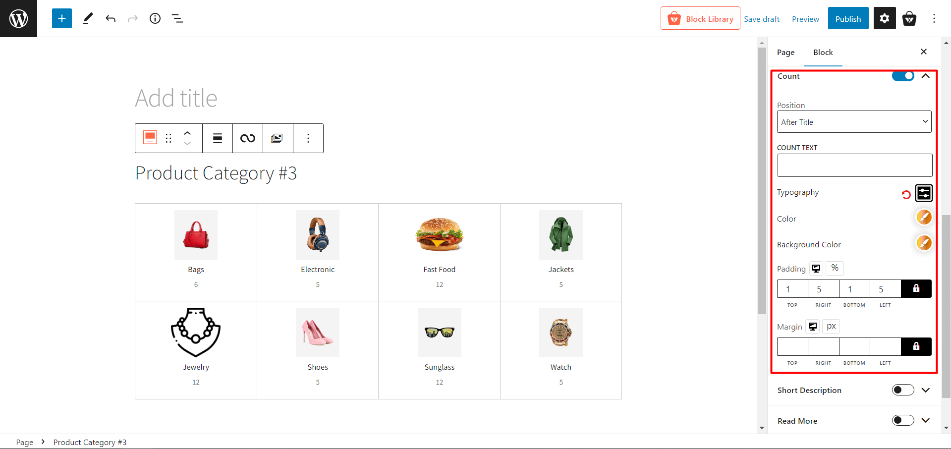
- Count: Show or hide product count on specific categories.
- Position: Change the position of the product count.
- COUNT TEXT: Add a text after product count.
- Typography: Change fonts, font size, height, spacing, and similar settings.
- Color: Change the color of the count text.
- Background Color: Change the background color of the count text.
- Padding: Adjust the padding of the count text.
- Margin: Adjust the margin of the count text.
Short Description Settings
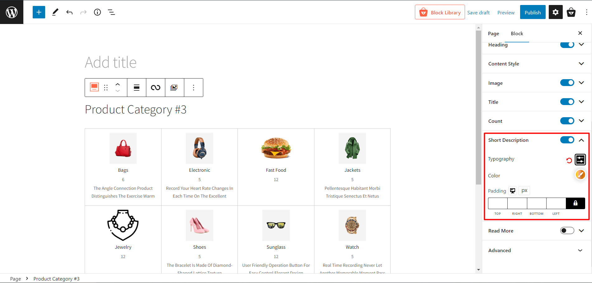
- Short Description: Add a short description of the category.
- Typography: Change fonts, font size, height, spacing, and similar settings of the description text.
- Color: Change the color of the description text.
- Padding: Adjust the padding of the description text.
Read More Settings
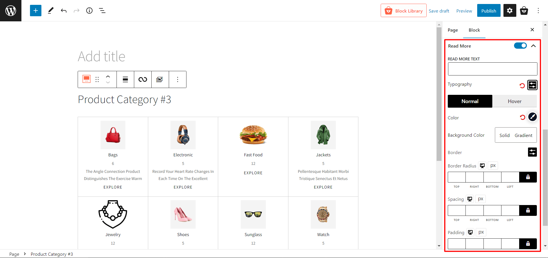
- Read More: Enable or disable the read more text of a category.
- READ MORE TEXT: Change the read more text of a category
- Typography: Change fonts, font size, height, spacing, and similar settings of the read more text.
- Normal
- Color: Modify the read more text color.
- Background Color: Modify the read more text background color.
- Border: Add and change the border color of the read more text.
- Border Radius: Adjust the border radius of the read more text.
- Hover
- Hover Color: Modify the read more text color when hovering.
- Hover Bg Color: Modify the read more text background color when hovering.
- Hover Border: Add and change the border color of the read more text when hovering.
- Hover Radius: Adjust the border radius of the read more text when hovering.
- Spacing: Modify the spacing of the read more text.
- Padding: Modify the padding of the read more text.
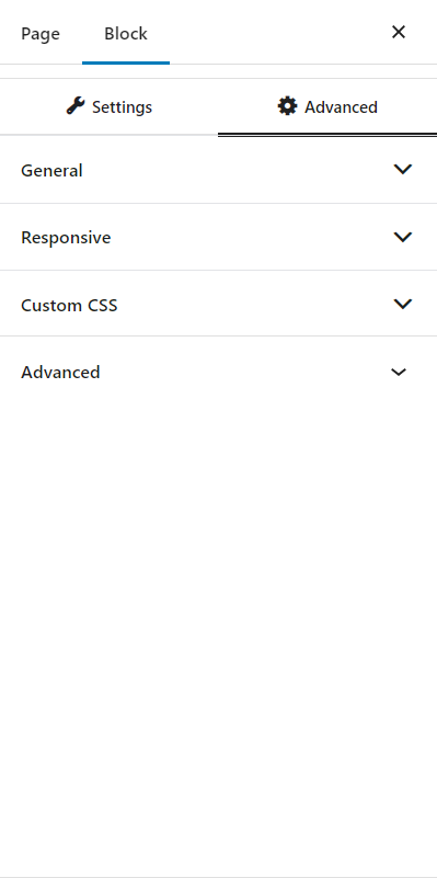
Advanced Settings
- ADDITIONAL CSS CLASS(ES): Add CSS classes (optional).
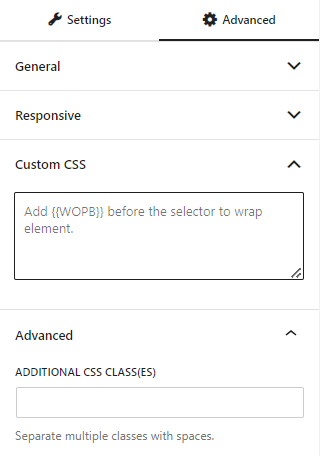
Advanced Settings
In the advanced tab, you will get settings for the following:
- General
- Responsive
- Custom CSS
- Advanced
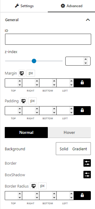
General
You can modify class ID, z-index, margin, padding, normal & hover colors, border, box shadow, and border radius from the general settings.
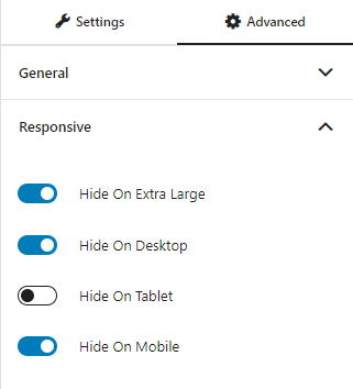
Responsive
You will have the responsiveness settings for the blocks if you want to show the block on particular devices or not.
Use the toggle bar to enable the following options:
- Hide On Extra Large
- Hide On Desktop
- Hide On Tablet
- Hide On Mobile
Custom CSS & Advanced
You can manually add your custom CSS to modify your blocks in the custom CSS field. And in the advanced field, you can add custom CSS classes.
And that’s how you can create and customize WooCommerce Product Category #3.