In this, we will show you the step-by-step settings you will get when creating and customizing WordPress bullet points using the powerful List Block of PostX.
How to Create WordPress Bullet Points using the List Block of PostX
Enhance your lists further with unique icons or custom image bullets. PostX provides a wide range of icon libraries and allows you to upload custom images, giving you the flexibility to create visually appealing and engaging lists.
Video Guide
Here’s a video guide for you so you can have a better understanding of the advanced list block of PostX.
Step 1: Adding PostX List Block
To unlock advanced list customization options, install and activate PostX.
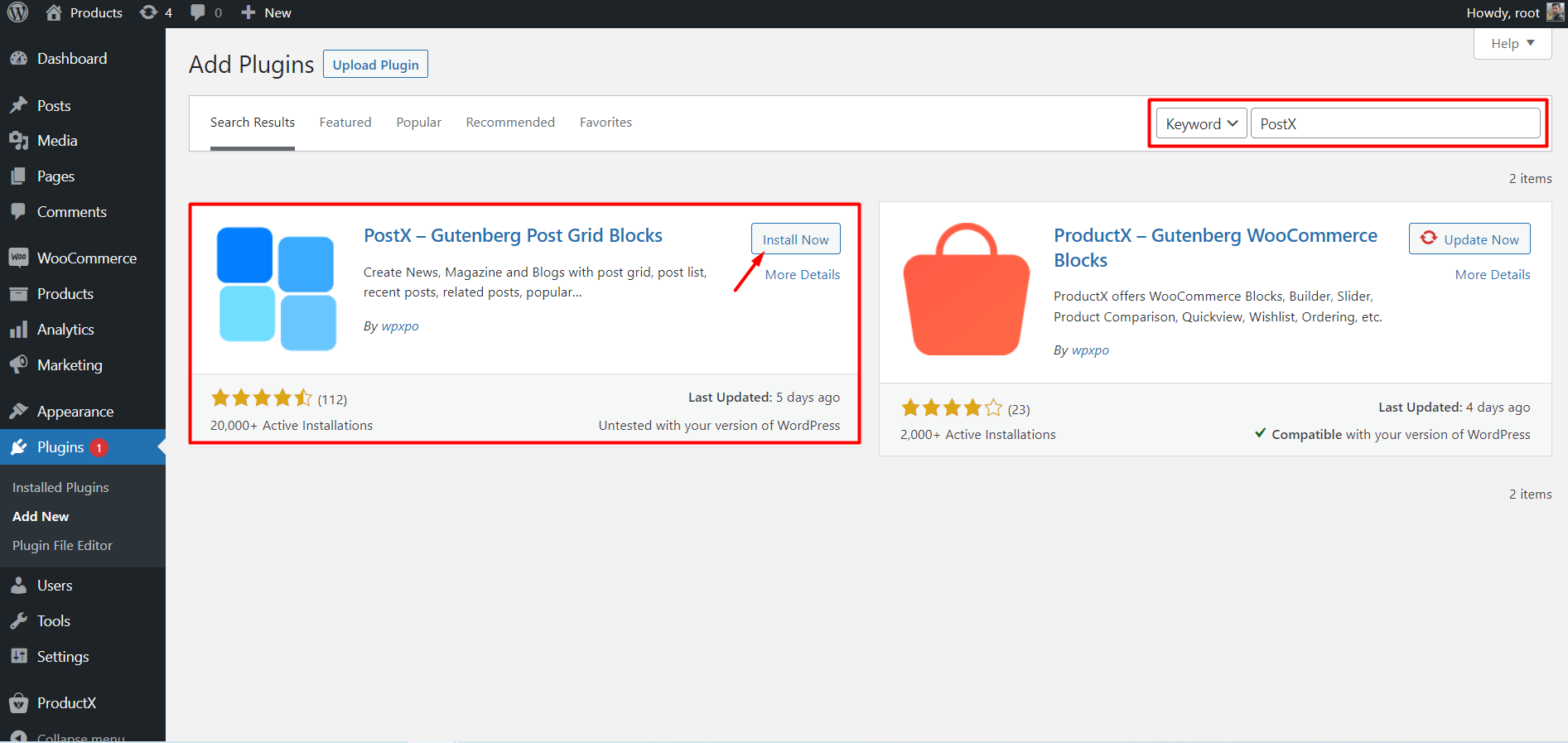
Now, from the WordPress editor, create or edit a page. Add the “List – PostX” block by clicking the “+” icon, searching for “List – PostX,” and selecting it. Customize the block to your preferences.
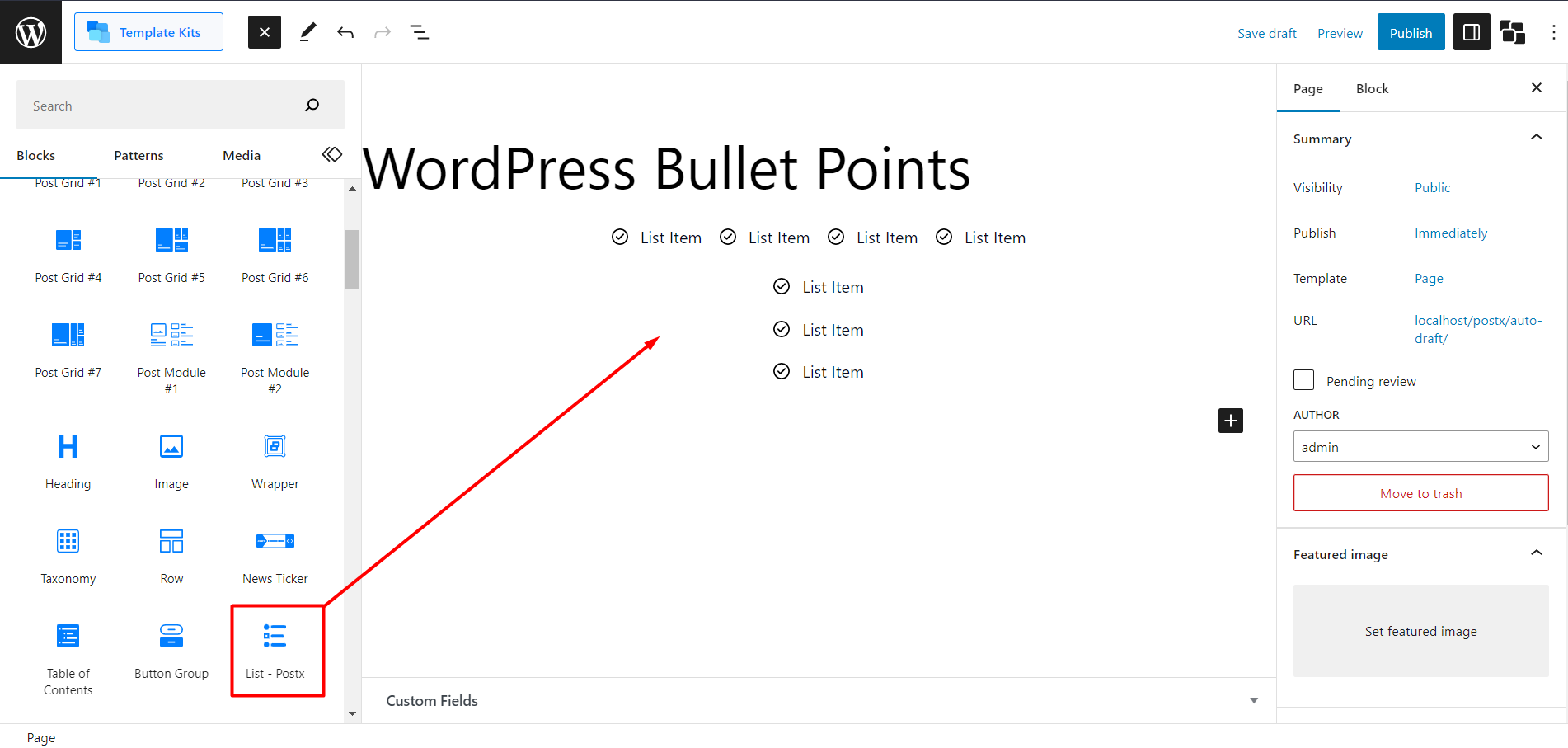
Once you’ve added the “List – PostX” block to your page, you’ll have a range of customization settings. So, let’s check them out.
Step 2: Importing Premade Patterns
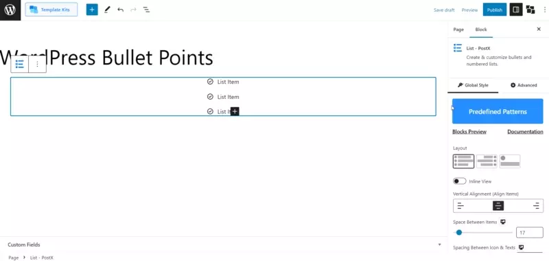
Once you’ve added the List block, click on the block to access its settings.
- Look for the “Predefined Patterns” option within the settings.
- Click on “Predefined Patterns” to open the pattern library.
- To ensure you have the latest patterns, click the “Synchronize” button.
- Browse through the collection of premade patterns and select the one that best suits your needs.
- Once you’ve chosen a pattern, click the “Import” button.
- The selected pattern will be imported into your List block, instantly applying the predefined styles and settings.
You can further customize the imported pattern to match your preferences if desired.
Note: Always click synchronize before importing any pattern because we constantly update the patterns for the best output possible.
Step 3: Customizing WordPress Bullet Points
Now, let’s step up the game with spicy customizations of PostX. Once you click the block, you will find the settings in the right sidebar.
Global Customization Settings for List Block
First, we will check the settings to customize the list globally. So, let’s start without any delay
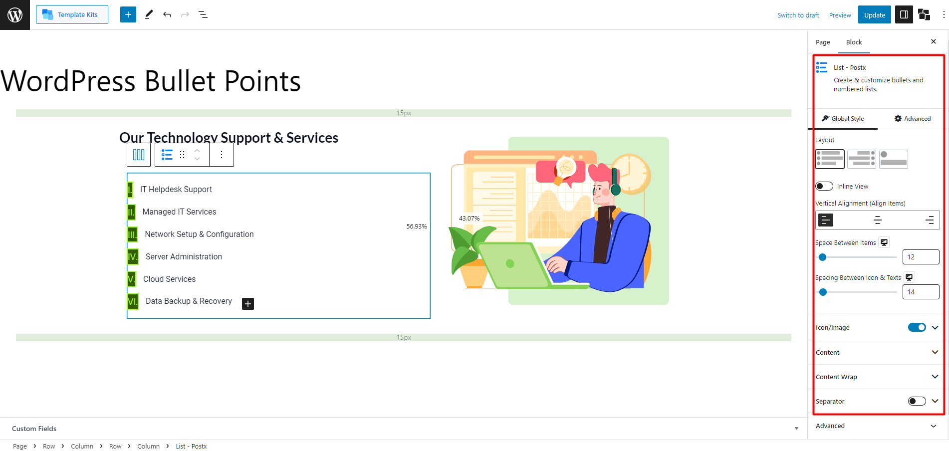
Layouts
The Layouts settings in the list block provide you with three different options to choose from. Here’s an overview of each layout:
- Layout 1: This layout displays the bulleted list in a regular column-like view. Each list item is represented by a bullet point, followed by the corresponding text.
- Layout 2: With this layout, the text is showcased first, followed by the bulleted points. It also adopts a columned display, but the emphasis is on the text content. This layout can be helpful when highlighting the textual information before presenting the bullet points.
- Layout 3: In this layout, the bulleted icon is positioned at the top, and the text field appears below it in a column. This arrangement draws attention to the bullet point symbol while clearly associating it with the corresponding text. It offers a visually distinct presentation style.
Inline View: By enabling the “Inline” setting, the list block will be displayed in a row format instead of the default column format. This allows the bullet points and text to appear horizontally in a single line. You can apply this setting to any of the available layouts.
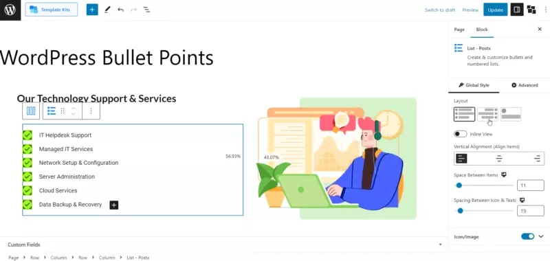
Vertical Alignment: This setting allows you to change the alignment of the bullet points within the list. You can choose between left, center, or right alignment, based on your preference and design requirements.
Space Between Items: With the “Space Between Items” slider, you can adjust the spacing between each point in the list. Increase or decrease the value to create a desired gap between two consecutive list items, enhancing the visual separation and readability.
Spacing Between Icons & Texts: This setting lets you control the space between the bullet point icons and the corresponding text. Use the slider to increase or decrease the gap, ensuring proper alignment and visual harmony between the icons and text content.
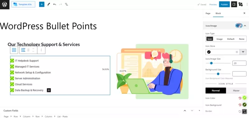
Icon/Image
The “Icon/Image” setting in the list block provides various options to customize your bullet points. Let’s explore each option.
Icon
Selecting the “Icon” option allows adding icons from an extensive library. You can also adjust the size of the icons and their background size.
Advanced customization options include changing the color, hover color, icon background color, and hover icon background color. You can also select different types of borders and specify their width and color with border-radius.
Image
Choosing the “Image” option lets you add images as bullet points. You can adjust the size of the image and its background size.
You can modify the regular and hover icon background colors in the color settings. Additionally, you can select different types of borders and choose their width and color.
Default
Selecting the “Default” option allows you to use traditional bullet points, such as ABC, Roman numerals, or regular numeric bullets. You can customize their typography and background size.
Like the previous options, you can adjust the color, hover color, icon background color, and hover icon background color. Additionally, you can choose different types of borders and specify their width and color with a border-radius.
None
The “None” setting is ideal if you prefer not to add any bullets or images to your list. This option removes any visual markers, leaving only the text.
Content
The Content settings in the list block offer various options to customize the appearance and layout of your list. Here’s an overview of the available settings.
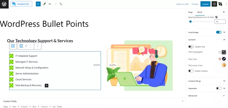
- Disable Text: This option allows you to disable the text displayed in your list items. When enabled, the text content of the list will not be visible.
- Title Typography: Choose the font family, size, weight, and other typographic properties for the list of item titles. This setting lets you define the visual style of the title text.
- Title Color: Set the color of the list item titles. You can choose a specific color or use a color picker to select a custom color that suits your design.
- Title Hover Color: Define the color the list item titles should change when users hover over them. This setting helps to create interactive and engaging lists.
- Enable Subtext: Enable or disable the display of Subtext in your list items. Subtext provides additional information or context related to the list item content.
- Subtext Typography: Customize the font style, size, weight, and other typographic properties for the Subtext displayed alongside the list item titles.
- Space Between Text & Subtext: Adjust the spacing between the list item titles and Subtext. This setting allows you to control the vertical distance between the two elements.
- Subtext Color: Specify the color of the Subtext in your list items. You can choose a predefined color or use a custom color to match your overall design.
- Subtext Hover Color: Set the color the Subtext should change when users hover over the list item. This helps to create an interactive and dynamic user experience.
- Midpoint Subtext: Choose the midpoint alignment style for the subtext. Select between layouts one and two to use this setting properly.
Content Wrap
The “Content Wrap” setting in the list block allows you to control the appearance and styling of the content within the list. Let’s explore each option.
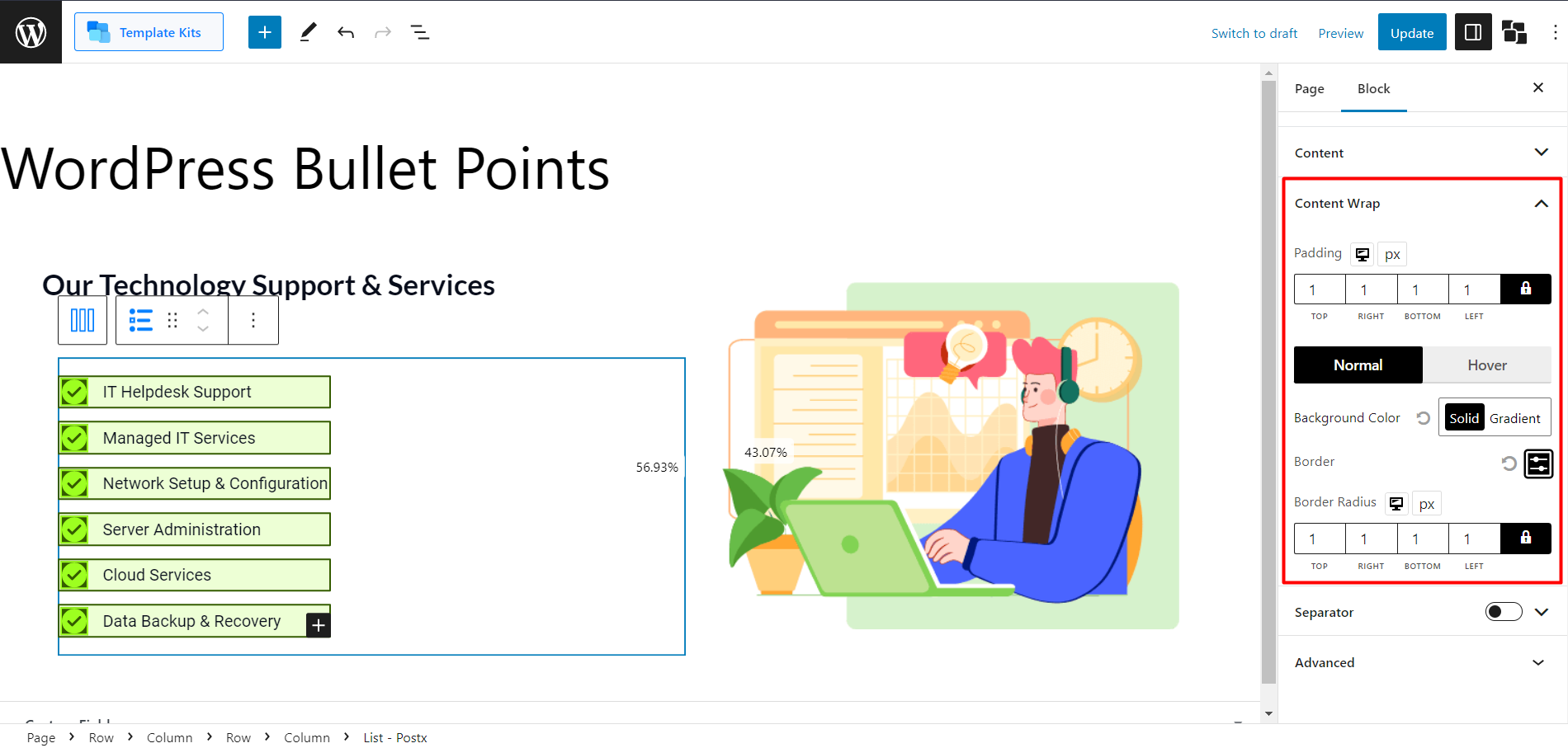
- Padding: By adjusting the padding setting, you can control the spacing between the content and the edges of the list item. Increasing the padding value adds more space while decreasing it reduces the space.
- Background Color: With the background color option, you can choose the color for the background of the list item. The “Solid” option allows you to select a single color for the background. The “Gradient” option enables you to create a gradient effect by selecting two colors that blend smoothly.
- Hover Color: The hover color setting determines the color of the list item when it is hovered over by the cursor. Like the background color, you can choose a single color using the “Solid” option or create a gradient effect with the “Gradient” option.
- Border: The border setting allows you to add a border around the list item. You can customize the border by selecting its type, such as solid, dashed, or dotted, and specifying its width.
- Border Radius: Border radius controls the roundness of the corners of the list item. A higher value creates a more rounded corner, while a lower value produces sharper corners.
Separator
The “Separator” setting in the list block allows you to add a visual separator between the list items. Let’s explore the available options:
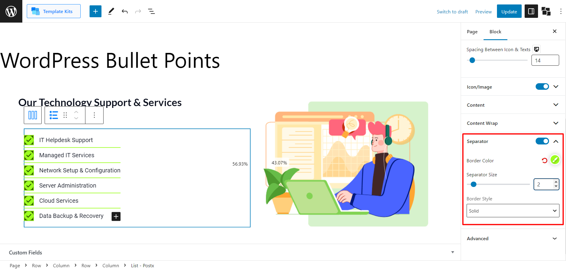
- Border Color: You can select the desired color for the separator border using the border color option. Choose a color that complements your website’s design.
- Separator Size: The separator size setting determines the thickness or width of the separator border. You can increase or decrease the size to achieve the desired visual effect.
- Border Style: The border style option enables you to choose the style of the separator border. Here are the available options:
- None: Selecting “None” will remove the separator border altogether.
- Dotted: This style creates a separator with a dotted line.
- Solid: This style creates a separator with a continuous solid line.
- Dashed: This style creates a separator with a dashed line.
- Groove: This style creates a separator with a bold dark appearance.
Single Bullet Customization Settings for List Block
When customizing a single bullet point in the list block, you have several settings at your disposal. Let’s explore these options:
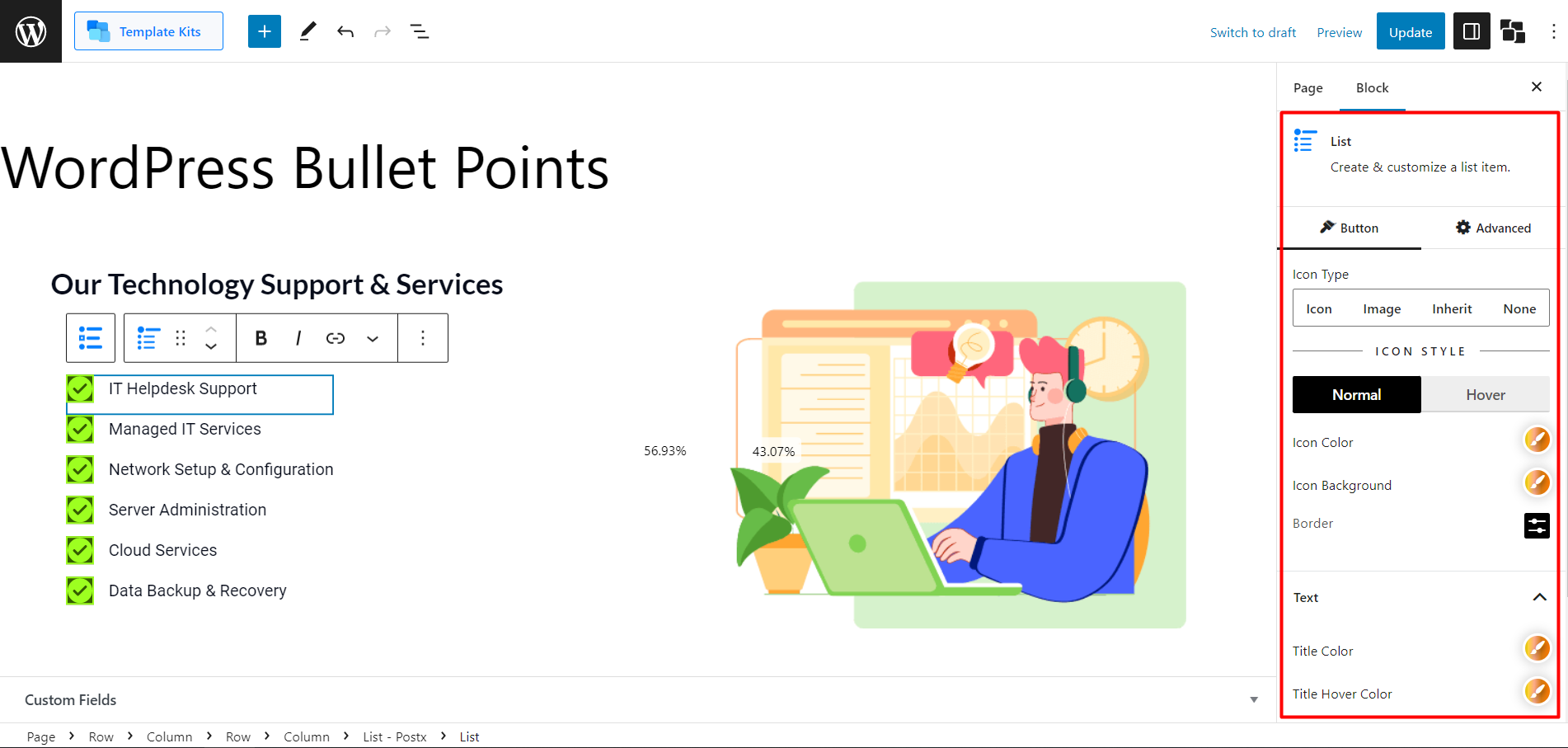
Icon Type
With the “Icon Type” setting, you can choose between different options for the bullet point. You can select:
- Icon: This option allows you to use an icon as the bullet point.
- Image: This option lets you use an image as the bullet point.
- Inherit: This option inherits the bullet point style from the parent list.
- None: Selecting this option removes the bullet point altogether.
Normal and Hover (Icon) Settings
- Icon Color: This setting allows you to choose the icon’s color and its hover color.
- Icon Background: Customize the background color and hover color of the icon.
- Border: Adjust the border settings for the bullet point.
Text Settings and Subtext Settings
- Title Color: Choose the color of the text/title associated with the bullet point.
- Title Hover Color: Set the color of the text/title when it is hovered over.
- Subtext Color: Define the color of the subtext.
- Subtext Hover Color: Set the color of the subtext when it is hovered over.
- Space Between Text & Subtext: Specify the amount of space between the text/title and the subtext.
And that’s all regarding PostX list block customization. Get creative freedom to make WordPress bullet points amazing.