Here’s in-depth documentation to help you explore and use all the exciting features WowStore’s button group block has to offer.
Video Tutorial
Here is a full-on explanation video of using WowStore’s Button Group Block.
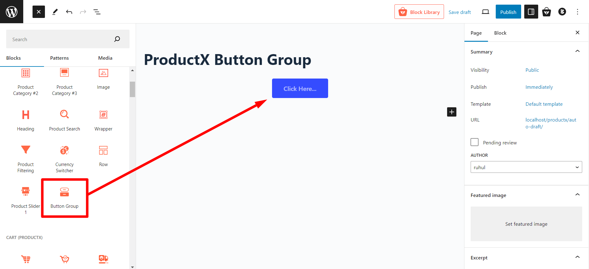
Adding Button Group Block
First, you need to add the Button Group block to your page.
To add the button group block, click the “+” icon to open the all blocks section. Click or drag and drop the “Button Group” block to your page. You can also use the “/” command and type “Button Group” to add it to your page.
You will have two (2) separate customization options for this block—one for the button group and another for the button itself.
We will explore both sets of customization options here.
Customizing Button Group
The button group has a very minimal customization option. But let us check them out!
Adding Multiple Button
Since this is a button group, you can add multiple buttons if you want. Simply click the “+” icon, and a second button will be added.
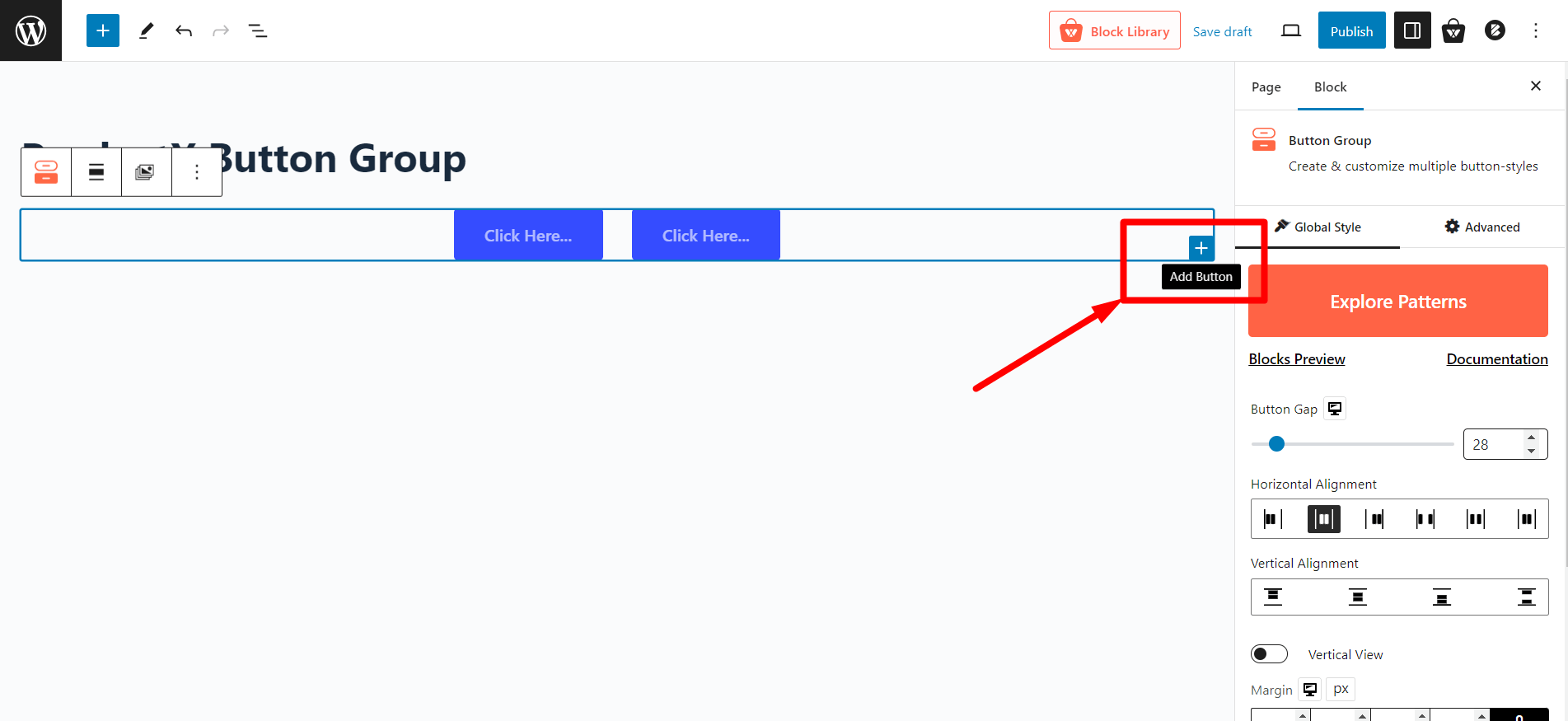
Note: You can add as many buttons as you want in the button group.
Premade Patterns
Like most other WowStore blocks, the button group blocks also have premade patterns available.
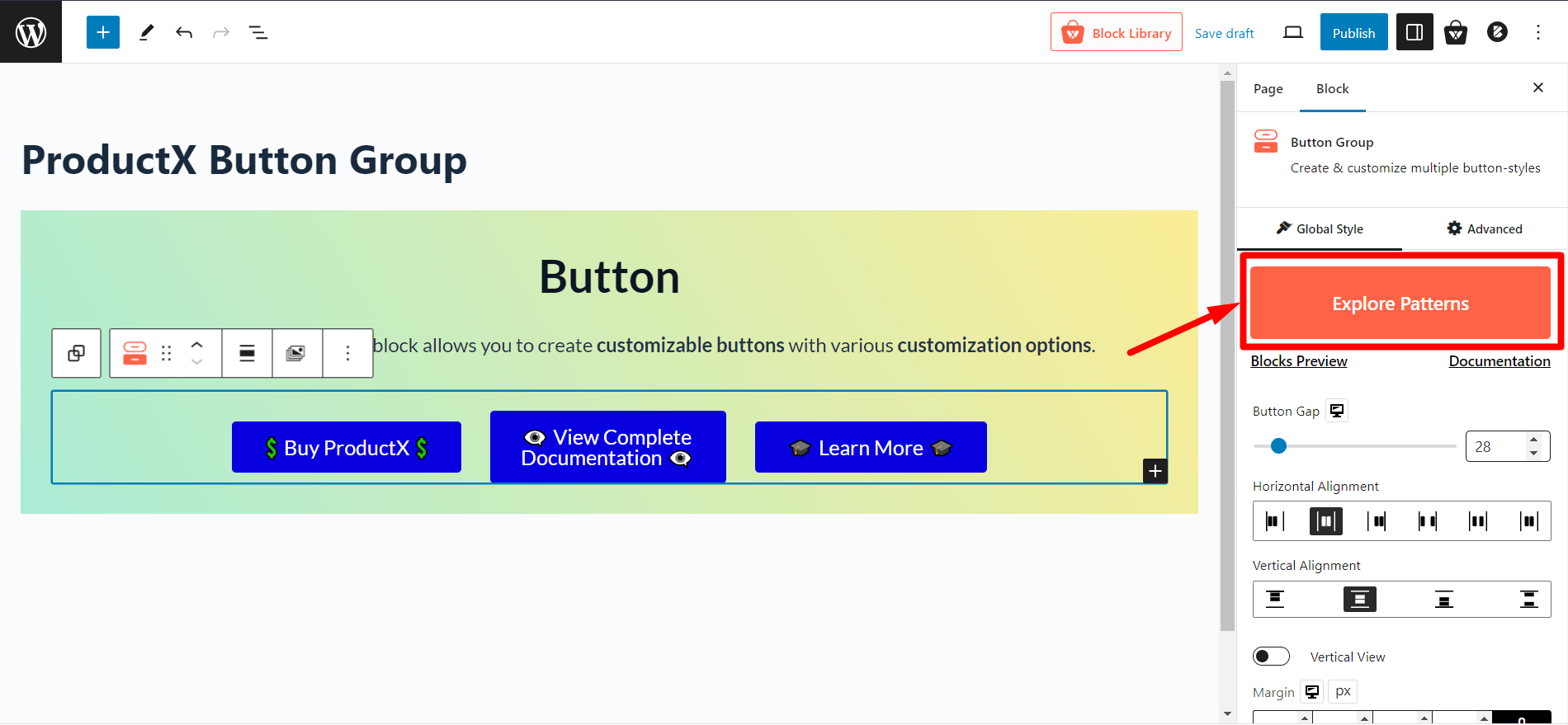
Click the “Explore Patterns” button to see all the available patterns for the button group block. And click “Import” to add it to the block.
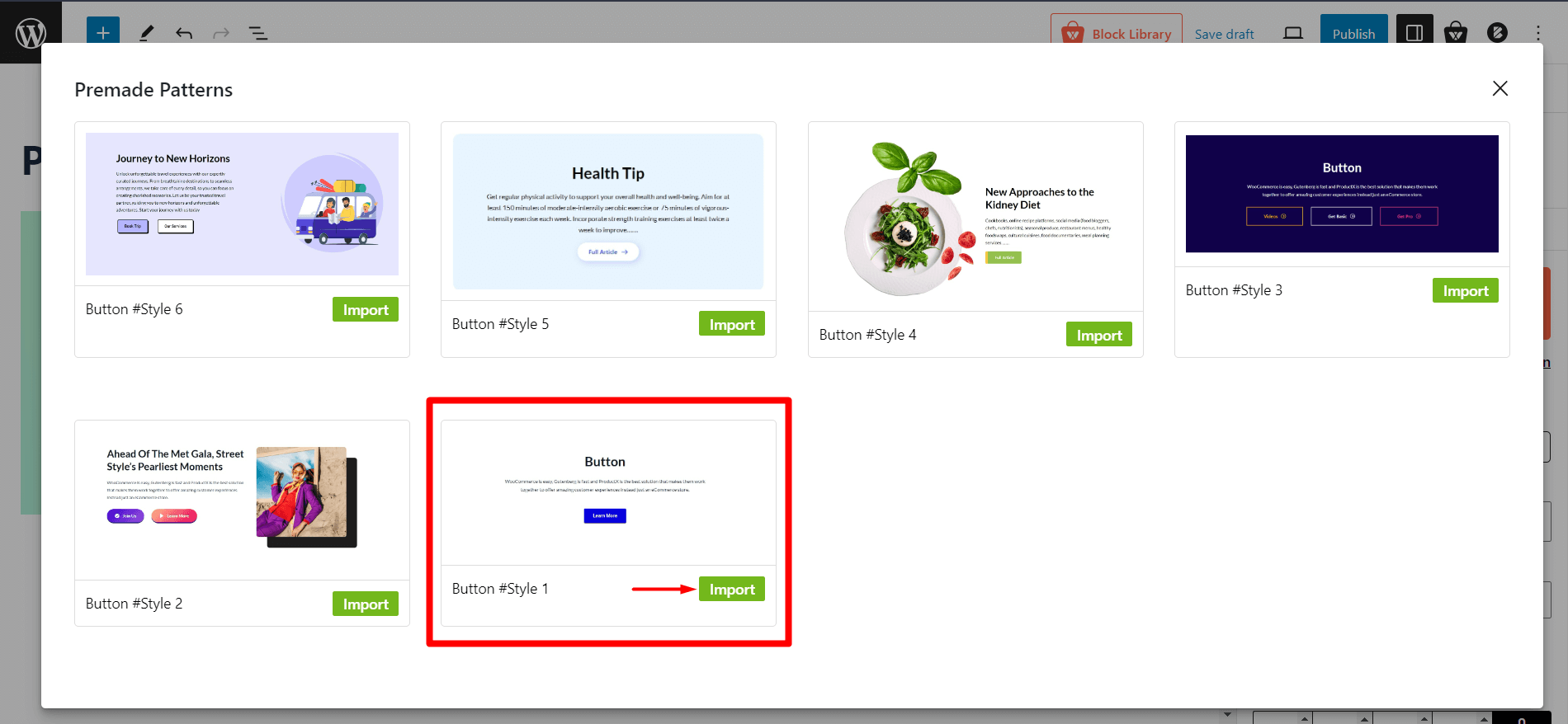
Note: You can further customize the premade designs if you want.
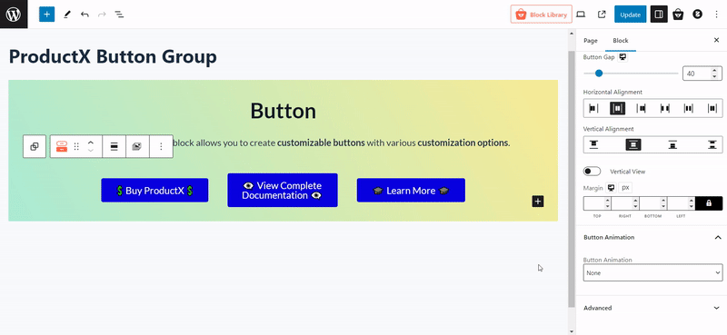
Button Gap
A button group can consist of multiple buttons. And you can adjust the gaps between the two buttons.
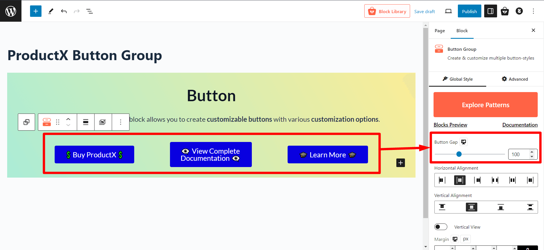
Use the “Button Gap” slider to adjust the gap between buttons (two or more buttons are needed).
Horizontal Alignment
Horizontal alignment settings let you change the predefined alignments of buttons in a group horizontally.
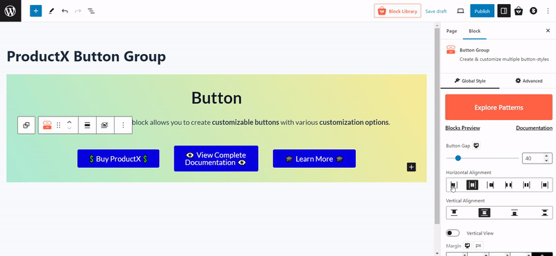
Note: If you have more than two (2) buttons, the horizontal alignment might not work as desired if you have low spacing.
Vertical Alignment
On the first look, vertical alignment might look like it is not working. But let us tell you, it is there for a specific reason, and you will need it when you see how to use it.
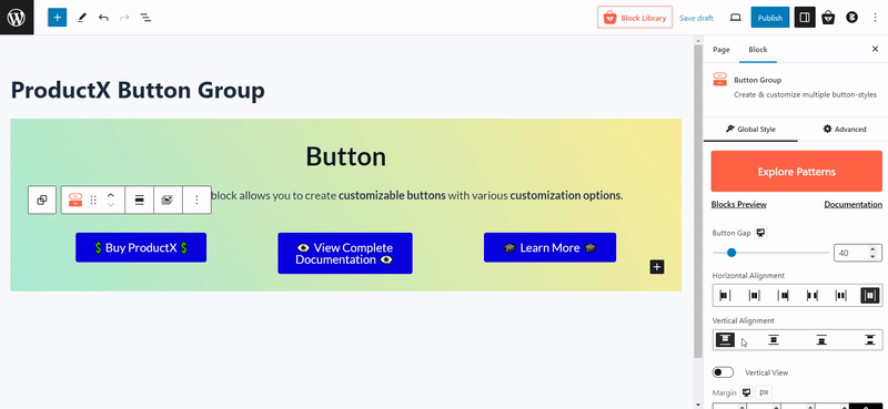
Suppose you have multiple (2, 3, or more) buttons in a button group. Some buttons have single-line text, whereas a particular button has double-line text. Then you can use this setting to align all the buttons vertically.
Vertical View & Horizontal Alignment
This is the option to show the button vertically instead of horizontally. Click the toggle bar to switch the button positions vertically.
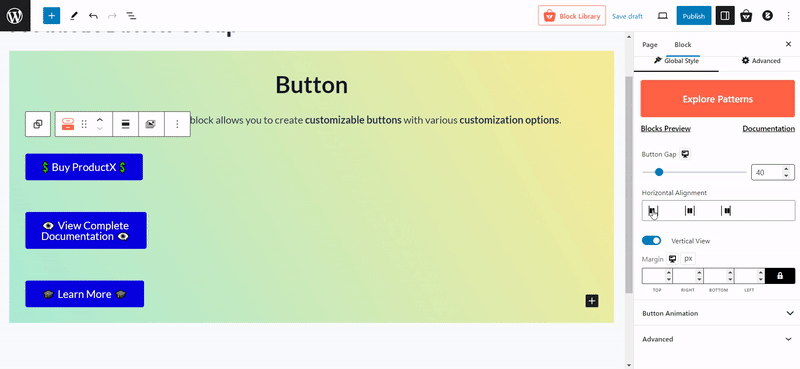
Also, you will get the option to control the vertical buttons’ alignment. Use the Horizontal alignment section to do that.
And you can also adjust the margin of the button group block. You can separately adjust the margins of the top, bottom, left and right.
Button Animation
Button group block also provides preset animations. Currently, you can select 4 different button animation variations from the dropdown.
Customizing Button
Now, let us show you the customization settings for buttons.
Note: These settings are only for particular buttons, so if you have multiple buttons, you must customize them separately.
Styles
WowStore provides 4 different button styles. You can select any to apply the style to a button.
Here is a preview of four different button styles.
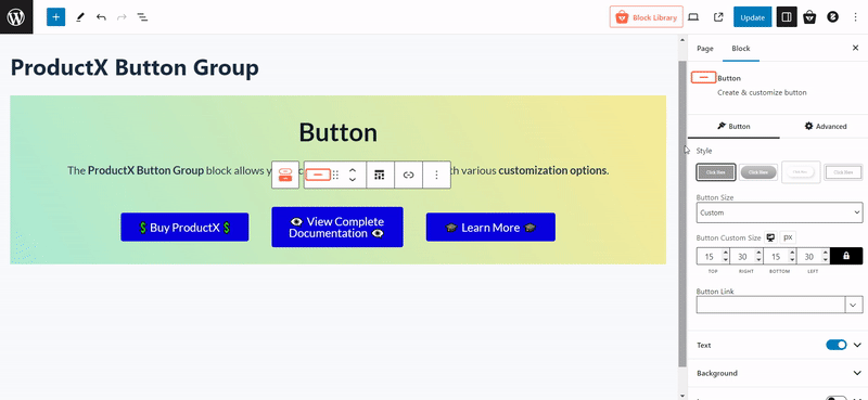
Button Size
You can also select button sizes from the dropdown. You will get the following options:
- Small
- Medium
- Large
- Extra Large
- Custom
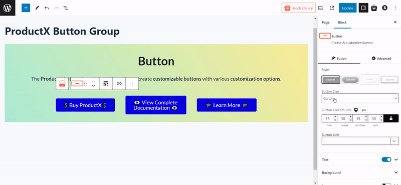
If you select custom, you will see another option, “Button Custom Size,” to configure the sizes from the top, bottom, left and right.
Button Link
Adding links to a button is essential for any store. So, we have added a separate section to paste URLs.
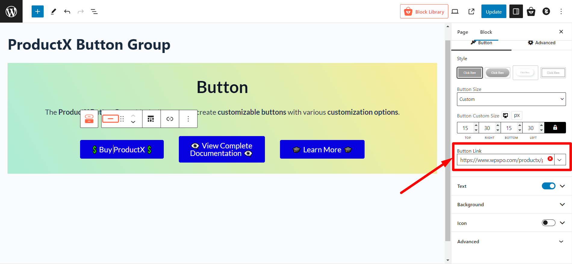
Also, you will have the option to specify the following for a linked button:
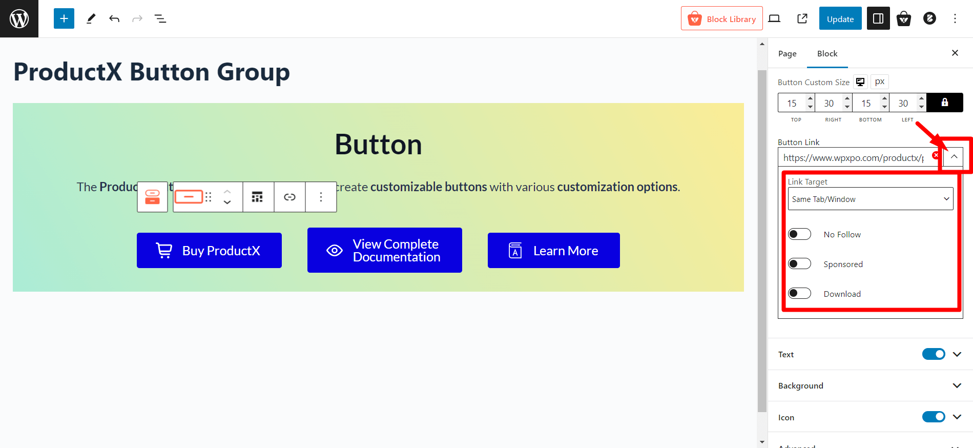
- Open in a new tab
- Same tab/window
- No follow
- Sponsored
- Download
Text
You can customize the text on the button. This includes text typography, text color, and text hover color.
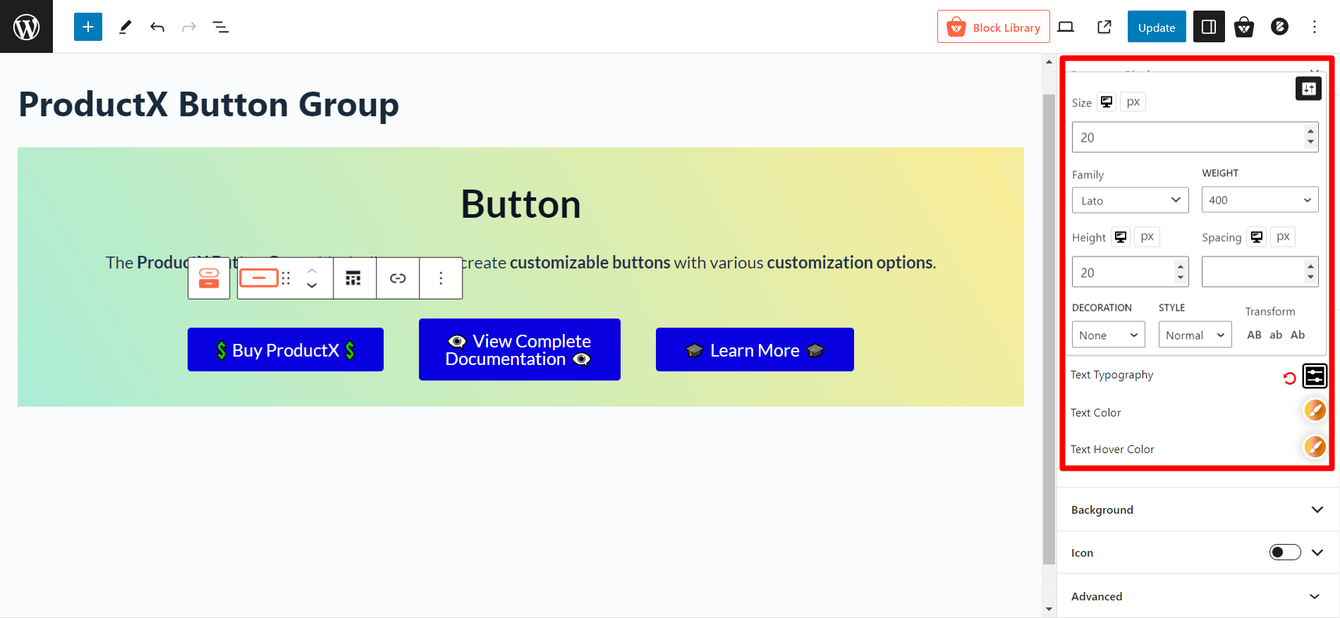
In the text typography option, you can select fonts, adjust font sizes, modify the height and spacing, and select decoration, style, and text cases.
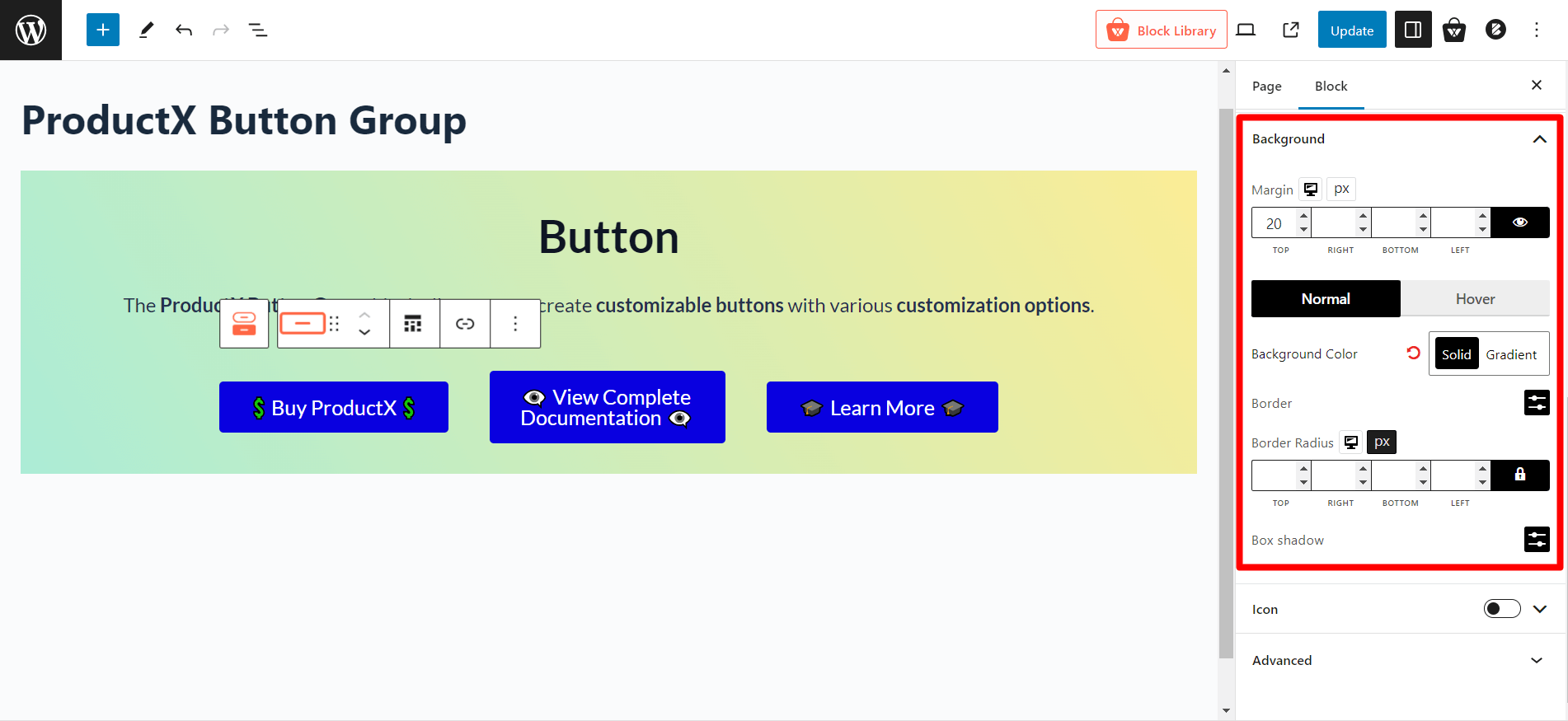
Background
In the background setting, you can adjust margins, background color, border, border radius, and box shadow for both normal and hover.
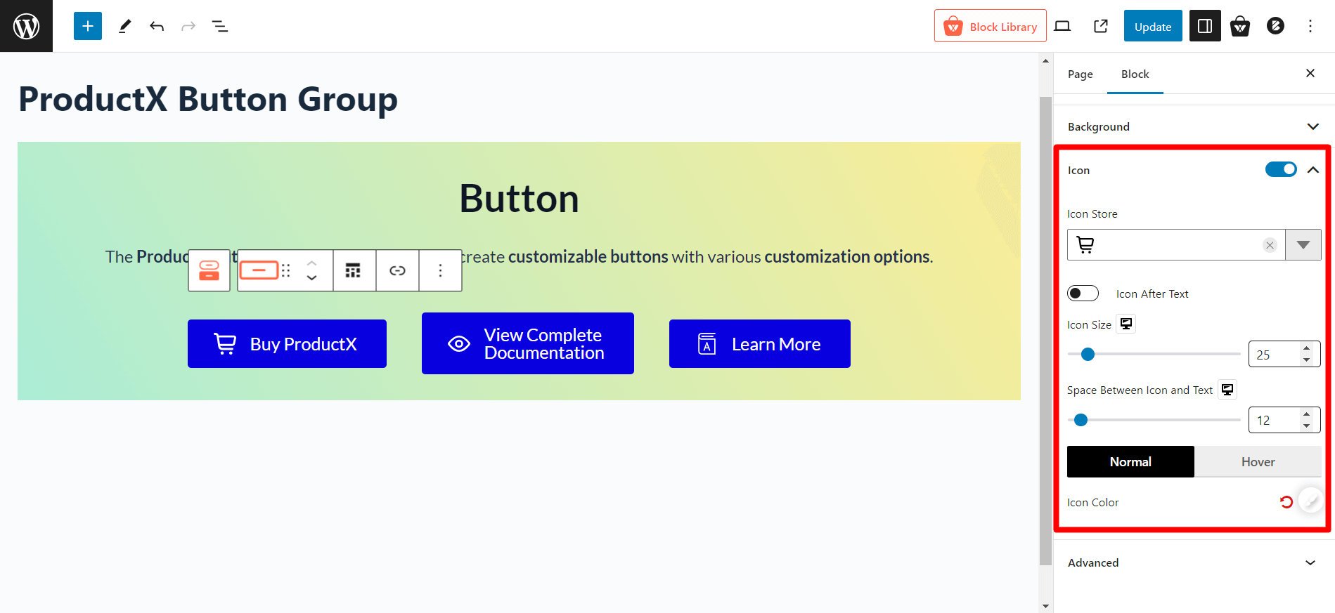
Icon
You can add icons for the icon library of this block. Also, you can adjust the icon size and space between icons and texts and choose normal and hover colors.
Responsive Settings
In the “Advanced” tab of the button group block, you can turn responsive options on/off. Currently, you will find the following options:
- Hide On Extra Large
- Hide On Desktop
- Hide On Tablet
- Hide On Mobile
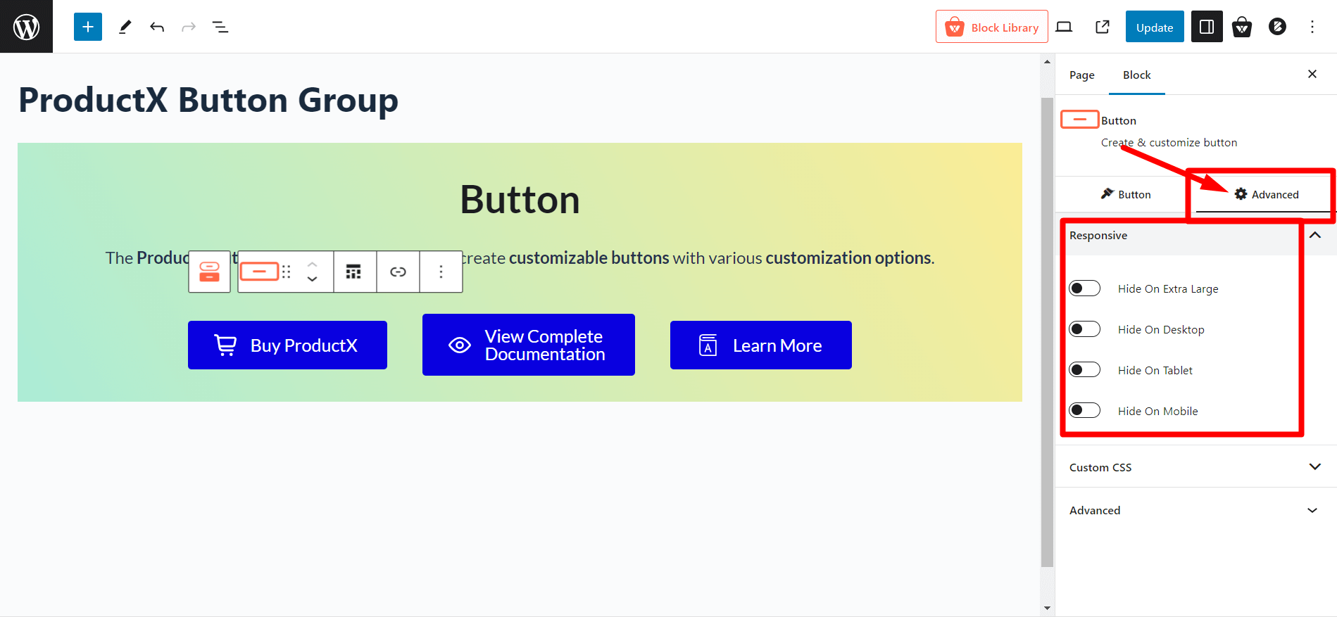
Click the toggle bar to enable each option.
And that is how you can use and customize this fantastic button group block from WowStore. You can also check out the demo of the Button Group block by clicking the link below!