ProductX is now WowStore! We’re very excited to bring you this experience, packed with exciting features. Please note that the features, blocks, starter packs, etc. all work the same. If you have used ProductX, you’ll feel right at home with WowStore.
Some people take button group blocks for granted.
And they’re not wrong. It’s a simple, yet very important feature that users can use in a variety of ways.
It’s not just true for blogs. It’s true for online e-commerce stores as well.
That’s why we are proud to introduce the ProductX Custom Button Group. It may seem like nothing. But we can assure you of one thing:
It’s a much-needed feature you’ll appreciate!
ProductX Button Group [Why Do You Need It?]
The button group block has many uses. Here are some key use cases:
Ease of Use
The primary need for a WordPress button block is to help the user navigate through your site with ease.
If they want to make a purchase or go from one section of content to another – it will be useful for them to have a button or a button group that’s responsive and well-designed.
Navigating to the Important Stuff
Placing buttons in the right places on your e-commerce store is super important as it helps them take action quickly.
If the button placement is correct (it will vary from user to user depending on their style, of course), users will find it easier to complete an action.
And this will help boost your sales figures in the long run.
Advanced Usability
The great thing about custom WordPress button block is usability. You, as an online store owner, have the ability to bring creative changes.
And that is the purpose of the ProductX Custom Button Group.
For example, if you are building a custom section targeting a particular user base, you can experiment with button placement.
We are giving you the option to place buttons creatively on your website. The features we are offering are more than enough for you to make stunning customizations with ease.
Let’s explore the features together.
Features of the ProductX Button Group
Before we begin, it is crucial that you understand how to add the WooCommerce button group in the first place. In order to do that, all you have to do is:
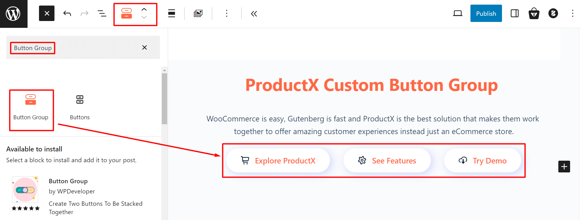
- Go to the page where you want to place the button
- Click on the “+” icon on the top right
- Search for “Button Group”
- Drag the button group block and place it wherever you like
It’s the simplest way to add the ProductX button group. Now, let’s explore the features of the button group block and see how you can bring changes.
Explore Different Patterns
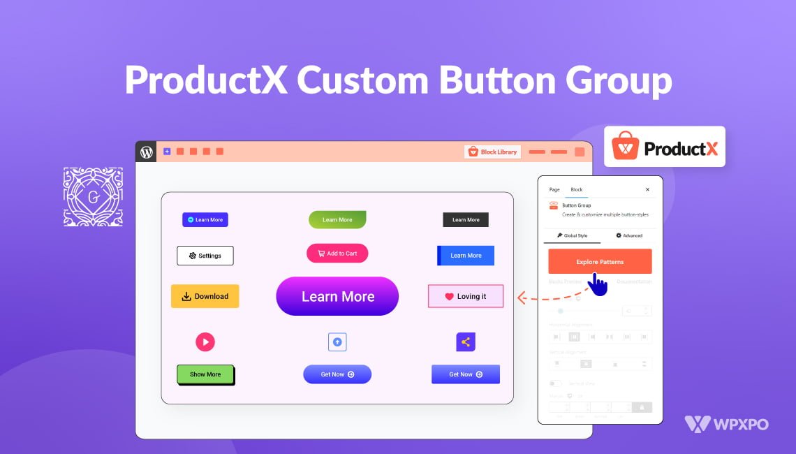
We came up with different patterns for you to try out. You can explore various button group patterns and use them to your liking.
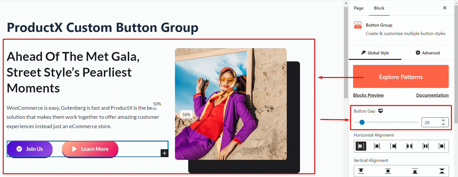
These patterns are customizable. So, you will be able to change various properties like the alignment, background, flex, and more.
Do you want to explore the different custom patterns for the ProductX button group block? You can check out the patterns here:
Group Alignment and Animation
With the button group, you can easily change the horizontal and vertical alignments – you have premade options available here.

Furthermore, the vertical view allows you to change the view of the vertically aligned buttons.
Change Individual Button Settings
In case you want to change the appearance of the buttons separately – you can do that.
For that, all you have to do is click on an individual button and start playing around with the settings.
Here are the things you can try:
Note: Want to dive deeper into button customizations? Make sure to check out the WooCommerce button group documentation to learn more about the features and how they work:
Individual Button Styling
You add individual styles to buttons. We have some pre-made designs that you may want to use for your e-commerce site.
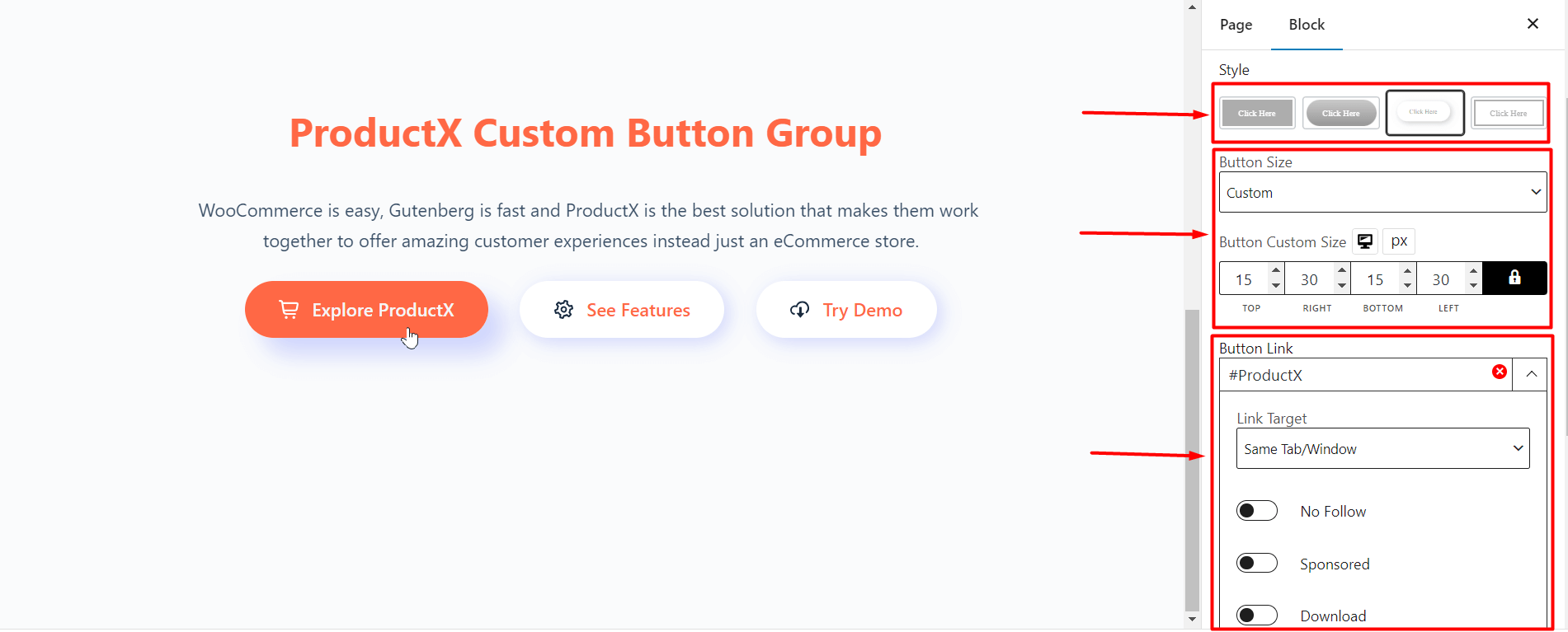
Moreover, you have the ability to change the button styles using the “Button Size” functionality. You can set predefined sizes from the dropdown or set individual sizing parameters.
Changes to the Text and Background
You can turn the “Text” on or off using the toggle. If you choose to leave the toggle on, then you can change the text settings from the different presets.

You can add changes to the background of the custom button group as well.
Applying Button Icons
You have the option to add icons to your buttons as well. All you have to do is make sure that the “Icon” toggle is turned on.
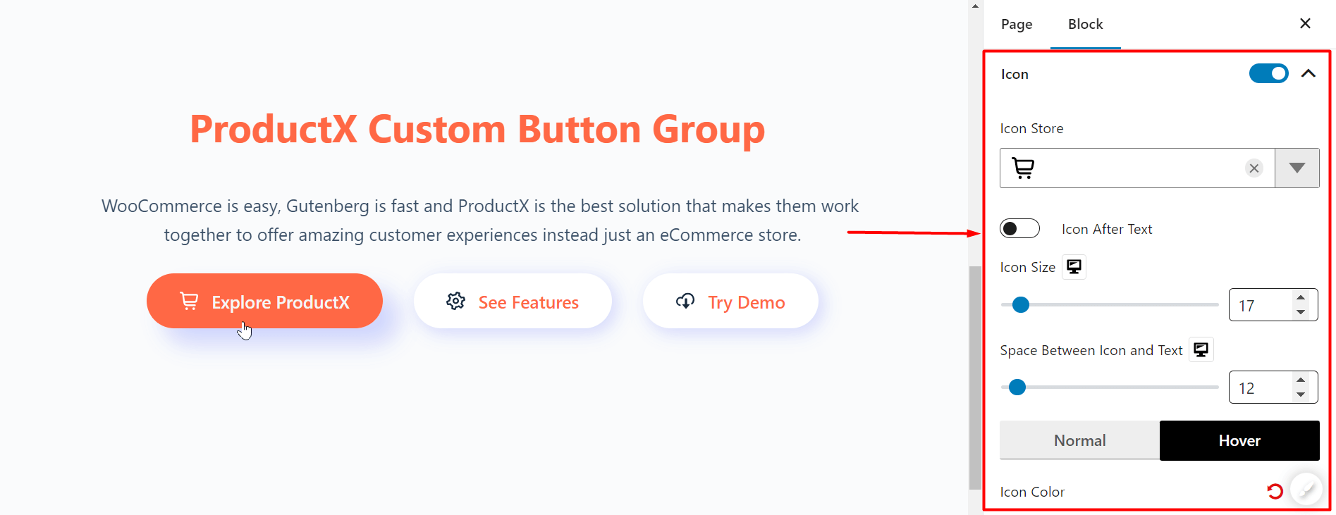
Here, you have the liberty to change the icon placement, color, and the style of icon you want to show – the presets should be more than enough for your online journey.
Button Responsiveness
Button responsiveness is a tricky element to use. However, many WooCommerce store owners like to use it to their advantage in different scenarios.
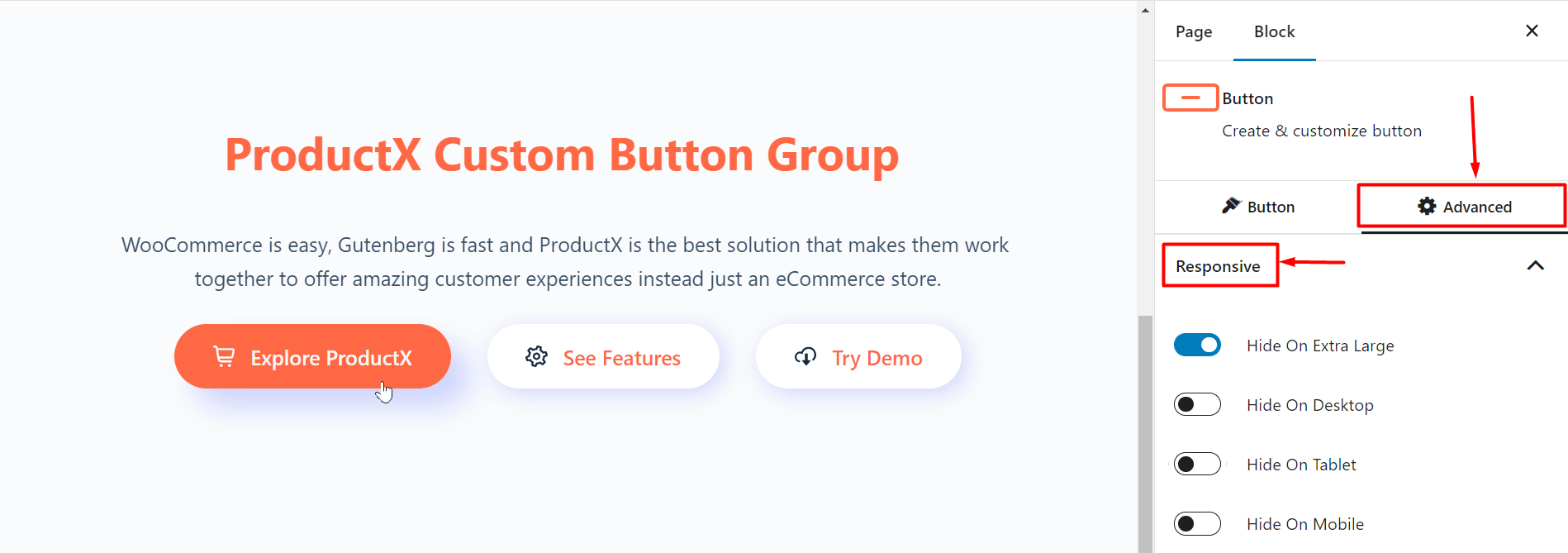
For example, if you need to hide your buttons in a particular media, you can do that with the button group. All you have to do is enable the toggle for the devices where you don’t want the button to appear. Simple as that!
Some Notes about Button Placement
Button placement requires special care when you’re designing a webpage for a particular page. There are some particular theories you can look into:
An ideal example comes from Apple’s Human Interface Design Guidelines:
“They specify that buttons should be to the right of any dialogue box. Furthermore, the action button should be farthest to the right. And the “Cancel” button should be close to the left.
If there is another button, it should be to the left of the “Cancel” button.”
Note: Want to make WooCommerce sites without the hassle? Check out the WooCommerce Builder to create your e-commerce sites with just a few clicks of the mouse.
Final Thoughts
We believe the ProductX Custom Button Group would be an excellent addition for novice and expert users alike.
We wanted to give our users the freedom of creativity. If you can take advantage of this feature, it will help you offer custom solutions to your users.
Do share your thoughts on how you want to use the button group block.
You can check out WordPress video tutorials on our YouTube Channel. Also, find us on Facebook and Twitter for regular updates!
