ProductX is now WowStore! We’re very excited to bring you this experience, packed with exciting features. Please note that the features, blocks, starter packs, etc. all work the same. If you have used ProductX, you’ll feel right at home with WowStore.
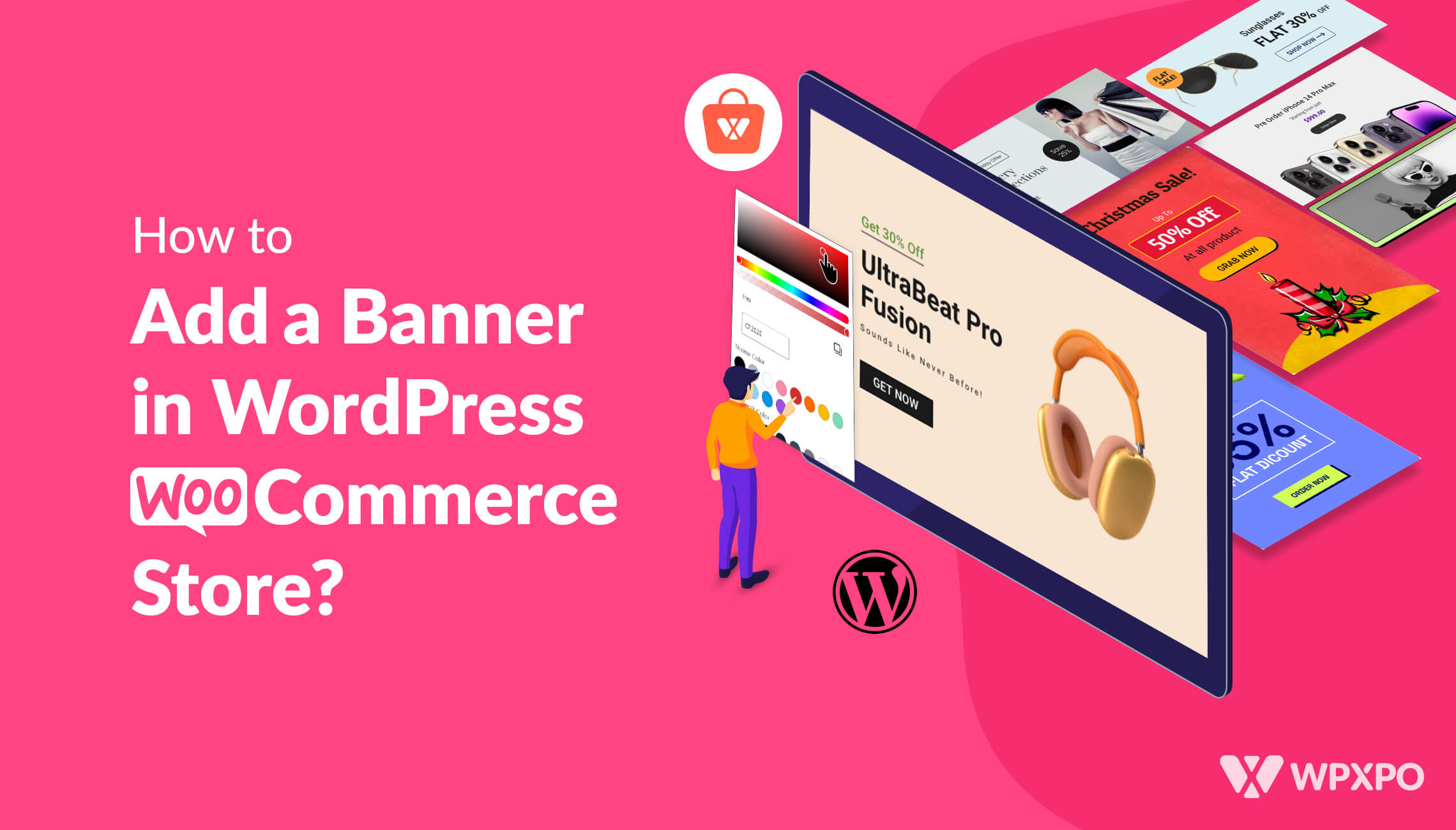
ProductX comes with another new feature – the Banner Maker. Today’s discussion focuses on how to add a banner in the WordPress WooCommerce store using the ProductX builder plugin.
But first, we need to explore a few things:
There’s no shortage of marketing strategies for your online store. You can choose different routes based on your budget, personnel, and resources.
However, choosing the right strategy can bring better results than sticking with a proven, yet outdated strategy.
This is especially true for online WooCommerce stores!
Online ads are one of the modern techniques for online store promotions. Many users take advantage of them in many different ways. However, online ads have different varieties.
Display or banner ads are one of them.
Previously, with ProductX, you could build a single product page, archive page, header template, footer template, and more. However, a medium to target your customers was not present.
We are proud to introduce you to the ProductX banner maker block – a way to add banners to WordPress WooCommerce store pages.
Before we begin explaining how it works – here’s a quick discussion on why it is important.
Banner Ads [The Why and the How]
Banner ads are a great way to attract users to your online store – it’s even more effective for clothing brands, online chain shops, etc. These banner ads can have static or dynamic elements – whichever works to generate traffic to the website.
However, in general, banners have a broader purpose. They don’t just work to generate traffic. They also work as anchors to bring users to a specific page or product.
There are plenty of options out there that will charge you per banner ad click. But ProductX now gives you the ability to create custom WooCommerce banners for your online store – you don’t have to pay per click!
On that note, you should know that banner ads have certain advantages:
Zero Cost!
The ProductX banner maker will not cost you a dime. You don’t have to pay per click – as you need to do with PPC platforms. This will allow you to move your resources into other important tasks – new product development, offline campaigns, etc.
Increase Product Awareness
With the banner maker block, you can share important product arrivals, discounts, and restocking alerts.
Users who are (or were!) waiting for a specific product will see the banner and know that their product is now available. This will act as a trigger for customers to buy that product!
Ease of Use
The ProductX banner maker comes with the ProductX signature trait – proper ease of use. Like all other product blocks, the banner maker block is super easy to get used to – it’s all very intuitive.
We will show you how it all works in a bit.
A/B Testing Simplified
Because of the simplistic nature of the banner maker block – you can A/B test your banner-making strategies. You can experiment with the color, typography, image selection, and more using the in-built settings of the banner maker.
How to Add a Banner in WordPress WooCommerce Store [Using the ProductX Banner Maker]
In order to use the banner block, you need to have the ProductX WooCommerce builder plugin installed on your WordPress site. Make sure to check the installation process documentation below to learn more:
Now that you have the ProductX plugin installed, you will be able to use the banner maker.
But the ProductX plugin has other excellent features you can explore. Make sure to check out the ProductX WooCommerce plugin:
Using the Pre-made Banner Maker Patterns
You can use the pre-made banner maker patterns to create awesome-looking ad banners for your WooCommerce store. You can also start from scratch if you want.
Here’s a preview of some of the banner patterns you can find in ProductX:
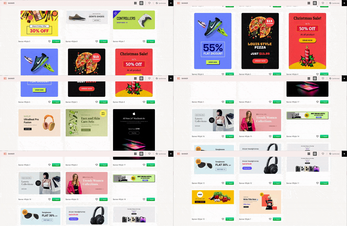
We created a test scenario where we changed the properties of a pre-made pattern to showcase clothing products. There is a call-to-action button that will take the user to a page from where they can buy certain clothing items (a jacket in this scenario).
Building the Banner with the ProductX Banner Maker
Before we start, here’s a quick feature overview of the ProductX Banner Block:
In order to build the banner, you need to go to a page or create a new page where you’ll place the banner. Once you are on the page, just use the forward slash “/” to search for the banner builder or drag it from the block menu by clicking on the “+” icon from the right.
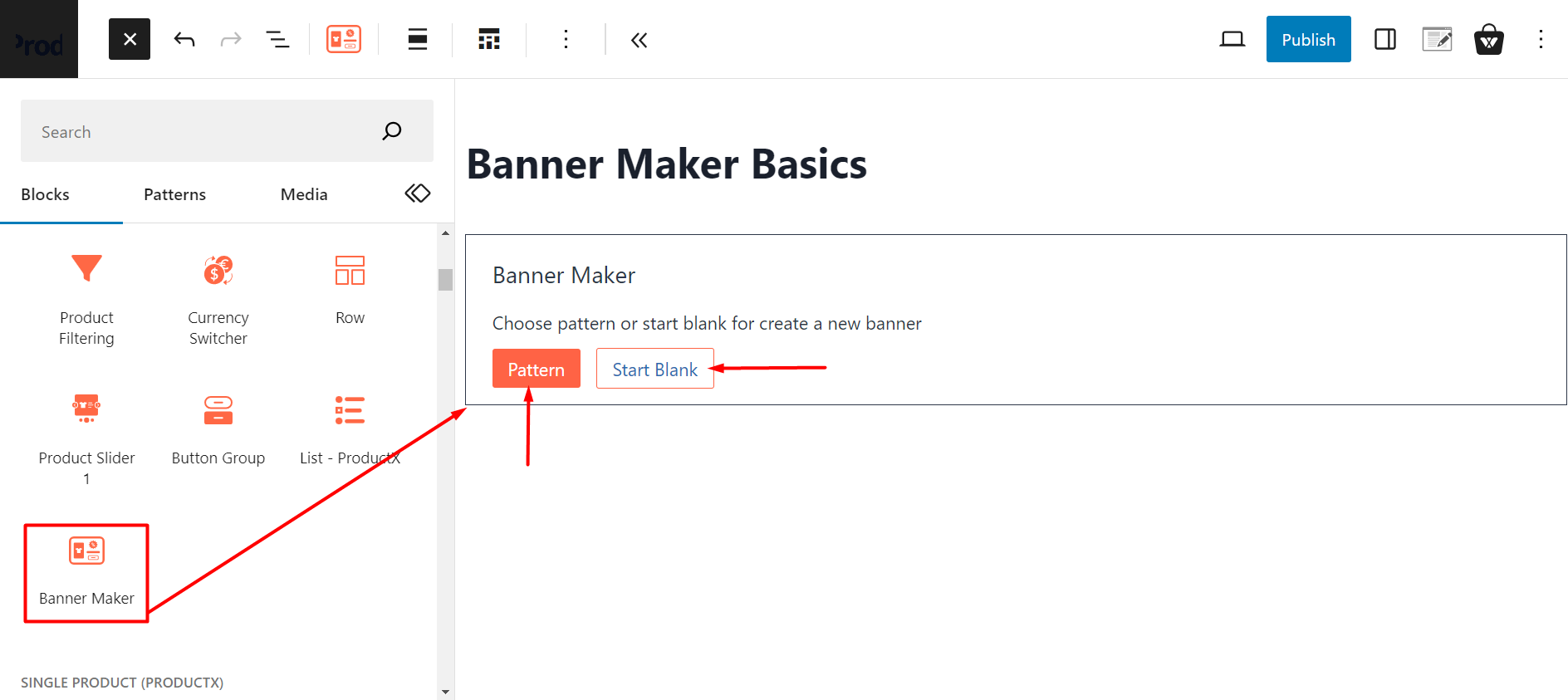
You will be prompted to do one of two things:
- Choose a pre-made banner pattern
- Start a blank banner design.
We are going to choose a pre-made banner pattern and customize it to create a new design. You can check out the banners from the design library section of the banner block. Here’s a preview:
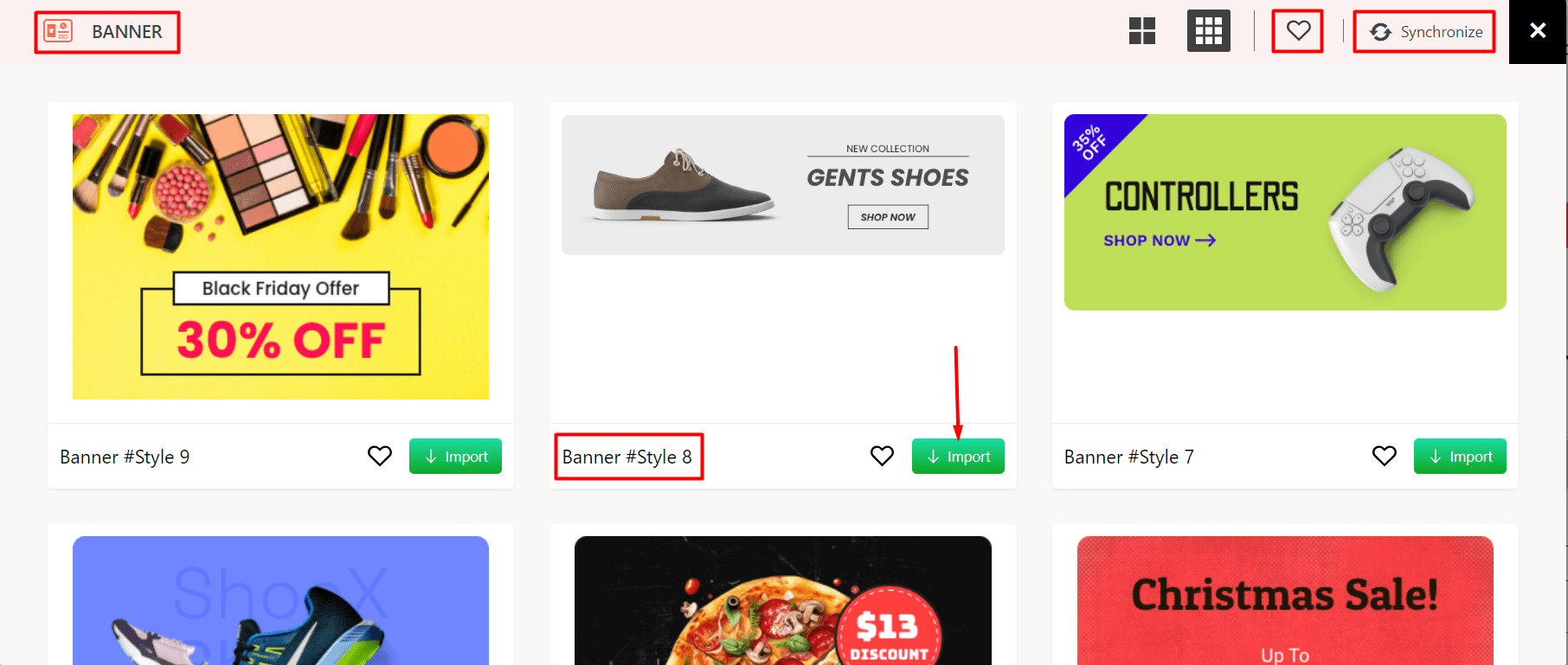
Please note that there is a synchronize button – click on it to get access to the latest pre-made patterns. Use the import button to import a new template from the design library. And the heart icon for accessing the wish list.
Here’s what the banner design looks like:
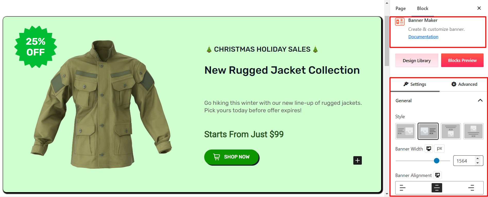
Now, let’s discuss the banner maker settings and go through each of the settings we changed. Let’s get started:
Changing the General Options in the Settings
Under the general settings tab, you will find settings like the banner style, banner width settings, alignment settings, and more. Since we are using the default setting, we kept the settings unchanged except for changing the style to show the image on the left.
Note that you can use 4 different banner styles – 2 of them are horizontal and the other 2 are vertical banner designs. We will share more information later on.
Changing the Image Settings
If you click on the image on the banner, it will tell you to upload an image. You can choose an image from the WordPress media library or upload an image from your PC.
We set the image height and width to 500 pixels (px) and 450 pixels (px) respectively. Also, we’ve set the image scale to contain:
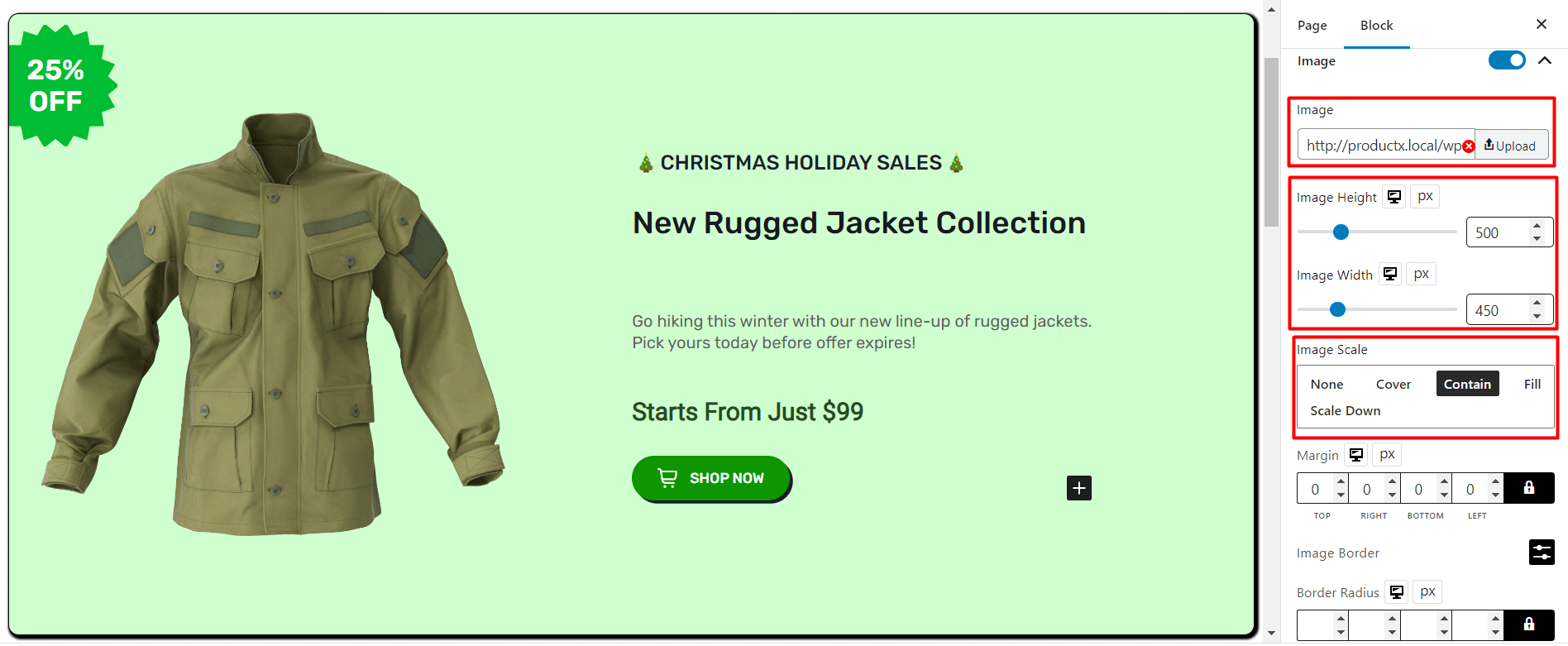
Please note that we will not be going through all the settings here. In order to check out the settings in-depth, make sure to check out the documentation:
The Content Settings
You can change the placement of the contents using the margin and padding. Since we are using a pre-made pattern and making changes as we go, we didn’t need to make any changes here.
Changing the Background Settings
Under the background settings, we made some changes:
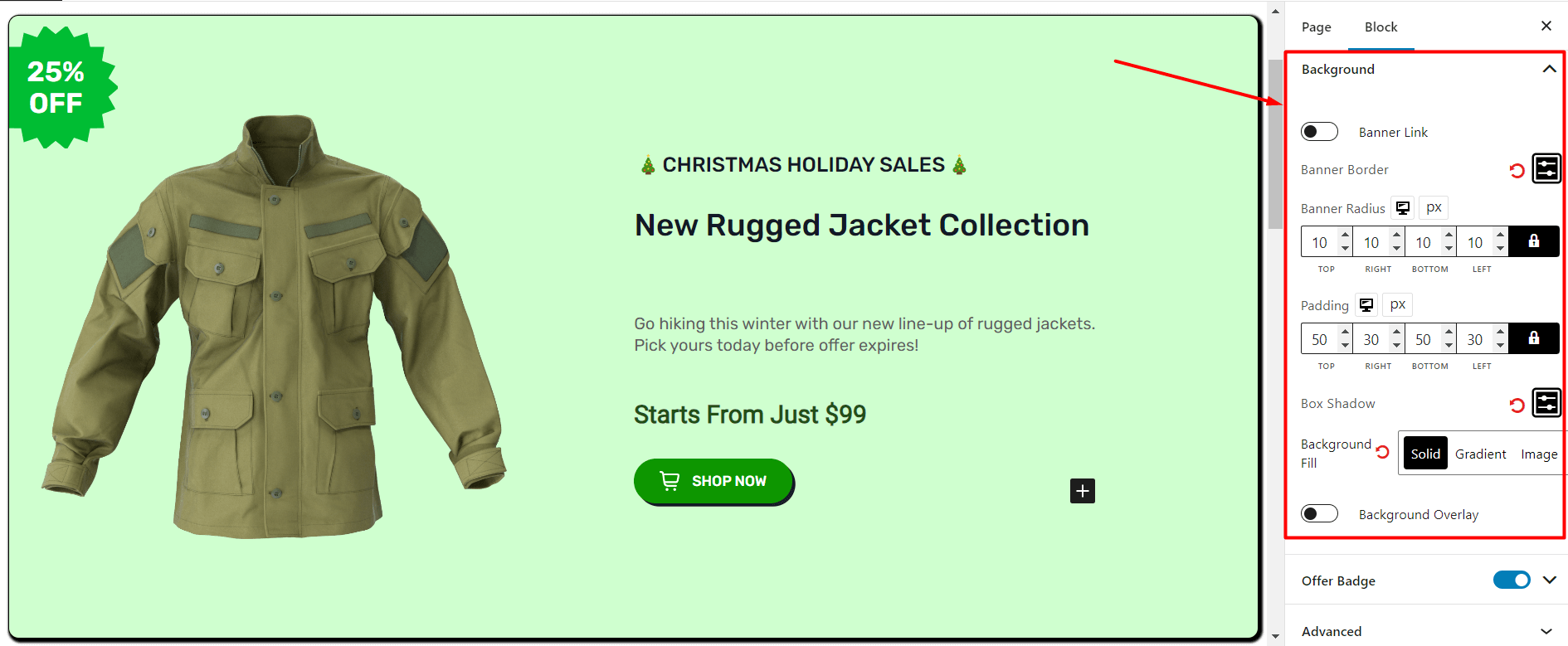
We gave the background a solid color (using the background fill setting) and changed the border-radius and the box shadow.
Again, settings like these are good for A/B testing. You can play around with the settings and controls to tailor the banner according to your needs.
Changing the Offer Badge Settings
We brought changes to offer badge settings as well:
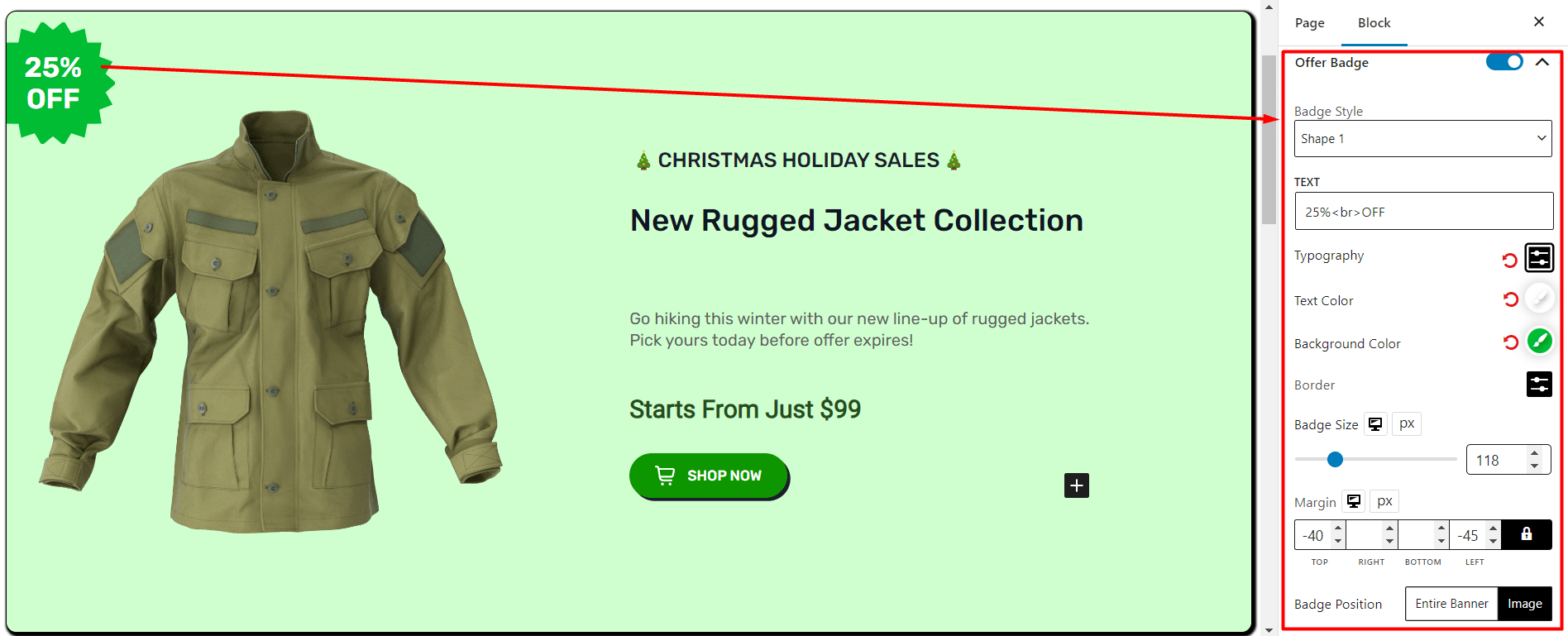
We changed the offer badge style (you can choose from the pre-made badge styles – play around with the settings) and the text (you can change the text directly from the banner). We brought a slight change to the badge size and changed the badge position.
Changes to the Banner Text
If you are using the ProductX Banner Maker, then you need to know one thing:
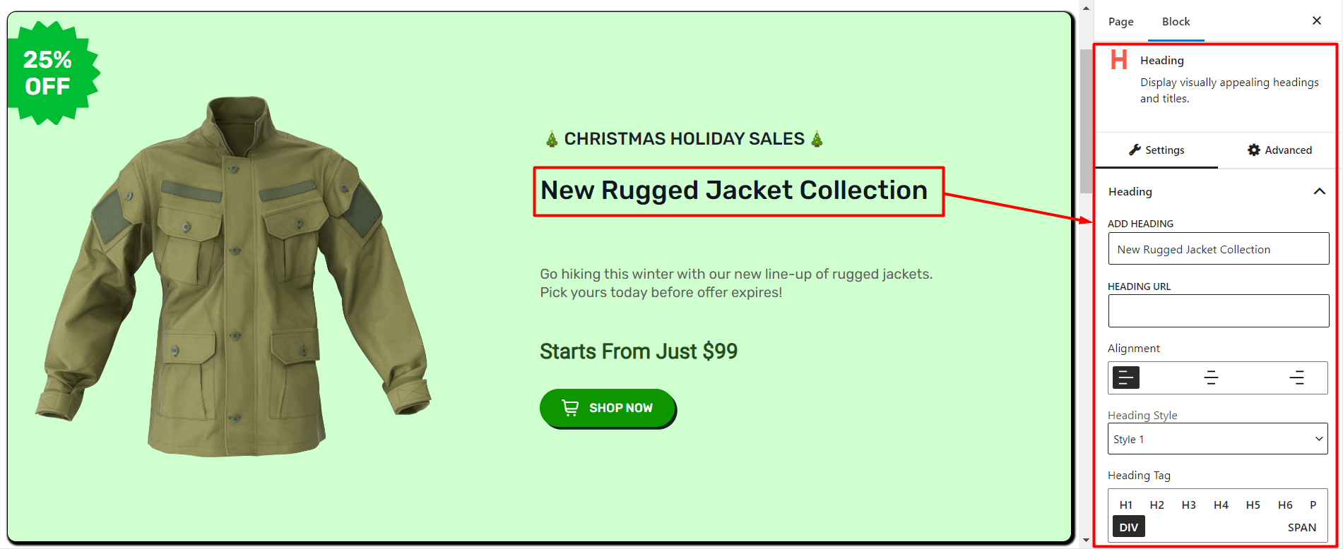
You can make changes to the live text on the banner itself. Just click on the text on the banner itself and you can change it.
Bringing Changes to the Banner Button
Click on the banner button to bring changes to it. In the button settings, you can bring various changes. Just like we did here, with the text, color, and icon:
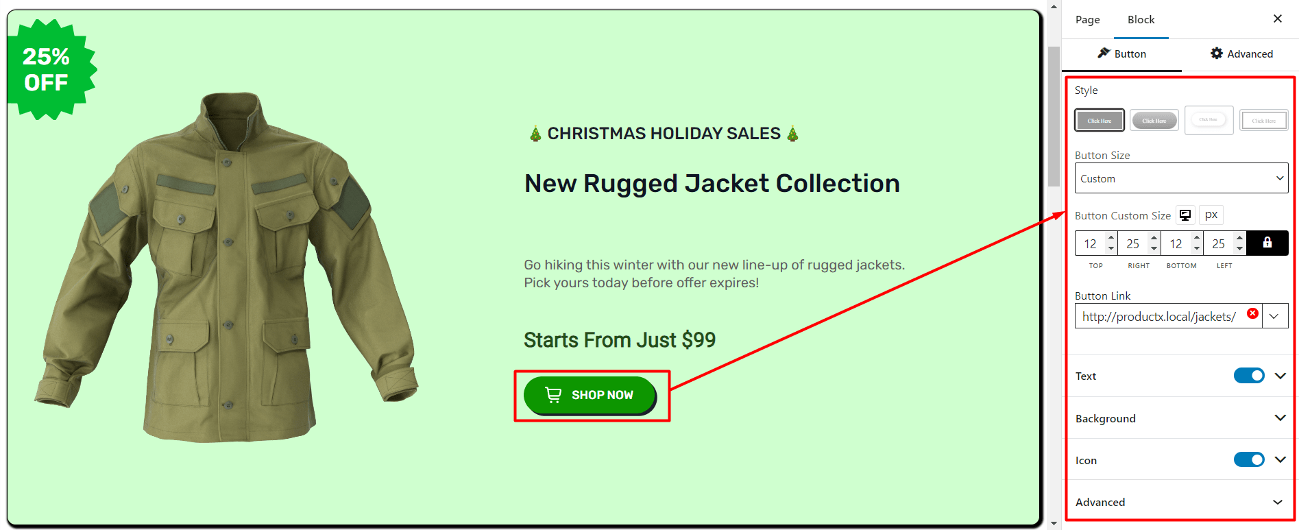
We also added shadows from the button background settings. Do play around with the different settings. Also, if you want you can check out the ProductX documentation to learn more about the various settings.
How Does the Banner Work?
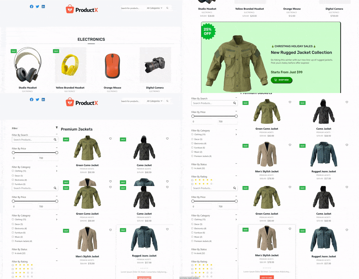
We placed the banner at the top of a product page (This is just for demonstration purposes – there are better practices to place an ad banner for better reach, go to the following section to learn more).
Here’s the example demonstration:
Add a Banner in WordPress WooCommerce for Better Reach [Proper Ways to Do So]
Ad banners can be highly effective if you use them in the right way. Unfortunately, there’s no “best” way to do so. You need to conduct A/B testing to get the best possible results.
However, there are some ways that perform ‘better’ than others. For example:
What are the Ideal Banner Sizes?
Some banner sizes perform better than other choices. Just take a look at the infographic for example:
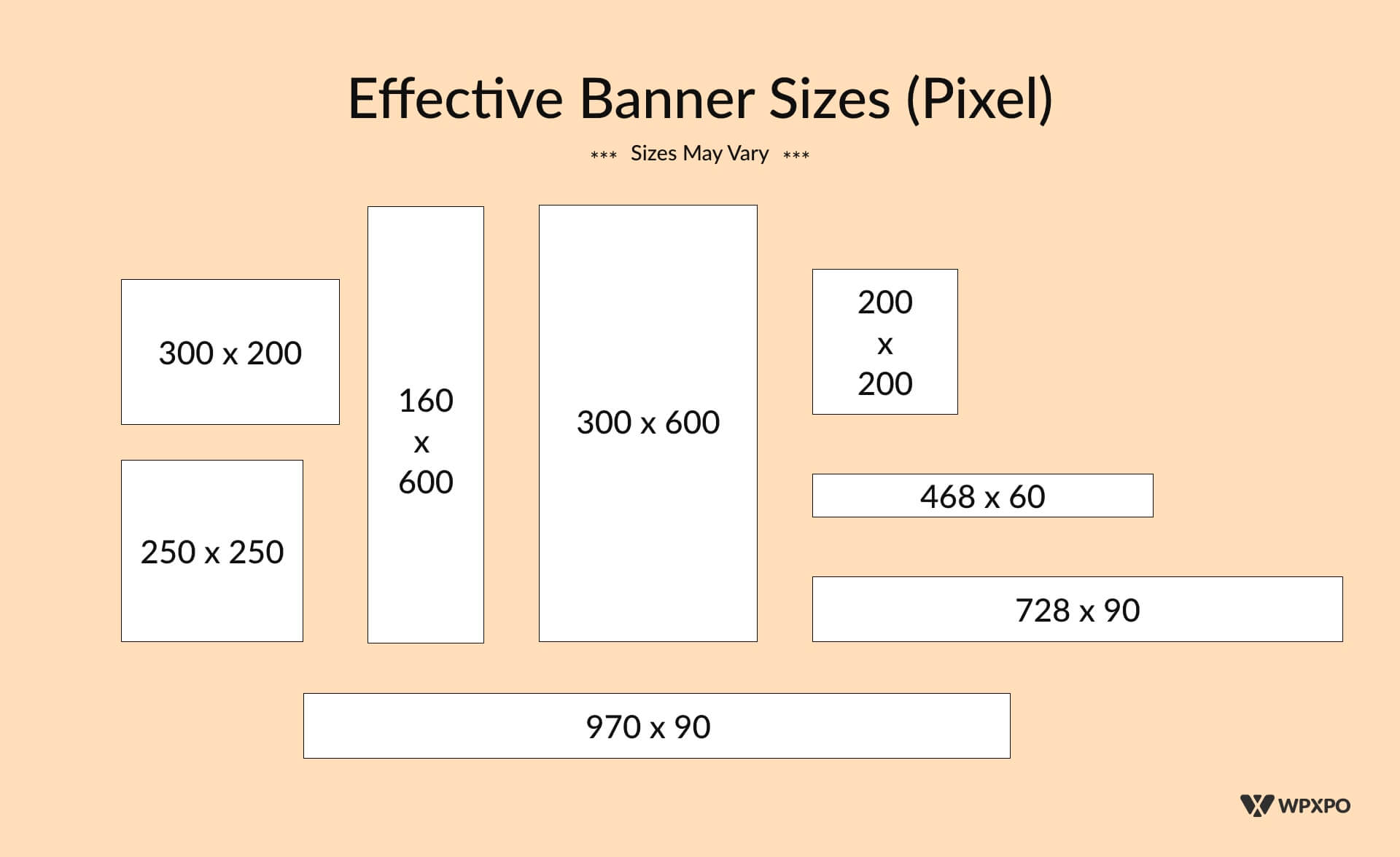
The banner sizes shown above are effective in most scenarios. In general:
- Small-size banners like the 250×250 and the 200×200 pixel banners are suitable for small spaces.
- The 468×60 pixel-size banners fit into tight spaces. This particular banner type is suitable for use in between blocks.
- The 728×90 pixel banners are for the top of the page. They usually go to the very top of a webpage. You can get creative though! For example:
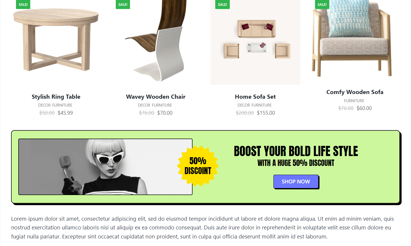
- 300×600 pixel banners offer very high visibility because of their size.
In the infographic, we only showed you a couple of options, You can use the banners however you see fit. Please note that the banner sizes may vary – you can experiment with different banner sizes.
*** The great thing about the ProductX banner maker is that you already have some of the banners pre-made for you as pre-made templates. Just use one of the pre-made templates and you are ready to go!
Add a Banner in WordPress: Things You Must Add!
There are 3 very important things you need to include in your WordPress banner if you want to get the best possible results:
The Visual Elements: Represent your Brand
There are two things that are very important:
- Include your brand assets like color, logo, and other elements in the banner to tell your brand’s story. These will help showcase your brand and gain authority.
- Use relevant imagery and other visual assets. For example, if you are a clothing brand, then you need to use proper clothing imagery along with relevant elements like a discount badge (the same can be said about other lines of business as well).
The Text Elements: Crafting the Right Copy
In a banner, you don’t have too much space to work with, you need to improvise.
The general rule of thumb is to use clear and easy-to-read text – the reader should understand exactly what message you are trying to convey. Again, test and try different banner solutions (ProductX can be your best friend here!).
The Call to Action
Your call to action should be short and simple. For example, if you want your user to buy something, you can use something like ‘shop now’ (with ProductX, you can use icons as well).
*** Whatever you do, make sure to test different variations of text. No single solution will give you the best results unless you test it properly.
In addition, you can add banners at the top of your site, right above the header. It’s a classic yet dynamic way to boost visitor interaction. Head over to WowOptin and grab your favorite banners to make your site pop—quick and easy!
Related Readings
- Features of the ProductX WooCommerce blocks.
- The ProductX Button Group: How Does it Work?
- Changing WooCommerce font using ProductX?
Final Words
You should now have a clear idea about how to add a banner in the WordPress WooCommerce store.
The ProductX WooCommerce plugin offers an extensive set of elements in the banner maker block to help you create awesome-looking banners.
However, we would like to hear your thoughts on the matter. How can we help make the ProductX experience better for you? Sound off in the comments section below.
