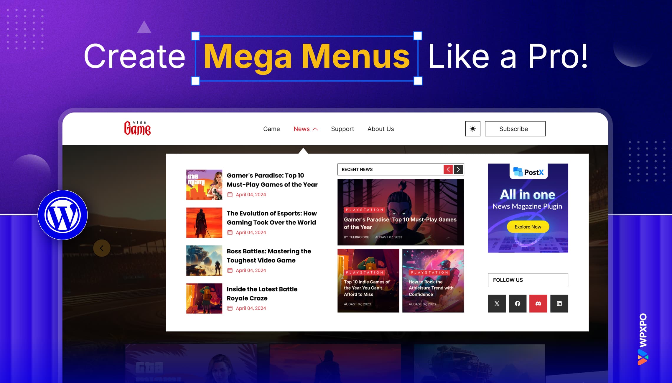
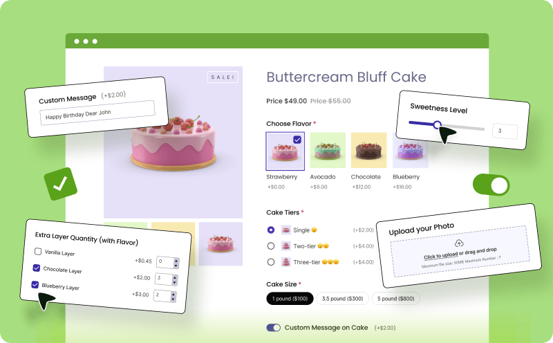
Traditional dropdown menus are like old flip phones—functional but outdated. A mega menu, on the other hand, is like a smartphone. It’s trendy, powerful, and built for an ultimate navigation experience.
Research by Nielsen Norman Group found mega menus can reduce the effort to find content by up to 50%. It makes browsing quicker and more intuitive, especially for websites with complex layouts.
In this guide, I’ll explain mega menus: what they are, why they matter, and how you can create mega menus in WordPress like a pro.
Let’s begin!
What is a Mega Menu?
A Mega Menu is a modern navigation tool that showcases multiple categories, subcategories, and content within a large panel.
Unlike traditional dropdown menus, which are often basic and lack space, Mega Menu offers a better-organized and more visually appealing layout.
They are perfect for websites with lots of content. They make navigation more accessible and more user-friendly.
Difference Between Regular Menus and Mega Menus
Here’s a simple comparison. Take a look.
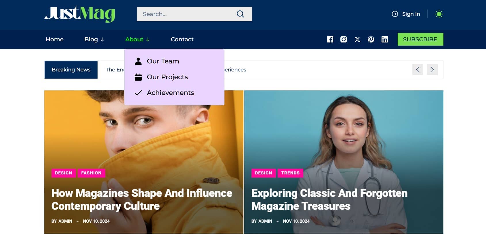
Regular Menus
- Simple dropdown menus, typically displayed in a basic list format.
- Having limited space makes them less effective for showcasing large amounts of content.
- Best suited for websites with minimal navigation needs.
Mega Menus
- Advanced, multi-column menus designed to present more information in an organized manner.
- Allow the inclusion of images, videos, icons, and custom styling for better aesthetics.
- It is best suited for any website requiring detailed categorization and much navigational content.

To sum up, mega menus make it easier for users to browse websites with complex or large amounts of content.
How to Create Mega Menus in WordPress Like a Pro
WordPress doesn’t have a built-in mega menu, so you’ll need a plugin. Among the available options, I found PostX as an excellent choice.
Why PostX?
PostX stands out as a premier Gutenberg Blocks Builder plugin. It transforms static websites into dynamic news portals, magazine hubs, and blogs.
The Mega Menu tool in PostX makes navigation building easy, attractive, and faster than ever.
Here’s a video tutorial to help you understand the steps visually:
Key Features of PostX
Here’s a brief look at why we recommend PostX for creating a mega menu:
- Gutenberg Site Builder: Build websites easily with the Gutenberg editor, no coding required.
- Advanced Query Builder: Filter content by categories, tags, authors, and more.
- Customizable Menu Layouts: Design multi-column mega menus with grids, lists, and sliders.
- Advanced Menu Styling: Adjust backgrounds, borders, shadows, and mobile responsive designs.
- Customizable Menu Items: Add badges, icons, images, and custom text to menu items.
- Premade Patterns & Starter Sites: Quickly set up websites with starter sites.
- Global Styles: Maintain a consistent design with customizable colors and typography.
To create a Mega Menu, log in to your WordPress dashboard, go to Plugins > Add New, search for “PostX,” then click Install Now and Activate.
Step 1: Add the Menu Block
To begin building the navigation system, follow these steps:
- Navigate to PostX > Site Builder from the dashboard.
- Select Header to edit the header section of your site.
- Within the header editor, choose a position and insert the Menu Block.
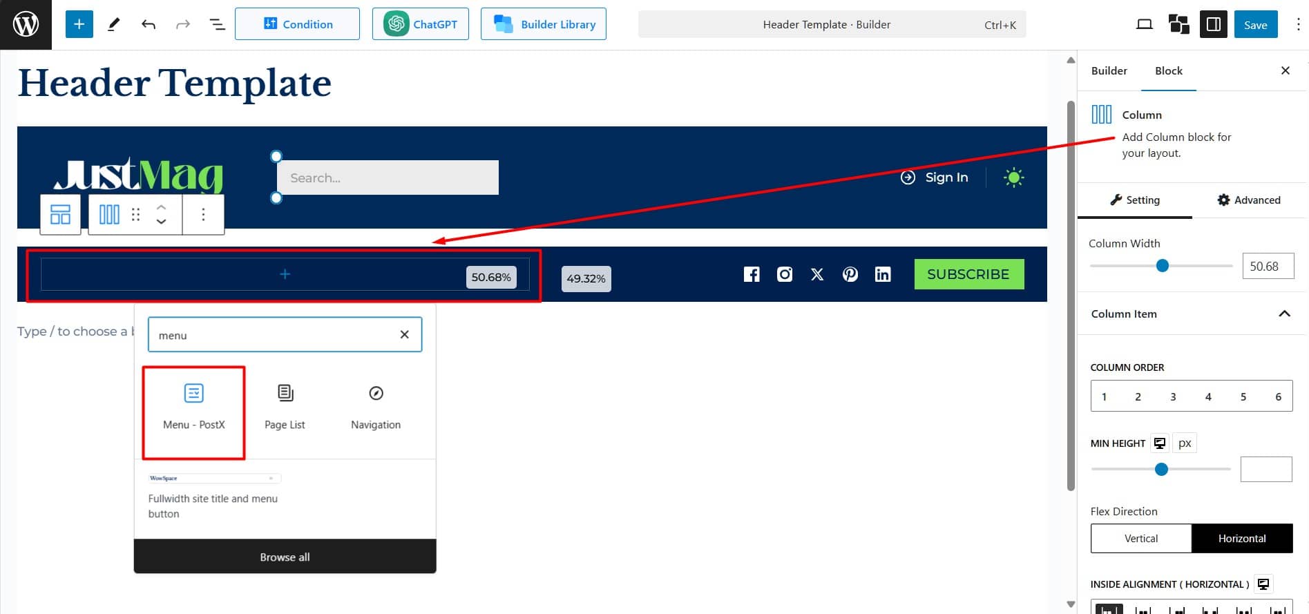
The Menu Block will automatically display default pages such as Home, About, and Contact, if they are available.
Step 2: Add and Customize Menu Items
Start by adding your primary menu items, subcategories, and any external links. To add new items, click + Add Item. Then, reorder items by dragging and dropping them into place.
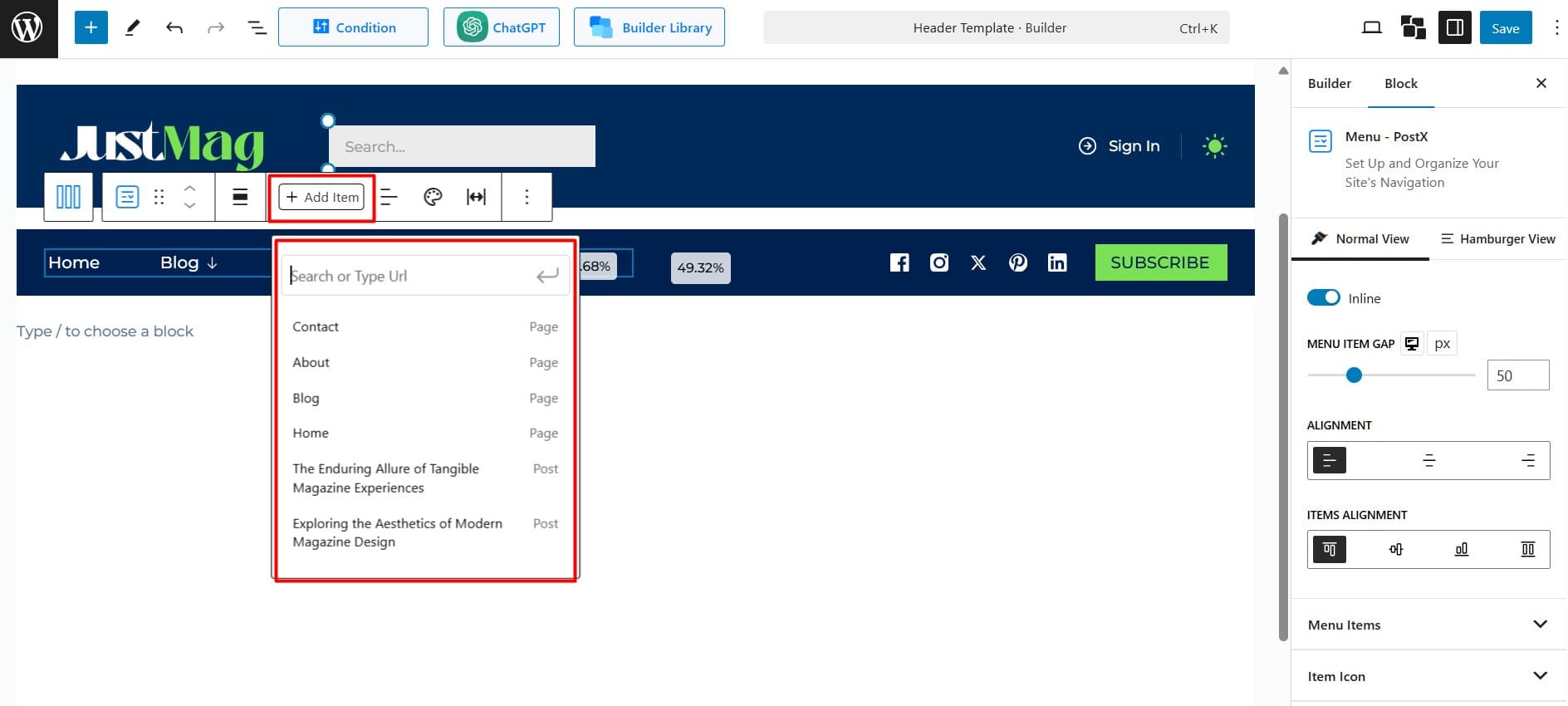
Personalize each menu item by adding icons, badges, and animations that enhance user experience.
Step 3: Add Mega Menu as a Sub-Menu
Choose which menu items will expand into a Mega Menu.
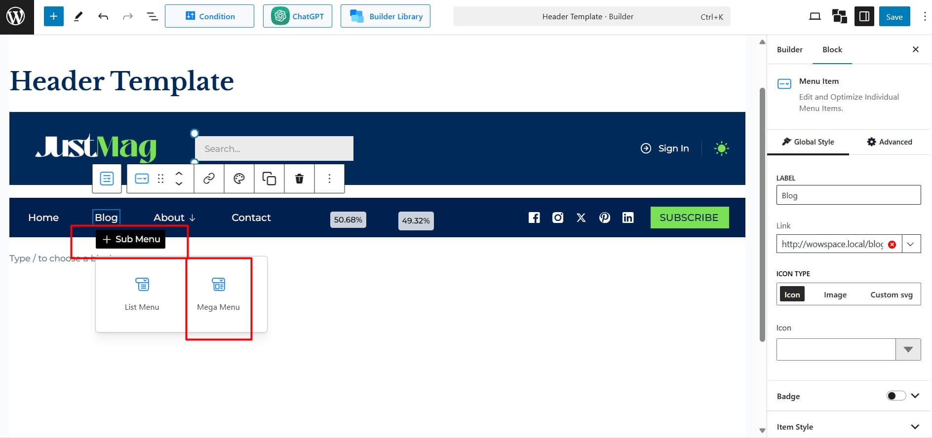
- Select the menu item where you want to add a Mega Menu.
- Click + Sub Menu under the chosen menu item.
- From the submenu types, select Mega Menu.
Step 4: Add Necessary Content Blocks
In this step, it’s time to add the content that will be displayed in the Mega Menu. For better organization, start by adding a row and setting the number of columns. Then, click within a column and select + Add Block.
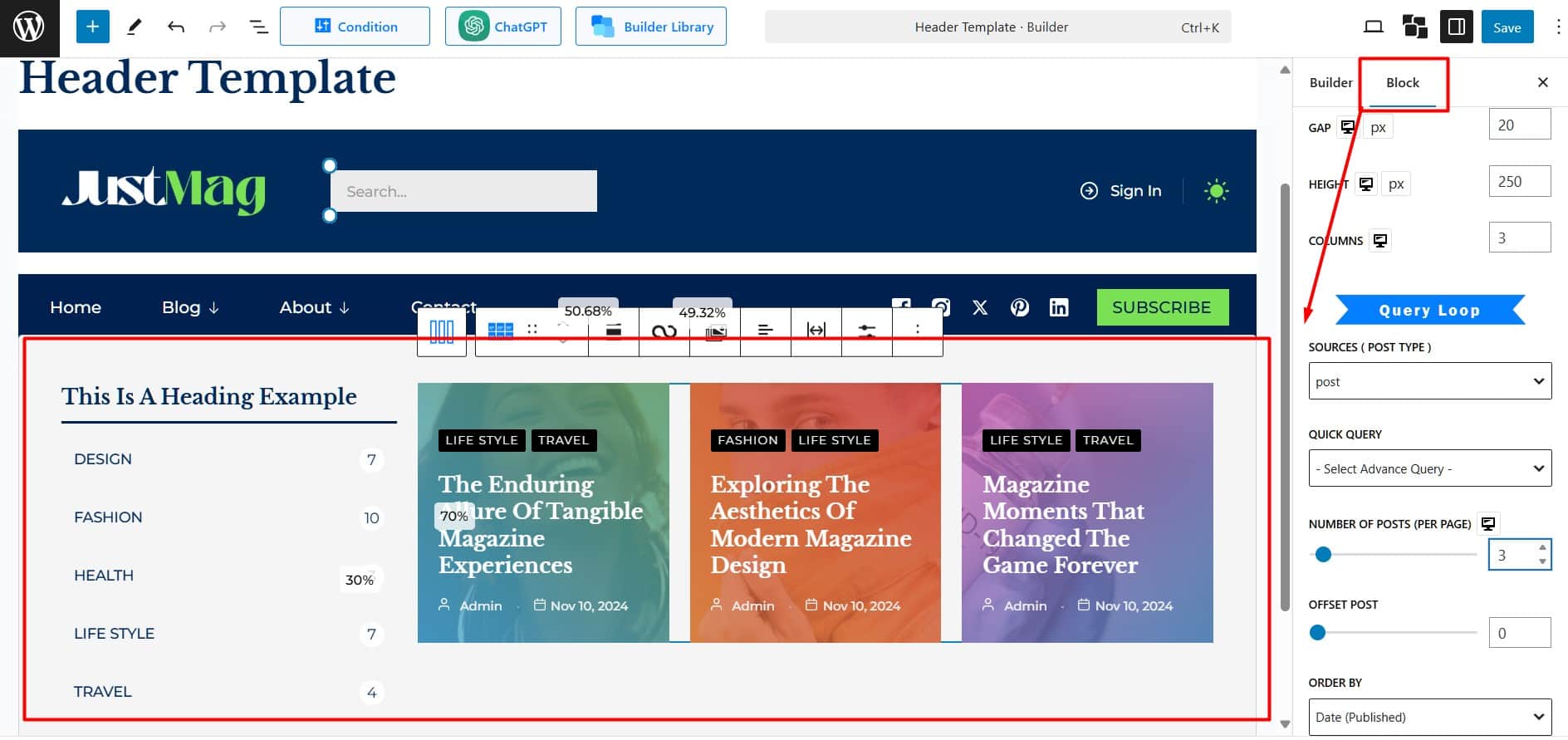
Choose from PostX blocks like Post Grid, Post List, Post Module, Post Slider, Taxonomy, Heading, Image, List, or Button. You can also use default Gutenberg blocks.
Step 5: Customize the Appearance of Mega Menu
To make your Mega Menu visually appealing, customize each content block (e.g., image blocks, post grid blocks) individually.
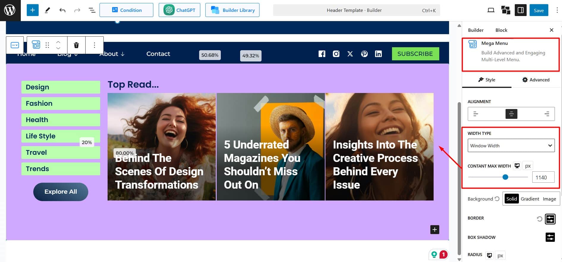
Access Mega Menu Block Settings
Modify the appearance directly from the settings panel. Adjust background colors, hover effects, fonts, and other elements to align with your website’s branding.
Customize Each Block:
- Configure each block’s settings to match your design preferences.
- Add content, adjust layouts, and style each block as needed.
Focus on maintaining consistency across all blocks to create a standout Mega Menu.
Step 6: Preview and Test the Menu
After designing your Mega Menu,
- Check how the menu looks and functions on your website..
- If everything works as intended, publish the changes.
You’ve just created a professional and visually appealing Mega Menu for your WordPress site.
If you want to learn more about creating mega megu and in-depth navigation customization of PostX, Here’s an official Documentation.
How to Optimize Mega Menus for Mobile Devices
PostX Mega Menu adjusts automatically for mobile screens. You can also use the Hamburger View to customize it for mobile and tablets.
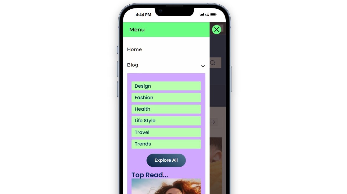
To optimize your mega menu for mobile devices using PostX, follow these steps:
- Enable Hamburger Menu: Turn on the Hamburger View in the menu settings for smaller screens.
- Set Breakpoint: Choose the screen width (default: 800px) for switching to hamburger style.
- Adjust Drawer Width: Set the navigation drawer’s width as a percentage or in pixels, up to 100%.
- Select Effects: Pick an animation style like Dissolve, Slide, or Accordion for transitions.
- Customize Icons: Change the size, color, background, and border of the hamburger, navigation, and close icons.
- Style Menu and Header: Update colors, backgrounds, spacing, and borders for menu items and the header.
These settings ensure a user-friendly and visually appealing mega menu on mobile devices.
Why Use a Mega Menu on Your WordPress Site?
Mega menu is your ultimate navigation upgrade. Here’s why it’s worth adding one:
✅ Perfect for Content-Rich Sites
A mega menu can simplify navigation if your site has many sections, topics, or articles. For instance, news portals can efficiently showcase categories like politics, sports, entertainment, and featured stories.
✅ Enhanced Visual Appeal
Mega menus allow multimedia elements like images, icons, and videos. This improves site aesthetics and helps you present key information more engagingly.
✅ Top Content | Higher Engagement
You can use a mega menu to prioritize important pages, promotions, or blog posts. It ensures they get maximum visibility without cluttering your homepage.
✅ Mobile-Friendly Navigation
A well-designed mega menu adjusts to any screen size. It provides smooth navigation on mobile devices and keeps users engaged.
✅ Better Categorization and Organization
Mega menus allow you to group items into logical categories and subcategories. This organization benefits both new and returning visitors.
✅ Customizable and Scalable
Whether you’re a blogger or running a large online store, you can scale the menu to match your site’s growth.
✅ Good for SEO
Mega menus enhance internal linking and clarify your site’s structure for search engines. This improves indexing, helping your site rank higher on search results.
Real-World Examples of Mega Menus
Mega menus are commonly used across websites. Here, I show the mega menus of three popular brands to help you see how they look on well-known sites.
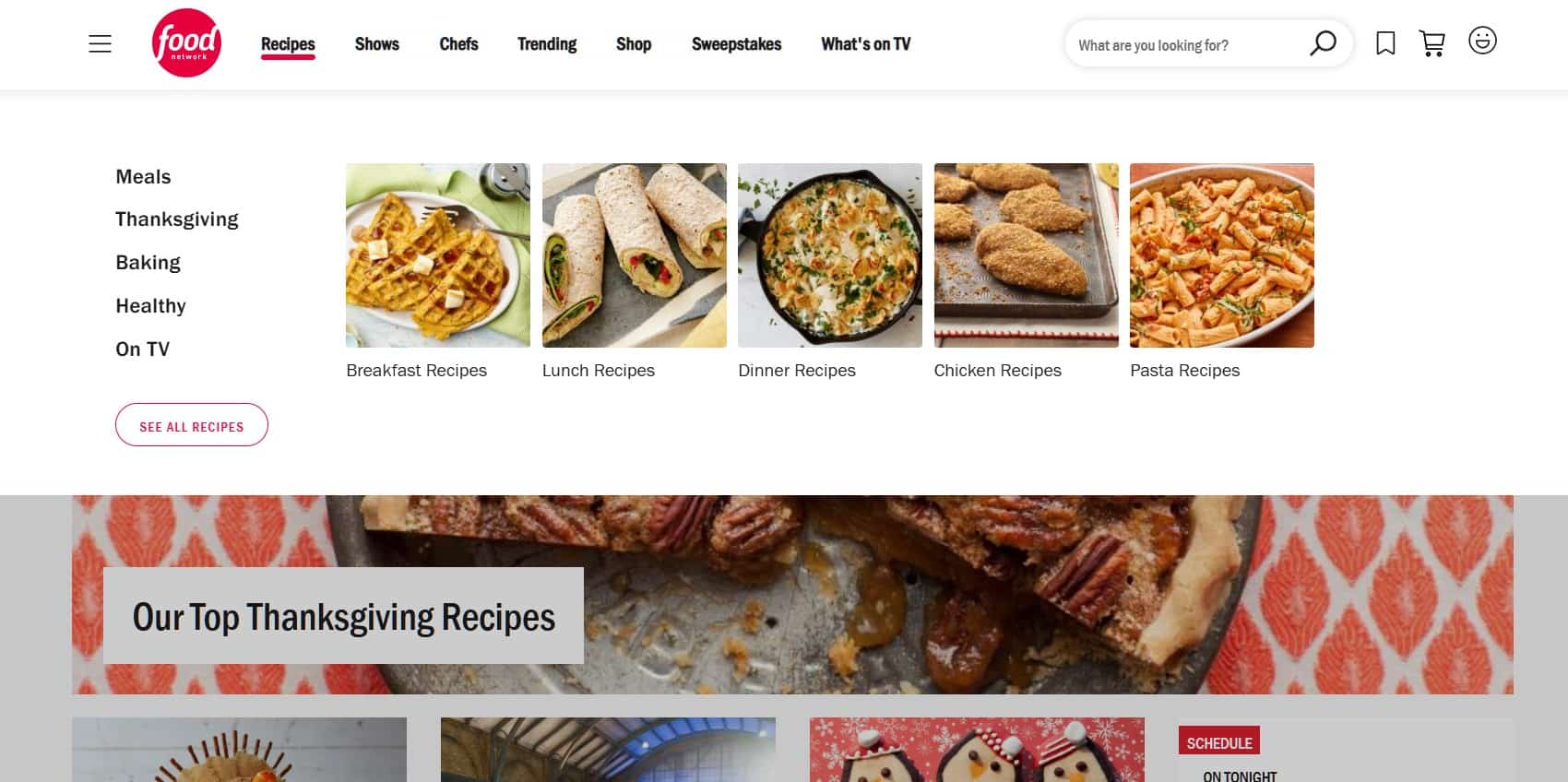
Food Network: Food Network’s mega menu is visually appealing and well-organized. It categorizes content into recipes, cooking shows, and chef profiles.
Each category has a submenu with rich imagery and links to trending dishes, upcoming episodes, and seasonal tips.
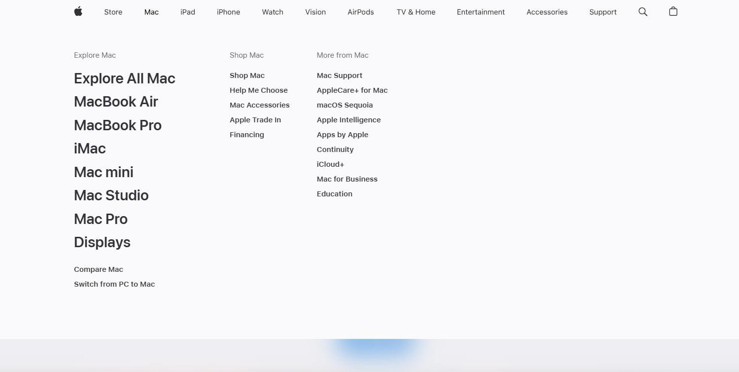
Apple: Apple uses a minimalist mega menu that is easy to navigate. Its products, like the Mac, iPhone, and iPad, are grouped into clear categories.
The submenus gives users detailed links to specific models, accessories, and support options.
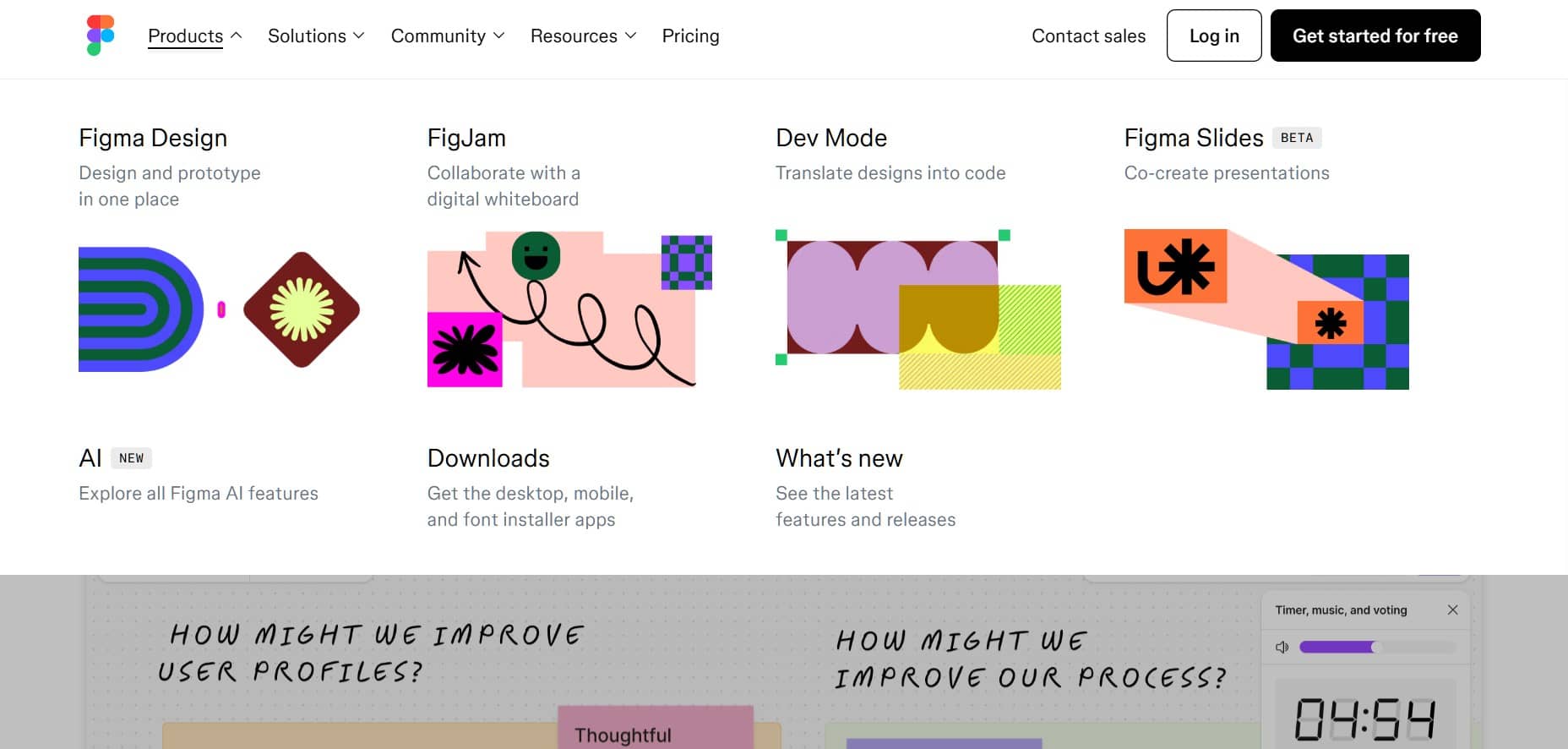
Figma: Figma features a modern navigation system that is clean and intuitive. Its core features, like design, collaboration, and plugins, are highlighted.
Dropdown mega menus give users quick access to resources, templates, and community events.
Common Mistakes to Avoid with Mega Menus
There are several common mistakes to avoid when designing and implementing a Mega Menu. An effective mega menu requires avoiding these.
⛔Overcrowded Menu: Avoid too many items. keep it simple and clear.
⛔Ignoring Mobile: Make sure the menu works well on phones and tablets.
⛔Too Many Images/Icons: Limit visuals to avoid messing your mega menu.
⛔No Hover Feedback: Use hover effects so users know what’s clickable.
⛔Inconsistent Design: Match the menu’s style with the rest of your site.
⛔Poor Readability: Use clear text, good spacing, and easy-to-read fonts.
⛔Unclear Structure: Combine similar items logically to simplify menu structure.
⛔Not Testing: Don’t miss testing on all devices to fix issues before launch.
Summing Up!
Now you know that the myth, “Complex websites can’t have simple navigation,” isn’t true! A Mega Menu makes it easy to organize even the largest sites effectively.
With tools like PostX Menu, building a modern and powerful navigation system is quick and simple, even for beginners. Follow the steps above and experiment to build a professional Mega Menu.
Remember, building a great menu is an ongoing process. The more you refine and adapt it, the better your site will become.
Start building and refining your menus with PostX!
